Crayons

Johanna Basford 16 Month Weekly Colouring Planner 2018-19 Written Review, Photos, Video Review and Flip Through

Johanna Basford 2018-19 16-Month Weekly Colouring Planner – A Review

Disclaimer – Please read this disclosure about my use of affiliate links which are contained within this post.
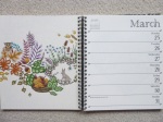
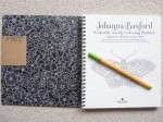
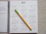
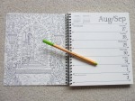
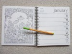
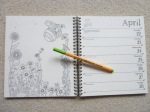
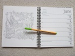
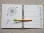
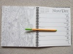
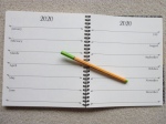
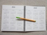
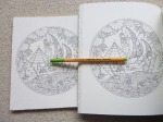
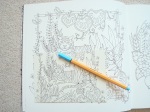
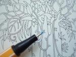
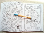
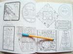
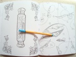
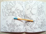
Johanna Basford 2018-19 16-Month Weekly Colouring Planner is published and was very kindly sent to me to review by Andrews McMeel Publishing. This planner is the perfect combination of organisation and colouring with space to write plans, appointments and notes, whilst also having weeks and weeks of colouring for you to do too. This planner is paperback with flexible pale cream card covers which have a beautiful black-heavy floral and foliage design on the front and back with a white floral design drawn on black on the insides of the covers, the front cover has gold foiling accents and the front and back cover have removable brown card strips with the information about the planner and the barcode etc printed on them. The planner is spiral-bound and measures 21.6 x 19.6cm, the covers aren’t especially sturdy so I’d be careful about travelling with it much and you’ll want to keep it safe somewhere rather than stuffing it in a bag or it’ll get damaged very quickly. This isn’t the best planner I’ve seen in terms of features and organisation, but for the combination of colouring and organising, it’s perfect and strikes a really good balance. The planner runs for 16 months and starts from the 27th of August 2018 all the way to the 5th of January 2019. The planner is printed double-sided and starts with a one-page overview of the year 2019 and then the planner itself starts with an image on the left of each double-page spread from one of Johanna’s six colouring books, images from all six (Secret Garden, Enchanted Forest, Lost Ocean, Magical Jungle, Johanna’s Christmas, and Ivy and the Inky Butterfly) are included, and the week’s days and dates with writing space for each on the right (this is in the same style as normal planners with added leafy accents and leafy lettering for the month title at the top). Each week runs from Monday to Sunday with equal space to write for each day, the dates are on the right and important festivals and bank holidays etc are written in small text on the left of the page, as well as the country it’s celebrated in. After the planner pages, which make up the vast majority of the book, there is a double-page spread with sections for each month of 2020 for you to add your advance plans to. Following this is a full page of 2018 dates and a full page of 2020 dates, followed by 5 lined pages where you can write notes (all with added leaf accents) and the final page is a colouring test page where you can test out your mediums to check for bleed through.

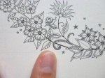
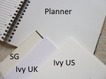
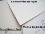
The paper this time is pale cream rather than bright white (it is the same paper as last time and it’s less yellow than the Secret Garden book paper and more cream than the new ivory paper in Ivy and the Inky Butterfly; see photo below of the different paper colours), lightly textured and medium thickness, sadly it does shadow a fair bit with water-based pens but it doesn’t bleed through; I’d strongly advise writing in pencil throughout or you’ll ruin the image on the reverse either with shadowing or indentation from ballpoint pens. Pencils work well on this paper so I’d suggest mostly colouring with pencils and using water-based pens if you don’t mind the shadowing showing through on the planner pages. A great selection of images from Johanna’s books are included with some being sections of original images at the original size and others being the whole page shrunk down to fit on the planner page so some of the illustrations are quite tricky to colour neatly but almost none look impossible as long as you use a good set of fineliners or sharp pencils. Because this is the third planner and the publisher has tried not to duplicate images it means that a number of my favourite images from her first few colouring books haven’t been included as they were in the first two planners, however, we’ve got new images from those as well as from the newest book, Ivy and the Inky Butterfly, and there are some lovely inclusions so there’s no disappointment to be had with this planner and it really is a great mix between organisation and colouring (two of my favourite things)!

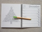
In terms of mental health, this colouring planner is ideal. It gives you a manageable goal of colouring one page per week which could either be next week’s page so that it’s coloured ready for that week or this week’s page so you can colour as you plan. You could even colour it ahead if you’re quick but you’ll need to get a wriggle on! The pages are a great size to practice colour schemes for your copy of the actual books, or even to try out colouring mediums on a smaller page. The spiral-binding makes it easy to access the whole page and none of the images go into the spine, it’s also ideal because once you’ve finished using the planner at the end of 2019, the pages are easy to remove for framing or gifting if you want to get more use out of your works of art. There isn’t a treasure hunt element in this planner and there are no written hints for drawing though there are plenty of spaces on a number of images to be able to add your own details or backgrounds to really make the pages your own but this of course isn’t necessary and it’ll look finished without the need to draw at all. This planner is perfect for fans of Johanna’s work and it is a beautiful way of using her illustrations. The line thickness varies a little throughout from thin to spindly thin and the intricacy and detail levels are higher than in the books because many of the images are shrunk down to fit the pages so you will most definitely need very good vision and fine motor control to get the most out of this planner if you’re wanting to colour it; you could of course leave it blank and just admire the illustrations because they really are beautiful to just look at with no need to add colour if that’s too challenging. The images aren’t arranged into any order but a few have been cleverly chosen to fit celebrations like a heart for the week of Valentine’s Day and images from Johanna’s Christmas through December. The page size is much more manageable and less daunting to colour and this is ideal for those of you with fluctuating conditions or concentration levels because these pages are quicker to finish and likely to cause less frustration.

I would highly recommend this colouring planner to fans of Johanna’s work and to those who love to be organised. It’s a great combination of planner and colouring pages and the size and format is ideal for those who find the full-size book pages too daunting. It’s great for practising colour schemes or using new colouring mediums and it’ll be a lovely keepsake to work through from beginning to end and see how you’ve progressed over the 16 months it runs for; you can even remove the images afterwards and frame or gift them.

If you’d like to purchase a copy it’s available below:
Amazon UK – Johanna Basford 2018-19 16-Month Weekly Colouring Planner
Book Depository Worldwide – https://www.bookdepository.com/Johanna-Basford-2018-2019-16-Month-Coloring-Weekly-Planner-Calendar-Johanna-Basford/9781449492441/?a_aid=colouringitmom

Can’t get enough of Johanna’s illustrations and the ability to organise your life? Then check out the following reviews for the Ivy and the Inky Butterfly 2019 Wall Calendar and the 2019 Page-a-Day Calendar.

Video Review and Flip Through

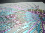
The image below was coloured using Caran d’Ache Luminance Pencils and a Caran d’Ache Blender Pencil.

Johanna Basford 2017-18 Weekly Colouring Planner - a great combination of colouring and organisation, click through to read my review and see images of inside

Johanna Basford 2017-2018 16-Month Weekly Colouring Planner – A Review

Disclaimer – Please read this disclosure about my use of affiliate links which are contained within this post.
Johanna Basford 2017-2018 16-Month Weekly Colouring Planner is published and was very kindly sent to me to review by Andrews McMeel Publishing. This planner is the perfect combination of organisation and colouring with space to write plans, appointments and notes, whilst also having weeks and weeks of colouring for you to do too. This planner is paperback with flexible pale cream card covers which have a beautiful black floral and foliage design on the front and back with the negative image drawn in pale cream on the insides of the covers, the front cover has gold foiling accents and the front and back cover have removable brown card strips with the information about the planner and the barcode etc printed on them. The planner is spiral-bound and measures 21.6 x 19.6cm, the covers aren’t especially sturdy so I’d be careful about travelling with it much and you’ll want to keep it safe somewhere rather than stuffing it in a bag or it’ll get damaged very quickly. This isn’t the best planner I’ve seen in terms of features and organisation, but for the combination of colouring and organising, it’s perfect and strikes a really good balance. The planner runs for 16 months and starts from the 28th of August 2017 all the way to the 6th of January 2019. The planner is printed double-sided and starts with a one-page overview of the year 2018 and then the planner itself starts with an image on the left of each double-page spread from one of Johanna’s five colouring books, images from all five (Secret Garden, Enchanted Forest, Lost Ocean, Magical Jungle and Johanna’s Christmas) are included, and the week’s days and dates with writing space for each on the right (this is in the same style as normal planners with added leafy accents and leafy lettering for the month title at the top). Each week runs from Monday to Sunday with equal space to write for each day, the dates are on the right and important festivals and bank holidays etc are written in small text on the left of the page, as well as the country it’s celebrated in. After the planner pages, which make up the vast majority of the book, there is a double-page spread with sections for each month of 2019 for you to add your advance plans to. Following this is a full page of 2017 dates and a full page of 2019 dates, followed by 5 lined pages where you can write notes (all with added leaf accents) and the final page is a colouring test page where you can test out your mediums to check for bleed through.

The paper this time is pale cream rather than bright white (it is less yellow than the Secret Garden book paper and more cream than the new ivory paper in Magical Jungle; see photo below of the different paper colours), lightly textured and medium thickness, sadly it does shadow a fair bit with water-based pens but it doesn’t bleed through; I’d strongly advise writing in pencil throughout or you’ll ruin the image on the reverse either with shadowing or indentation from ballpoint pens. Pencils work well on this paper so I’d suggest mostly colouring with pencils and using water-based pens if you don’t mind the shadowing showing through on the planner pages. A great selection of images from Johanna’s books are included with some being sections of original images at the original size and others being the whole page shrunk down to fit on the planner page so some of the illustrations are quite tricky to colour neatly but almost none look impossible as long as you use a good set of fineliners or sharp pencils. Because this is the second planner and the publisher has tried not to duplicate images it means that a number of my favourite images from her first three colouring books haven’t been included as they were in the 2016/17 planner, however, we’ve got new images from those as well as from the newer two books and there are some lovely inclusions so there’s no disappointment to be had with this planner and it really is a great mix between organisation and colouring (two of my favourite things)!

In terms of mental health, this colouring planner is ideal. It gives you a manageable goal of colouring one page per week which could either be next week’s page so that it’s coloured ready for that week or this week’s page so you can colour as you plan. You could even colour it ahead if you’re quick but you’ll need to get a wriggle on as it’s already been running for a week. The pages are a great size to practice colour schemes for your copy of the actual books, or even to try out colouring mediums on a smaller page. The spiral-binding makes it easy to access the whole page and none of the images go into the spine, it’s also ideal because once you’ve finished using the planner at the end of 2018, the pages are easy to remove for framing or gifting if you want to get more use out of your works of art. There isn’t a treasure hunt element in this planner and there are no written hints for drawing though there are plenty of spaces on a number of images to be able to add your own details or backgrounds to really make the pages your own but this of course isn’t necessary and it’ll look finished without the need to draw at all. This planner is perfect for fans of Johanna’s work and it is a beautiful way of using her illustrations. The line thickness varies a little throughout from thin to spindly thin and the intricacy and detail levels are higher than in the books because many of the images are shrunk down to fit the pages so you will most definitely need very good vision and fine motor control to get the most out of this planner if you’re wanting to colour it; you could of course leave it blank and just admire the illustrations because they really are beautiful to just look at with no need to add colour if that’s too challenging. The images aren’t arranged into any order but a few have been cleverly chosen to fit celebrations like a heart for the week of Valentine’s Day, a skull for Halloween week 2018 and images from Johanna’s Christmas through December. The page size is much more manageable and less daunting to colour and this is ideal for those of you with fluctuating conditions or concentration levels because these pages are quicker to finish and likely to cause less frustration.

I would highly recommend this colouring planner to fans of Johanna’s work and to those who love to be organised. It’s a great combination of planner and colouring pages and the size and format is ideal for those who find the full-size book pages too daunting. It’s great for practising colour schemes or using new colouring mediums and it’ll be a lovely keepsake to work through from beginning to end and see how you’ve progressed over the 16 months it runs for; you can even remove the images afterwards and frame or gift them.

If you’d like to purchase a copy it’s available below, there has been a delay in getting stock to retailers and therefore Johanna has released a free download of the pages for September which can be found here.
UK Edition
Amazon UK – Johanna Basford 2017-2018 16-Month Weekly Colouring Planner
US Edition
Amazon UK – Johanna Basford 2017-2018 16-Month Weekly Coloring Planner
Book Depository Worldwide – https://www.bookdepository.com/Johann-Basford-2017-2018-16-Month-Coloring-Weekly-Planner-Calendar-Johann-Basford/9781449482794/?a_aid=colouringitmom

Can’t get enough of Johanna’s illustrations and the ability to organise your life? Then check out the following reviews for two different wall calendars and a page-a-day calendar too.
Magical Jungle 2018 Wall Calendar
Secret Garden 2018 Wall Calendar
Page a day calendar

The image below was coloured using Holbein Artist’s Coloured Pencils.

Abenteuer Natur (Adventurous Nature) – A Review

Disclaimer – Please read this disclosure about my use of affiliate links which are contained within this post.
Abenteuer Natur is published by Christophorus Verlag GMBH and illustrated by Richard Merritt who very kindly sent me a copy to review. You may not know his name but you’re sure to know his work because he’s one half of the incredible duo who illustrated The Menagerie, The Aviary, The Aquarium and The Labyrinth and he also solely illustrated another German published colouring book, Tierzauber (Animal magic), last year. He’s well-known for his stunning drawings of highly intricate, hyper detailed and patterned animals and these have been featured in the Art Therapy series of books which was where I first discovered his work. Abenteuer Natur translates as Adventurous Nature and the content really doesn’t disappoint with a wide range of exotic and unusual animals pictured inside.

This book is 22.5cm square, a little smaller than the bestsellers, paperback, with thick card covers that are double-thickness and open out to reveal pairs of animal images at the front and back that are contained within the book. The covers are soft-feel and have gold foiling accents on both the front and back images. The spine is glue and stitch bound so it’s durable but a little tight, however this will ease up with use. The formatting inside is different from Tierzauber and this time the images are printed single-sided and all are perforated meaning they can easily be removed for colouring or framing but these perforations are quite subtle and therefore the pages will only come out if you remove them, not accidentally.  The paper is bright white, medium thickness with a bit of tooth, you can get a few layers with pencils but it’s a little tricky to blend and shade, water-based pens do shadow but this isn’t a problem due to the pages being single-sided and you could use alcohol markers as long as you put some protection behind the page to avoid bleed through. The 27 images are of a huge range of exotic and unusual animals including Mandarin Ducks, Warthogs, Humpback Whales, a Bushbaby, Bison, Grasshopper and loads more. Everything is pictured from insects to sea creatures, land mammals to tree inhabitants, birds to reptiles and everything in between. So many things from the animal kingdom are pictured including lots of animals that aren’t often found in other colouring books.

In terms of mental health, if you love animals, or at least love colouring them, then this book is sure to help! I have always found Richard’s illustrations wonderful for my own mental health because there are so many small sections to colour and really focus your mind on which is ideal when I’m very anxious and need to get out of my head. The images are all filled with lots of patterns creating small sections that you can colour within or colour over and leave as texture behind your work so although this book is very intricate and detailed, it doesn’t have to be used in that way so it’s ideal for almost anyone, regardless of vision or fine motor control depending on how you wish to use it. The line thickness is consistent throughout and is medium/thin so again, it’s suitable for almost anyone but not those with particularly poor vision or dexterity. Unlike in The Menagerie series, there is no added colour so you’re free to add your own backgrounds and colour schemes to every image. While a number of the animals are featured in the Menagerie series, they are all drawn differently (see comparison photos below) so you won’t be getting any duplicates if you want copies of both. Images of nature and animals are fantastic for calming you down and these images are particularly good because there are so many sections to attend to. The size of the book means the pages are a bit more manageable which is great for those of you with poor concentration as these pages will take less time to colour than The Menagerie which is much larger. While these illustrations are all of realistic animals, the patterns within allow you to use natural or totally outlandish colour schemes as and how you wish and both will look equally fabulous! The images are really cohesive and great fun to colour and they would look amazing removed from the book and framed for a really funky office or a cutesy nursery.

I would highly recommend this book to people who love colouring animals, to fans of Richard’s work and The Menagerie or Art Therapy series, and to anyone who likes intricate and detailed images. This is a beautiful book with fabulous and unusual imagery, even the inside and outside covers are colourable with alcohol markers so this book is a true example of a fully colourable colouring book.

If you’d like to purchase a copy it’s available here:
Amazon UK – Abenteuer Natur
Book Depository Worldwide – https://www.bookdepository.com/Abenteuer-Natur-Richard-Merritt/9783862303786/?a_aid=colouringitmom

The image below was coloured using Stabilo Point 88 Fineliners, Stabilo 68 Fibre-tips and Staedtler Triplus Fineliners.

I recently created a dedicated Facebook Group for artwork by Richard Merritt, Claire Scully and all that found in the Art Therapy series, Menagerie series and those books illustrated singly by either of them. This group can be found here and I’d love you to join and share you work!

Magical Jungle: 36 Postcards to Colour and Send – A Review

Disclaimer – Please read this disclosure about my use of affiliate links which are contained within this post.
Magical Jungle: 36 Postcards to Colour and Send is published and was kindly sent to me to review by Virgin Books. It is with a heavy heart that I have to write a less than positive review of these postcards. I had high hopes for them after detailing my criticisms of the Lost Ocean Postcards and raising these issues with the publisher and hoped things would be changed, but when they arrived I’m afraid to say I was very disappointed. This set of postcards contains 36 scaled down images from Johanna Basford’s hugely successful Magical Jungle adult colouring book (reviewed by me here). Each postcard is printed single-sided with a leaf-outlined stamp space and space for an address (left blank with no lines) on the back so that you can send them to family, friends and loved ones. The postcards arrive in a sort of box that doesn’t have a top or bottom and opens out to reveal the postcards inside with three black images drawn in a white line from inside the book, in two designs. The cover is cream with beautiful gold accents and a scaled down version of the book cover. The postcards are attached to the inside back cover of this box and have a glue binding which isn’t attached to anything other than the cards, it’s very sticky on the outside and also not very hard or strong, after the first careful look through the postcards I had already loosened a few and by the fourth time looking through them over half had completely detached. I’ve only had this set for two days and I’ve already had to completely remove the glue binding because so many postcards had fallen out and they’re now all loose in the box-type cover which they fall out the bottom of.

This time there is only one size of set including 36 postcards rather than the 50 we were offered for Lost Ocean. Of my 36 postcards, one was duplicated meaning I got 36 postcards with 35 designs and of the duplicated cards, one had a printing error with a centimetre gap of unprinted design at the top (see photo below), I’ve been in touch with a fellow reviewer whose set also has the duplicate. Four of the postcards didn’t have the design printed centrally and were drastically shifted to one edge of the card (see photo below) and a further one had some text printing at the very top which I assume should have been cut off during manufacturing. The majority of the postcards are landscape and a few are portrait (7 including the duplicate image twice), they measure 16×11.2cm (a little smaller than the SG and EF postcards). Some are of the whole original image scaled down (8) and others are of sections of the original image that have been shrunk so there is a variety of intricacy levels from very intricate to virtually impossible to colour – the majority of the postcards are nowhere near the same size as the original illustrations with some being shrunk from 22.5cm across to just 9.5cm so you can imagine just how small these are. All but one of the designs are unique and they’re a beautiful selection of images from the book.

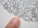
The postcards are made of thick, cream card which doesn’t bleed with water-based pens. The cards are a much yellower colour than the Secret Garden and Enchanted Forest Postcards and books. There were issues with white circles and patches on the Lost Ocean postcards which haven’t continued with this set, however, the card is identical and as before, water-based pens don’t colour smoothly or evenly and are repelled by the surface causing a much paler colour and a patchy appearance (see photo below – I will definitely be avoiding pens on these cards because of this). The postcards are lightly textured but don’t take pencils well, when covering larger areas the pencils almost clump and won’t apply smoothly, no matter what brand I’ve used, and it’s difficult to get smooth coverage over any size of area. I’ve found my Holbein pencils the best on this card but even they struggle and burnish quickly. There isn’t much space within the designs to blend or shade unless you want to colour over the lines. The line thickness is spindly thin, I have very good vision for small, close things, and also have very good fine motor control but many of the images on these postcards are so tiny that they’re almost impossible to colour and I went over the lines a number of times on my card which was one of the larger designs. Fineliners would be best to colour such intricate images but can’t be used due to being repelled so you’ll need some super sharp pencils and patience to colour slowly and sharpen very regularly. It’s such a shame because I’m a huge fan of Johanna’s images and I just love her books but scaling down the images to postcard size really wasn’t a sensible choice because it’s so limiting. The postcards are beautiful to look at and would be gorgeous to send or display as they are but given that they’re sold as colouring postcards, I expect to be able to colour them and I just haven’t found that possible to do as neatly as I’d like to. I had assumed that the images would include full-size zoomed in sections of the original images so that you can still blend and shade with pencils but because the images have been shrunk, many of them are just too small to colour (see the photos below where I’ve shown a 0.4mm Stabilo nib for scale).

Unfortunately, from a mental health perspective I really can’t recommend these, I really struggled to colour them and found it quite stressful because I just couldn’t get it to look right. They require a huge amount of concentration and while they’re less intricate than the majority of the Lost Ocean postcards, this is because Magical Jungle was Johanna’s least intricate and detailed book and therefore had larger spaces but when scaled down this doesn’t make a huge difference. Though they’re really interesting to look at, I would have to say that they’re really not well designed for colouring (I coloured one of the largest, least detailed images and still really struggled). All in all, I’m afraid I’m really disappointed. It’s such a shame these postcards didn’t follow the format of the Secret Garden Postcards, or those of Millie Marrotta’s Animal Kingdom and Tropical Wonderland which had very few uncolourable images due to them being zoomed in sections of the illustrations, a much more sensible and usable format. My recommendation would be to get the book of Magical Jungle instead, this is a fairly expensive set of postcards when you factor in that many of them aren’t colourable. These postcards would look beautiful framed as they are but for me, they’re just not suitable for colouring, a real shame!

If you’d still like to purchase them or view them online, they can be found here.
Amazon UK – Magical Jungle: 36 Postcards to Colour and Send
Book Depository Worldwide – https://www.bookdepository.com/Magical-Jungle-Johann-Basford/9780753548158/?a_aid=colouringitmom

The book of Magical Jungle can be found here:
Review – Magical Jungle
Amazon UK – Magical Jungle
Book Depository Worldwide – https://www.bookdepository.com/Magical-Jungle-Johann-Basford/9780753557167/?a_aid=colouringitmom

The image below was coloured using Holbein Artist’s Colored Pencils and blended with a Caran d’Ache Blender Pencil.
Harry Potter Magical Artefacts Colouring Book – A Review

Disclaimer – Please read this disclosure about my use of affiliate links which are contained within this post.
Harry Potter Magical Artefacts Colouring Book is published and kindly sent to me to review by Studio Press. This book is the fourth in the Harry Potter Colouring Book series and my reviews of the first, second, and third can be found here. Grab your wand, bring a lantern, swat up on your incantations and let’s get delving into the magical artefacts of the wizarding world. This book is paperback with a glossy accented cover and a pale blue spine, it’s A4 in size and glue-bound meaning that a little of some images is lost. The images are a mixture of single and double-page spreads with many of the single pages having a thin border meaning that they’re not lost into the spine. The book contains 96 pages which are printed double-sided. The paper is bright white and thick (they’ve sorted out the paper issues since the first book), and didn’t bleed or shadow when tested with water-based pens, it’s lightly textured and perfect for pencils, you can get plenty of layers for blending and shading! It also held up fine to light use of water when activating the Derwent Inktense Pencils.

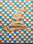
The images are drawn by multiple illustrators so they’re cohesive in content but some are drawn quite differently from each other. The images themselves include almost no stills from the film this time. There are a number of images based on concept art for the films and a few patterns are included which do feel a bit like “filler” images but there are fewer of these in this book than the first two (about 4 full page patterns) however, at least 24 pages are images with a centralised object overlaying a repeating pattern, like my coloured page of the sorting hat, and these get quite samey and dull. A huge number of different artefacts are pictured from obvious inclusions of wands, brooms, a time-turner, the Sorting Hat and horcruxes, to many of the items sold by the Weasley twins, book covers, the Marauders’ Map, Delores Umbridge’s cat plates and lots more. There are single and double-page spreads of objects and posters. This time there aren’t many pictures of characters though a few are included  At the end of the book are a number of full colour pages of the images included in the book meaning you can either copy the colour schemes in those or pick your own, they’re also great for helping you re-live the magic of the films and get yourself back into the world of Hogwarts – as if any of us ever left! I have to say, this book feels quite samey when compared to the previous three and they haven’t been brilliantly represented as specific titles due to the first book containing a real mixture of images and then the following three being specific aspects, many of the most obvious of which had already been featured in the first book. It just feels like it’s lacking, we’ve already had images of wands in two books, we’ve already seen the quidditch balls and different brooms, the collection of images is just quite random and the most obvious wizarding artefacts aren’t pictured well due to being shown in previous books.

In terms of mental health, this book doesn’t have an awful lot of impact on it unless you’re a Harry Potter Mega Fan in which case it’s likely to considerably lift your mood and give you hours and hours of distraction and enjoyment. The images take a long time to colour if you want them to look realistic so you will need fairly good levels of concentration. The line thickness varies from very thin to thick but mostly it remains thin so you will definitely need good vision and fine motor control to get the most out of this book. The best part of this book is that it has coloured pages at the back which can be used to copy or give inspiration for colour schemes, you can also easily google the objects and artefacts in order to work out exactly how to colour them so they look true to the film, or you can go it alone and try out your own colour schemes with purple broomsticks, glittery wands and rainbow time-turners – it doesn’t have to be realistic, remember it’s a magical world! Some of the illustrations are very intricate and detailed and others are much simpler with larger open spaces so this book does have a variety of difficulty levels to accommodate your good and bad days.

All in all, this is a good book, but I’m left disappointed, it feels samey and lacklustre and the image style gets boring quite quickly, I think a trick was missed by creating the first generic themed book, it really took away from the subsequent three specific titled books as the best bits of each had already been pictured. However, if you’re wanting to finish off the set, or you’re just a bit less picky than me then this book may be for you. The paper quality is good and there’s a wide range of objects and artefacts pictured, I just feel they could have been pictured in a better, more exciting and inspiring way.

If you’d like to purchase a copy it’s available here:
Amazon UK – Harry Potter Magical Artefacts Colouring Book
Book Depository Worldwide – https://www.bookdepository.com/Harry-Potter-Magical-Artefacts-Colouring-Book/9781783705924/?a_aid=colouringitmom

The image below was coloured using Stabilo Point 88 Fineliners and Derwent Inktense Pencils activated with water.

Floribunda: A Flower Colouring Journal – A Review

Disclaimer – Please read this disclosure about my use of affiliate links which are contained within this post.
Floribunda: A Flower Colouring Journal is illustrated by Leila Duly and published and kindly sent to me to review by Laurence King Publishing. These journals often come shrink-wrapped in plastic so unfortunately, even if you’re able to hunt it down in the shops, you may not be able to see inside so here is my review to unlock its mysteries and show you inside so you can make an informed decision. This journal is beautiful, as you’d expect, those of you familiar with Leila’s first colouring book, Floribunda, will know just how stunning her artwork is and now some of the smaller elements have been collated into this journal. It’s really luxurious from its pale pink hardback cover with a beautiful floral scene from the book, to the black linen-style spine, this journal oozes class and specialness and will be perfect for using as a diary, writing special notes or taking down your life story, or even using as a scrapbook, this journal is certainly not for your run of the mill shopping or to-do lists! It is A5 in size and contains 144 pages which are plain and un-lined meaning you can write in it or even use it for doodling, the corners are rounded so there are no harsh lines or corners making this journal feel very warm and inviting. There is a handy shell pink ribbon bookmark so you can easily find your place each time and on every other double-page is a small image from Leila’s Floribunda colouring book. The 37 illustrations include lots of the single flower illustrations which were printed in colour on the inside covers of her original book, they are printed in a very similar size to those and therefore look very delicate on the page. Of these illustrations, around 5 are printed twice, first towards the front of the book and then towards the end, these include the freesia, iris, delphinium, and two others. They look beautiful left uncoloured or brightened up with splashes of colour. The cover has a paper strip which is folded over but not attached stating the title of the journal and the price and description on the back of it, which can be removed. The inside covers and first and last pages are pale pink and the first internal page of the book has a large floral image with a small lined space to write your name. The paper is cream adding to the luxurious, vintage feel of the book and it is smooth meaning it’s a little tricky to layer your coloured pencils but it is doable with a bit of effort. I tried out my water-based fineliners and they didn’t bleed at all and only had the slightest hint of shadowing with very dark colours but I only noticed because I was closely inspecting it. The ink lines do transfer ever-so slightly when pressing hard with pencils so do use a spare piece of paper behind when burnishing the images to avoid image transfer. My recommendation would be to use pencil to write in the journal or water-based pens rather than ball-points which would dent the paper heavily and take away from its lovely smooth feel.

From a mental health perspective, this journal is lovely because it gives you small little colouring projects for the days when a whole page is far too overwhelming. The illustrations are small and can be completed in a short amount of time meaning you don’t need a good attention span or level of concentration to be able to enjoy each illustration though you do have to focus very hard to not colour over the lines. You could complete them one by one, in order, each time you get to writing on that page, or pick and choose your favourites. The images are very intricate and detailed, and the lines are possibly the thinnest I’ve seen with the illustrations much smaller than those in the original colouring book pages and a similar size to their coloured counterparts on the inside covers of it, therefore you will need extremely good vision and fine motor control, a steady hand and some sharp pencils or a trusty set of fineliners so that you don’t go over the spindly thin lines. When compared to the two previous colouring journals Laurence King have published, I was very slightly disappointed with this one as there are no foiled elements on the cover (apart from the title on the removable paper strip), no metallic coloured edging to the pages, and half the number of colourable designs also including 5 repeats. This seems a little bit of a shame, however, as a standalone product it’s simply beautiful, I just feel the two journals of Johanna Basford’s artwork were better value for money as they had double the number of illustrations but for Floribunda fans this journal will still be ideal.

I would highly recommend this journal for stationery addicts, those who love to write and ‘need’ a new notebook, and fans of Floribunda and the stunning work of Leila Duly. This is wonderfully luxurious, beautifully illustrated and ideal for mixing colouring and writing and it’s perfect for your bad mental health days when all you can cope with colouring is one little flower. This journal is delicate and beautiful and a lovely addition to the colouring journal range.

You can purchase a copy here:
Amazon UK – Floribunda: A Flower Colouring Journal
Book Depository Worldwide – https://www.bookdepository.com/Floribund-Leil-Duly/9781780679402/?a_aid=colouringitmom

The images below were coloured using Holbein Artists’ Coloured Pencils.

Enchanted Forest Journal – A Review

Disclaimer – Please read this disclosure about my use of affiliate links which are contained within this post.
Enchanted Forest Journal is illustrated by Johanna Basford and published and kindly sent to me to review by Laurence King Publishing. I will freely admit to being a total stationery addict – I love nothing more than a brand new pen or notebook, so when I saw that our colouring Queen Johanna Basford had released another colouring journal, I had to have a copy, her first colouring journal Secret Garden can be found reviewed by me here. This journal comes shrink-wrapped in plastic so unfortunately, even if you’re able to hunt it down in the shops, you won’t be able to see inside so here is my review to unlock its mysteries and show you inside so you can make an informed decision. This journal is beautiful, as you’d expect. It’s really luxurious from its hardback cover with a beautiful woodland scene from the book and gold foiling accents, to the black linen-style spine and beautiful gold-edged pages, this journal oozes class and specialness and will be perfect for using as a diary, writing special notes or taking down your life story, or even using as a scrapbook, this journal is certainly not for your run of the mill shopping or to-do lists! The journal is A5 in size and contains 144 pages which are plain and un-lined meaning you can write in it or even use it for doodling, the corners are rounded so there are no harsh lines or corners making this journal feel very warm and inviting. There is a handy cream ribbon bookmark so you can easily find your place each time and on every double-page is a small image from Johanna’s Enchanted Forest colouring book. The 72 illustrations include loads of different leaves, fish, birds, owls, feathers and more, and they look stunning on each double-page spread either left uncoloured or brightening it up with splashes of colour. The cover has a paper strip which is folded over but not attached stating the title of the journal and the price and description on the back of it, which can be removed. The inside covers are cream with black line drawings of Johanna’s flower patterns which can be coloured and the first page of the book has space to write your name. The paper is cream adding to the luxurious, vintage feel of the book and it is smooth meaning it’s a little tricky to layer your coloured pencils but it is doable with a bit of effort. I tried out my water-based fineliners and they didn’t bleed at all and only had the slightest hint of shadowing with very dark colours but I only noticed because I was closely inspecting it. The ink does transfer ever-so slightly when pressing hard with pencils so do use a spare piece of paper behind when burnishing the images to avoid image transfer. My recommendation would be to use pencil to write in the journal or water-based pens rather than ball-points which would dent the paper heavily and take away from its lovely smooth feel.

From a mental health perspective, this journal is fantastic because it gives you small little colouring projects for the days when a whole page is far too overwhelming. The illustrations are small and can be completed in a short amount of time meaning you don’t need a good attention span or level of concentration to be able to enjoy each illustration. You could complete them one by one, in order, each time you get to writing on that page, or pick and choose your favourites. The images are intricate and detailed, some at the same level as contained in the original book and others are much smaller and therefore more intricate and detailed so if you’re wanting to colour these images you will need extremely good vision and fine motor control, a steady hand and some sharp pencils or a trusty set of fineliners so that you don’t go over the spindly thin lines. I found that the illustrations are ideal for testing out colour schemes and techniques ready for doing my ‘best’ version in my copy of Enchanted Forest but this is also a great stand-alone journal.

I would highly recommend this journal for Johanna Basford fans, stationery addicts, and those who love to write and ‘need’ a new notebook. This is wonderfully luxurious, beautifully illustrated and ideal for mixing colouring and writing and it’s perfect for your bad mental health days when all you can cope with colouring is a sprig of leaves or a little fox. This journal is gorgeous and certainly the best I’ve seen and its gold-edged pages are a lovely addition.

You can purchase a copy here:
Amazon UK – Enchanted Forest Journal
Book Depository Worldwide (cover shown is incorrect but item is right) – http://www.bookdepository.com/Johann-Basfords-Enchanted-Forest-Journal-Johann-Basford/9781780679181/?a_aid=colouringitmom

The images below were coloured using Stabilo Point 88 fineliners and Prismacolor Premier Coloured Pencils.

The Great British Colouring Map: A Colouring Journey Around Britain – A Review

Disclaimer – Please read this disclosure about my use of affiliate links which are contained within this post.
The Great British Colouring Map: A Colouring Journey Around Britain is published and kindly sent to me to review by Laurence King Publishing. LKP have teamed up with Ordnance Survey, historic map creators and producers of the UK, to produce this wonderful colourable map book. Ordnance Survey was established in 1791 and they have been creating detailed maps ever since, these were originally produced in black and white and colour wasn’t added until 1887. While their mapping processes have altered and become digitised over the decades, their maps are still known, used, and well-regarded all over the world and now we’ve been offered the chance to colour them ourselves.

This book is huge (the second largest colouring book I’ve seen) at 34.9 x 26.8cm. It’s paperback with thick flexible card covers with three-quarter French flaps. The cover of the book depicts a map of London which continues over the inside flaps with the front flap having a list of all of the towns and cities which are depicted within, and an outline of Great Britain. The flaps open out to reveal a red lined interior, I personally feel this space could have been better utilised and would have been lovely with an added map. The spine of the book is not attached to the cover and is supposedly lay-flat, it’s glue and string-bound and while you can get to the centre of the majority of the images, it’s a bit of a challenge on a few so I wouldn’t describe it as truly lay-flat binding but it’s not far off. The spine of the book is bound with green tape so your pages should remain secure and aren’t removable unless you use a blade of some sort. The pages are printed double-sided and contain a mixture of single and double-page spreads. The paper is a pale cream colour, similar to Secret Garden, it is very lightly textured which gives a smooth surface to colour on but there’s not a lot of tooth for building up pencil layers. Water-based pens don’t bleed or shadow but do always test them somewhere inconspicuous first! The images are all as you’d expect, black and white line drawings of maps just waiting to be coloured. There is no key in the book so some of the symbols are a little confusing however a quick google search should help you identify any you’re stuck on. Nothing is named or labelled on the maps so the images are all text-free apart from a red outlined box that tells you what town or city the map is depicting, the source, location and a little information about the place and its most famous areas or landmarks. The maps show a really good cross-section of locations from coastal to inner cities, piers to stations, rivers to mountains. The book is split into sections, the largest of which is dedicated to England, followed by Scotland, and Wales. Heaps of places are mapped from Brighton to Loch Ness, Norwich to Aberystwyth, York to Lerwick and Blackpool to Margate. In the centre of the book is a single-sided 4-page fold out spread of Thames Valley, London showing the River Thames in the centre and spanning from Belgravia to the O2 Arena. This spread could easily be removed and would look stunning framed before or after being coloured.

In terms of mental health, this book doesn’t have much of an impact, the content is just as you’d expect and maps aren’t known for being calming or soothing. Due to lack of any writing on the maps, I found it quite difficult to identify what the map was specifically showing and what each section was meant to be. As a perfectionist, I wanted to colour my map in the correct colours and it took a surprisingly long time to find exactly where on the map I was looking at and what colour each section should be so this book certainly can’t be used for a quick colouring fix. The line thickness is pretty consistent throughout and thin with spindly thin details and bolder accents here and there. The levels of detail and intricacy varies throughout from large open spaces of fields or sea, to teeny tiny spaces showing residential areas and country roads. I would recommend this book for those of you with pretty good vision and fine motor control and I’d advise using fineliners or sharp pencils so that you can get into the details. This book requires a huge amount of concentration to identify each part and colour within some of the small sections so it’s definitely one to keep for your better days when you can focus well and not get frustrated by the process. Once you have managed to identify the sections, if you’re wanting to colour the map realistically it’s very easy and you don’t have to spend ages narrowing down your colour choices, you can just get going which may be useful for anxious colourers though I personally found this book quite stressful due to the sheer amount of difficulty I had with identifying symbols and areas. The pages are huge, especially the double-page spreads and centre fold-out so this book will certainly keep you distracted and occupied for long periods of time if you’re able to concentrate on it, progress is quite slow because there is so much detail included in each but this could be a real labour of love and for anyone who managed to finish colouring it cover to cover, I’m sure it will look truly fantastic! This book is pretty niche and I’ve realised that despite being interested in looking at maps, colouring them is not my forte, but for keen cartographers who fancy having a go, this is the best book to go for. The paper colour offers a real vintage feel and once finished, the maps do look beautiful!

Overall, I would highly recommend this book to those with a keen interest in maps but for those, who like me, sort of like them, this book is just a bit too challenging to get started with. The production of it can’t be faulted and I truly believe it’ll look incredible when finished if you have the determination to persevere!

If you’d like to purchase a copy it’s available here:
Amazon UK – The Great British Colouring Map: A Colouring Journey Around Britain
Book Depository Worldwide – http://www.bookdepository.com/Great-British-Colouring-Map-Ordnance-Survey/9781780678597/?a_aid=colouringitmom

The image below was coloured using Prismacolor Premier Coloured Pencils.

The Great British Bake Off Colouring Book – A Review

Disclaimer – Please read this disclosure about my use of affiliate links which are contained within this post.
The Great British Bake Off Colouring Book is published by Hodder and Stoughton and is from my personal collection. It’s been a sad couple of weeks in the baking world after discovering that not only is our favourite baking show moving from the safety of the BBC to the big wide world of Channel 4 but that also 3 of our 4 presenters and judges won’t be relocating with it. I can’t be the only one who feels as if their world has been turned upside down and isn’t sure if they should be whisking or kneading the mess of dough before them. It’s therefore the perfect time for Tom Hovey, resident artist (at least for now) on the Great British Bake Off, to publish his wonderful colouring book filled with familiarity and nostalgia from the series we know and love! I was so worried that after the devastation of the past few days’ news, this book might disappoint, that it might not be a recipe for success and might have the dreaded soggy bottom! I can safely say it hasn’t, at least for me, it’s beautiful, filled with recognisable bakes and just begging to be coloured! So grab your aprons, preheat your ovens and “On Your Marks, Get Set, BAAAAKE!”!

This book is 25cm square, the same size as the bestsellers, paperback with flexible card covers which have partially coloured designs from inside the book on the outside and on the inside covers are colourable pages of cream horns which are also pictured in the book. The spine is glue and string-bound and isn’t especially tight on arrival meaning it’s quite easy to get most of the way into the gutter so very little of the image edge is lost. The pages consist of a mixture of single and double-page spreads, the book contains 90 pages of designs and 12 (24 sides) of these are double-page spreads. Many of the images are centralised cakes which don’t have any aspects reaching the edges of the pages, for those that are full page spreads of double-page designs, a very thin border has been left down the centre of the spine so once you’ve worked the spine and can open the book completely flat you’ll be able to reach all aspects of the image to colour which is fantastic and very rare! The paper is bright white, medium thickness and lightly textured, my water-based pens barely even shadowed though they did bleed through when I added water to them but that’s to be expected, the paper didn’t hold up brilliantly to water and did buckle a bit but I’m new to using water with pens so I wasn’t sparing enough with it. Pencils work really well on the paper, you can build up plenty of layers for blending and shading and this will be ideal for getting your chocolate looking perfectly tempered, icing superbly swirled, and fruit looking well glazed.

The contents of the book includes loads of Tom’s original illustrations from the series and they are instantly recognisable. There is no text through the book and on my first look through I was really worried about how I’d know what each bake was and who’d made it, I was very relieved and excited when I got to the final three pages of the book and saw that thumbnails of each image have been included and titled with what the bake is, who baked it and which series it’s from. This means a quick google search with those details, or a re-run of that episode if you’re a die-hard fan and have them all, will allow you to find the original bake and Tom’s original coloured illustration so that you can copy it if you wish or you can go to town and colour a unique baked creation. The bakes pictured include trifle, tiered pies, decorative loaves, 3D biscuit scenes, opera cakes, Swiss rolls, Charlotte Russe, eclairs, vol-au-vents, canapes, and even a povitica. All of the images are from Series 4-6 and there is a great cross-section with creations from all of your favourite bakers included, even Mary and Paul’s! Settle yourself down with a cup of tea and a slice of cake (purely for research purposes of course), get your pens and pencils out and colour the perfect crumb, shiniest icing, and sauciest self-saucing pudding! None of the people are pictured in this book, no bakers, presenters or judges, but the tent and the beautiful Welford Park House are pictured and even the famous Bake Off squirrel!

In terms of mental health, I have personally found this book fantastic! If you like cakes then this book has to be on your must-have list, it’s sure to cheer you up and improve your mood because the cakes are so beautiful and it might even inspire your baking (if you like to bake). I found the book really calming and very distracting, there are so many little details that you notice new ones each time you flick through the pages allowing you to become totally absorbed and I really noticed my worries melting away as I coloured Tamal’s Charlotte Russe. The images are all drawn in a consistently medium/thick line so this book would be ideal for almost anyone to enjoy regardless of vision impairment or issues with fine motor control. The detail level varies throughout from large pastry slices and meringue peaks on baked Alaska, to much smaller details in the garden scenes, and Chetna’s caramel covered Dobos Torte. This book will be ideal for those of you with varying concentration levels and symptoms because the illustrations are really varied in size and also have very natural stopping points so you could colour one chocolate covered strawberry or cream horn, a pastry or even a whole gateau, the choice is yours! The lines are quite black and heavy and at first I found this a little off-putting because I normally like to colour thin-lined images with delicate linework but I love how my page turned out and instead of just creating sections to colour within, the lines in this book are truly part of the artwork of the finished piece, the boldness of them means that your colours really pop so whether you use pens or pencils you’re liked to want to use some really bold colours so they stand out well and don’t disappear. These illustrations are almost identical to Tom’s originals from the show so if you’re not quite sure which section is nut, which is fruit or what colour dipping sauce has been used then just google the original and you can copy his colour scheme if you wish, this is ideal for anxious colourers like me because it’s like paint-by-numbers without the numbers and it takes all of the stress out of choosing colours and you can just pick the matching shade and get going, your symptoms can take a back seat and you can just enjoy colouring some deliciousness.

This book certainly contains some technical challenges and some pages that you can truly colour into your own signature bake and more still that will hopefully become showstoppers! It’s sure to make you hungry and get you hunting through your recipe books for inspiration and to make tasty treats to snack on when you need a break from colouring. I would highly recommend this book to anyone who loves cake, baking, or the Great British Bake Off because this really is the ultimate book for cake-lovers, it completely transports you back to the Bake Off tent!

If you get a copy of this book then be sure to avoid Mel wearing your tuille as bracelets and Sue accidentally elbowing your English muffins. Keep your colouring area a disaster-free zone and for goodness’ sake, colour slowly so that nothing needs to be discarded and we can all avoid another episode of “bin-gate”, I’m still not sure I’m over the trauma of the Baked Alaska challenge! You can take your finished pages and offer them up on the Gingham Altar for Mary and Paul to poke, prod, and almost certainly tell you it’s under-blended or over-shaded, but perhaps, if you’re lucky enough, you might just get crowned Star Colourer for the week and receive the coveted handshake from Paul – we can all dream can’t we?! This book truly offers you a way to have your cake, and eat it!

If you’d like to purchase a copy of the book it’s available here:
Amazon UK – The Great British Bake Off Colouring Book
Book Depository Worldwide – https://www.bookdepository.com/Great-British-Bake-off-Colouring-Book-Tom-Hovey/9781473615625/?a_aid=colouringitmom

The image below was coloured using Stabilo 68 Fibre-tip pens and a Derwent waterbrush to create the macaron colour, bavarois colour and drips on the berries to create a mottled appearance.

If you’d like to see a silent video flick-through of the entire book then click here.

The Aquarium: Marine Creatures to Colour – A Review

Disclaimer – Please read this disclosure about my use of affiliate links which are contained within this post.
The Aquarium is published and was kindly sent to me to review by Michael O’Mara Books. This is the third book created by the super talented illustrators Richard Merritt and Claire Scully, known for The Menagerie and The Aviary. This book is exactly the same size and format as the predecessors (it’s non-perforated like The Aviary) but in case you missed those here are the specs. The book is huge at 29cm square, it’s paperback and has beautiful blue and magenta foiling on the cover. The pages are not perforated but they are easy to remove by cutting as close to the spine as possible so you can still frame them if you wish. There are 31 images, all printed single-sided and very little of the image enters the spine so hardly any of it is lost. The paper is bright white, fairly thick and lightly textured. My water-based pens barely shadowed and didn’t bleed through at all and there was no sideways bleeding so these images are ideal to be coloured with fineliners or fibre-tipped pens as well as coloured pencils, you could also use alcohol markers as long as you pop some protective sheets of paper behind your work. Each image is just like a portrait of a person but each one is of a fish or sea creature instead, some are zoomed in a little, some are drawn side on and others are pictured front on or even in pairs or shoals. The images are beautiful and if you are a fish or underwater creature fan then you’ll love this book! Michael O’Mara are incredibly proud of this new title and quite rightly so, it’s just gorgeous and a worthy sequel to The Menagerie and The Aviary, this series is really different from any other books I’ve seen in the way it’s presented and the content of the images, I think this might actually be my favourite so far because you can use such an array of bright colours.

Each picture (except the walrus, clown fish and seal) has a bit of colour added to the background in the form of blue or purple bubbles, red seaweed, turquoise waves and lilac jellyfish silhouettes but the animal itself is always colour-free ready for you to make your mark. These images would look stunning framed on their own or as a set and I’m already making grand plans for some of my favourites! I have put a photo below of the list of sea creatures included but some of my personal favourites are the orcas, lined seahorses, chambered nautilus, and common octopus, but that’s just to name a few. Unlike in the previous books where a few of the animals were naturally black which made it difficult to colour them realistically if you so chose, in this book only the orcas and penguins are naturally black and as you can see from my finished page, I decided to go all out and use as many colours as possible to create rainbow orcas which I really wish were a real thing!

In terms of mental health, this book is fabulous! As seasoned readers of my reviews will know, I think natural images and those of things in nature are by far the most relaxing to colour and animals are absolutely top of my list for that so this book is ideal! I found it really calming to colour ready for review and this is sure to be one of my go-to books when my anxiety peaks and I need to get control of it quickly. Because the images are of something real, you can either colour them realistically meaning you can have a quick google and find out exactly what pens and pencils to use to make it come alive and practice your blending and shading, or you can do what I did and really spice things up with your brightest pens and wildest colour schemes. There’s no right or wrong way of colouring this book and having seen other people’s finished versions of the pictures online, I’m still not sure which I prefer out of realistic or outlandish and I’m intending to mix and match through my copy! The sea creatures themselves are drawn with a varying line thickness which ranges from thin to medium but none of it is spindly thin which is ideal. The intricacy and detail levels also vary throughout but mostly these images are pretty intricate and are made up of lots of teeny tiny sections. However, because the images are of fish, you don’t have to colour in each section a different colour and could easily colour whole chunks and just use the black lines as texture behind that rather than guides for where you must colour within. A number of the images really lend themselves to beautifully blended pencils and I most certainly won’t be colouring within every section and will instead be using those to colour over and look like scales through my coloured pencil. There are loads of possibilities with these images so this is one book that you don’t need to be put off from just because at first glance it looks too intricate. You will need a moderate level of fine motor control and good-ish vision but neither need to be perfect for you to be able to create a scaly, tentacled masterpiece! These images will take ages to colour so they’re great for keeping you distracted from difficult thoughts and calming you down when your mind is racing and your anxiety is off the chart. The size of the images means that you’ve really got something to get your teeth into and you can just colour small sections on bad days when your concentration isn’t so great, or the whole image on days where you’re feeling more focused.

I would highly recommend this book if you love sea creatures, like colouring natural things, or if you really like intricate, detailed books with plenty of different sections to colour. This is one of the nicest colouring books of fish and marine life that I’ve seen. The Aquarium is a fantastic book for keeping you focused and distracted from mental illness and I found it really helpful for calming down my anxiety and slowing down my thoughts so I could focus again.

If you’d like to purchase a copy it’s available for less than the RRP here:
Amazon UK – The Aquarium
Book Depository Worldwide – https://www.bookdepository.com/Aquarium-Richard-Merritt/9781910552322/?a_aid=colouringitmom

A Fourth book has also been announced called The Labyrinth which will be filled with mythical creatures and can be pre-ordered here but you’ve got a long wait as it doesn’t publish until May 2017!
Amazon UK – The Labyrinth
Book Depository Worldwide – http://www.bookdepository.com/The-Labyrinth-Richard-Merritt-Claire-Scully-Sabine-Reinhart/9781910552612/?a_aid=colouringitmom

I scoured the internet looking for places that sold frames that fit these images and found these ones on Amazon were perfect and are available in various colours to suit your image no matter how it’s coloured.
White 11 inch square frame
Oak 11 inch square frame
Beech 11 inch square frame

The image below was coloured using Stabilo Point 88 Fineliners and Stabilo 68 Fibre-tips.