Disclaimer – Please read this disclosure about my use of affiliate links which are contained within this post.
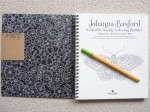
Worlds Within Worlds is illustrated by Kerby Rosanes and published and kindly sent to me to review by Michael O’Mara. This book is the seventh title by Kerby and is not part of the Morphia series albeit it’s drawn in a very similar style but without the signature alien creatures and swirls of the earliest Morphia titles.
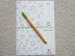
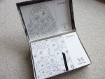
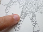
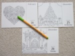
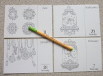
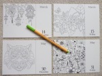
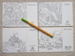
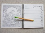
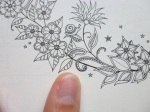
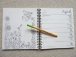
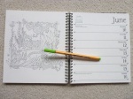
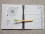
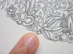
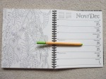
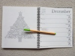
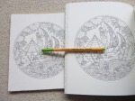
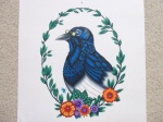
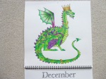
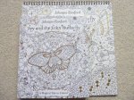
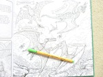
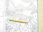
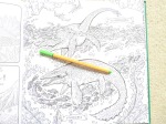
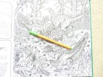
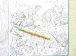
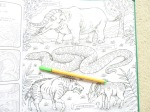
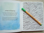
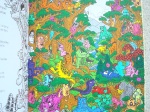
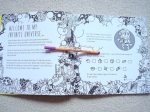
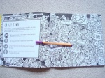
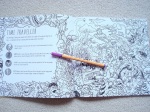
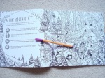
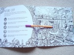
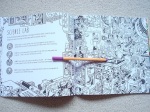
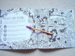
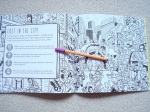
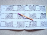
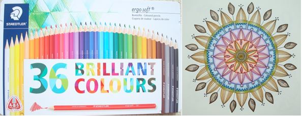
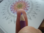
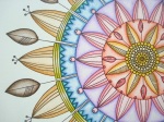
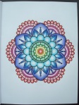
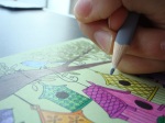
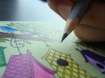
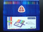
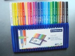
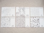
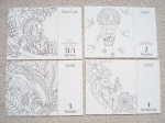
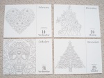
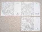
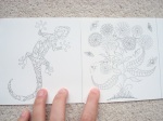
The book is 25cm square, the same size as Kerby’s previous titles and most other bestsellers. It’s paperback with black covers and white lettering. The images on the front and back covers are partially coloured and are both contained within the book. The spine is glue and string-bound and quite tight on arrival, it takes a bit of work to get it lying flat however you shouldn’t need to crack the spine to colour the entirety of each image. The majority of images don’t enter the gutter so it’s not a big issue and it will ease up with use. The paper is bright white and medium thickness, it has a light tooth and allows for blending and shading. I used Prismacolor Premier Pencils which blended very well. When using heavy pressure, some of the image on the reverse page did transfer to the opposite page so you may want to put a sheet of scrap paper under your work in order to prevent this, however it’s easily erased if it does happen. The book begins with a name plate spread and information about the new search and find element of the book, a key hidden on a tiny image of a main feature of the proceeding image hidden within each colouring design. The book then contains 83 pages of illustrations printed double-sided which are a mixture of single pages, paired designs and double-page spreads. The image content is extremely wide ranging and because there is no specific theme, it really does contain a bit of everything including themes that he’s previously drawn in his earlier titles. None of the images are repeats, a few of them are just the same subject, drawn differently including fish, nautilus, dragon, bees, skull, and stags. The vast majority of the images are of completely different subjects and all of them are drawn in a very different way from previously. The premise of the book is exactly as the title suggests of worlds within worlds including cities within Russian dolls, rabbit warrens in rabbits, terrariums containing fields and windmills, underwater asteroids and so much more. The imagery is so inventive and as with all of Kerby’s work, it constantly surprises you and each time you look at it you notice something new that you hadn’t spotted before. Kerby’s artwork is full of the weird and wonderful and although it can often be very tricky to know where to start, no matter what colour palette you choose, you’re sure to create a masterpiece, it’s almost impossible not to with line drawings like this!
In terms of mental health, this book is fantastic. It offers so much choice in image theme and the content can’t help but inspire you! I often feel very overwhelmed when looking at Kerby’s work and trying to choose an image to colour because they’re quite an undertaking because of the amount of stuff crammed into each drawing but I didn’t feel that way about this book and the page I coloured was the page I chose as my favourite on my first flick-through of the book which is pretty much unheard of for me! The images contain a wide range of intricacy and detail levels and although none could ever be described as simple, there is a good variety ranging from pages absolutely packed with content and hundreds of individual component parts all overlapping each other which can be quite difficult to visually distinguish, to much larger, less complicated images where a centralised object takes centre-stage and there are a few internal or surrounding details. On flicking through the book, these differences are apparent and it means that you can use this book during lots of different symptom levels and pick simpler images to colour on days where your concentration isn’t up to scratch and attack a much more complicated design on days where you’re really able to focus and not inadvertently identify things as background that shouldn’t be. This book is hugely distracting, even just to look through and it’s certainly helped me over the last week when I’ve struggled to focus on much at all and really needed a distraction, colouring my page took far longer than I expected but I’ve really enjoyed it and it’s certainly kept me busy and kept my mind occupied which I’ve been very grateful for. It’s a great book to get you out of your comfort zone because nothing is as it seems and you absolutely don’t need to stick to conventional or realistic colour schemes if you don’t want to.
I would highly recommend this book. It’s a great title to begin with to delve into the world of Kerby’s artwork and for those of us who’ve been fans for years, it’s a wonderful new title and theme to add to his previous works. The images are just incredible and feel very exciting and fresh, you’d never guess this was the 6th book of new images, it feels like a show-stopping debut! I can’t recommend it highly enough and although I often find that new books are my favourite of an illustrator’s, this isn’t just my favourite Kerby book because it’s new, it’s by far my favourite imagery of his and an absolute must-have for followers and fans of his work!
If you’d like to purchase a copy, it’s available here:
Amazon UK – Worlds Within Worlds
Book Depository Worldwide – https://www.bookdepository.com/Worlds-Within-Worlds-Kerby-Rosanes/9781912785124/?a_aid=colouringitmom
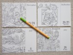
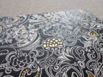
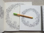
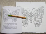
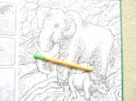
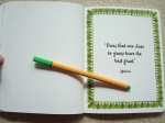
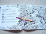
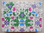
The image below was coloured using Prismacolor Premier Pencils.
My video review and flick through can be found here.