Faber-Castell

Colourmorphia – A Review

Disclaimer – Please read this disclosure about my use of affiliate links which are contained within this post.
Colourmorphia is illustrated by Kerby Rosanes and published and kindly sent to me to review by Michael O’Mara. This book is the sixth and final title in the Morphia series and this time it’s a compilation of all of the best pages from the previous five titles with no new artwork contained. The five titles that the images are from are Animorphia, Imagimorphia, Mythomorphia, Fantomorphia, and Geomorphia. I haven’t yet reviewed the last two titles but I have copies and will be reviewing them soon.

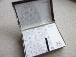
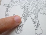
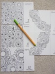
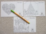
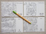
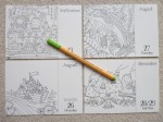
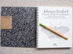
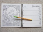
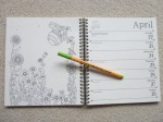
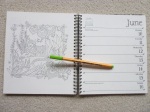
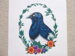
The book is 25cm square, the same size as Kerby’s previous titles and most other bestsellers. It’s paperback with white covers and white lettering with a blue background down the left side of the front cover. The images on the front and back covers are partially coloured and are both contained within the book. The spine is glue and string-bound and very tight on arrival, it takes a lot of work and manipulation to get it to start lying flat so you’re likely to need to crack the spine if you want to colour the entirety of each image however very few images enter the gutter so it’s not a huge issue and it will ease up with use. The paper is bright white and medium thickness, it has a light tooth and allows for blending and shading. I used Caran d’Ache Luminance Pencils and a black Faber Castell Pitt Pen to colour my image and despite doing two layers of the pen for my background, I experienced absolutely no bleed-through or shadowing and almost no ink transfer even though I used heavy pressure when colouring some sections. The book begins with a 16-page introduction including coloured pages from some of the colouring community which provide great inspiration and Kerby has written a short commentary on each piece explaining how it was created and why he likes it and chose it for the book. Each of these coloured pages are contained as line drawings in the book so that you can use those as inspiration or interpret them in your own way. The book then contains 78 pages of illustrations printed double-sided which are a mixture of single and double-page spreads. The image content is the most wide-ranging of all of Kerby’s titles because there is no theme and so it ranges from landscapes to mythical creatures, animals to buildings, objects to the surreal and everything in between. Many of the colouring community’s favourite images are included and so this is a great title to purchase to get a second chance to colour those special images that you’ve previously finished in the original books. Alternatively, if you didn’t like one or two of the themed books quite so much, this might have just the right amount of each theme to satisfy your tastes and as a starter book to Kerby’s work, it’s absolutely perfect! It’s also a brilliant way to round off the Morphia series as this book really feels like a celebration of his work.

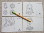
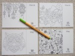
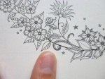
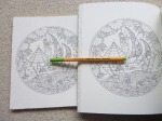
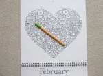
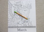
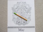
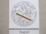
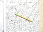
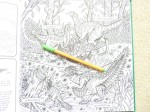
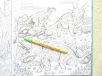
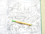
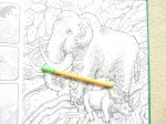
The images themselves are so varied and include his doodles and cloudy swirls as well as all sorts of hidden objects though this time there is no search and find feature at the back of the book. Some of the vast quantity of things pictured include: gem beetles, an anchor, a kraken, a rhinoceros, stags, castles, multiple dragons, a crow, jellyfish, swans, a dinosaur skull, owls, and so much more. Best of all, at least in my opinion, although there are no new images, the back halves of the cover designs of Fantomorphia and Geomorphia are contained which is a lovely addition because those were sorely missed in the original titles as they were printed single-sided and as single-page designs with the back halves missing within the books, it’s lovely to be given the opportunity to colour those images in full, as they were originally drawn and designed by Kerby. There is a huge range of morphing sections within the book from Kerby’s signature doodles and swirls to steampunk influences, plant life, mechanical elements and bizarre collections of objects as well as scenes morphing from one thing into another as seen in the elephant page where his trunk and tusks morph into the trunk of a tree and the back half of a polar bear becomes an iceberg. Kerby’s artwork is full of the weird and wonderful and although it can often be very tricky to know where to start, no matter what colour palette you choose, you’re sure to create a masterpiece, it’s almost impossible not to with line drawings like this!

In terms of mental health, this book is fantastic. Not only does it offer more choice in image theme than any of his other titles, it also offers colour inspiration at the front and a second-chance to colour images from the previous titles. The images contain a wide range of intricacy and detail levels and although none could ever be described as simple, there is a good variety ranging from pages absolutely packed with content and hundreds of individual component parts all morphing into each other which can be quite difficult to visually distinguish, to much larger, less complicated images where a centralised creature takes centre-stage and there are a few surrounding details. On flicking through the book, these differences are apparent and it means that you can use this book during lots of different symptom levels and pick simpler images to colour on days where your concentration isn’t up to scratch and attack a much more complicated design on days where you’re really able to focus and not inadvertently identify things as background that shouldn’t be (like I did on my skull page). This book is hugely distracting, even just to look through and it’s certainly helped me over the last week when I’ve struggled to focus on much at all and really needed a distraction, colouring my page took far longer than I expected but I’ve really enjoyed it and it’s certainly kept me busy and kept my mind occupied which I’ve been very grateful for. It’s a great book to get you out of your comfort zone because nothing is as it seems and you absolutely don’t need to stick to conventional or realistic colour schemes; the inspiration pages at the start prove that point brilliantly. I’ve never liked skulls and never wished to colour one at all but the coloured page at the beginning was so beautiful that I felt inspired to go against my norms and have a go at creating something similar and I’m so pleased that I did!

I would highly recommend this book. It’s a great title to begin with to delve into the world of Kerby’s artwork and for those of us who’ve been fans for years, it’s a wonderful celebration of all of his best work and a great opportunity to re-colour some previously finished illustrations. The content is wide-ranging and exciting and the paper is great to work on. It’s a really lovely book!

If you’d like to purchase a copy, it’s available here:
Amazon UK – Colourmorphia
Book Depository Worldwide – https://www.bookdepository.com/Colourmorphia-Kerby-Rosanes/9781912785056/?a_aid=colouringitmom

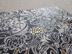
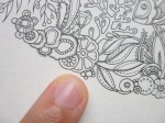
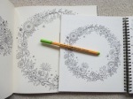
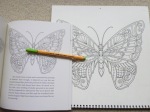
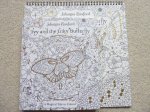
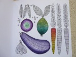
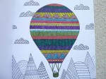
The image below was coloured using Caran d’Ache Luminance Pencils and the background was coloured with two layers of black Faber Castell Pitt Pen.

My video review and flick through can be found here.

Johanna Basford Page A Day 2019 Coloring Calendar Written Review, Photos, Video Review and Flip Through

Johanna Basford 2019 Colouring Day-To-Day Calendar in a Keepsake Box – A Review

Disclaimer – Please read this disclosure about my use of affiliate links which are contained within this post.
Johanna Basford 2019 Colouring Day-To-Day Calendar in a Keepsake Box is published and was very kindly sent to me to review by Andrews McMeel Publishing. This page-a-day calendar arrives in shrink-wrapped plastic which keeps the keepsake box clean and free from damage. The keepsake box is made of thick ivory card which is covered all over (including the bottom) with a black-heavy flower and leaf design that almost looks like it is drawn in white rather than black. The pattern is most similar to designs from Enchanted Forest and the top and all four sides of the box have gold foiling accents. The box opens with a hinge-style (the lid remains attached at the top) with two pieces of black ribbon holding it open at a >90degree angle; the inside of the lid and the box are lined with black paper with white flower and foliage designs drawn in Johanna’s signature style; the box is fully colourable if you wish. A black ribbon allows easy access to lift out all of the loose calendar pages which aren’t bound in any way so it’s easy to pick out which ones to colour, move them around, leave them out to dry if using wet media and so on. The pages are the same size and format as any other page-a-day calendar, the illustration is on the left and takes up two thirds of the page and on the right at the top is a leafy-lettered title of the month and at the bottom is the date and day, above this in small text are written the important festivals and celebrations and the country they’re celebrated in; as with all others, Saturday and Sunday share a page so there are approximately 313 pages of colouring for you to complete over the year. The pages are pale cream (just like the 2018 edition) rather than bright white (they are less yellow than the Secret Garden book paper and more cream than the new ivory paper in Magical Jungle and Ivy and the Inky Butterfly; see photo below of the different paper colours), thin (slightly thicker than copier paper), and lightly textured, pencils don’t build up many layers on this paper but I’m sure those of you who are more talented than me will have more luck with this and create wonderful masterpieces; water-based pens do heavily shadow and may bleed through if you’re particularly heavy-handed but the images are printed single-sided so really you can use whatever mediums you like, these pages would be ideal for testing out new mediums or trialling colour schemes.

The illustrations themselves are all taken from Johanna Basford’s six currently published colouring books, Secret Garden, Enchanted Forest, Lost Ocean, Magical Jungle, Johanna’s Christmas, and Ivy and the Inky Butterfly, I have carefully looked through all of the images and there are no new images, all are directly from the original books. Some of them are the whole page scaled down, others are sections of the page printed at the original size, others are zoomed in sections which are printed larger than the original so there is a really good mix of detailed sections, larger spaced illustrations to practice blending and shading on, and whole pages which you’ll need your finest of fineliners and sharpest of pencils to colour accurately. The lid is designed to display the current day’s page in but it will hold plenty more pages than this so you could easily place a month’s worth in there before having to move them under the proceeding days’ pages.

In terms of mental health, this page-a-day calendar is fantastic because it provides you with a manageable size of project to attempt each day, you could colour the page in a few minutes or really take your time to try out new techniques and spend much longer, it’s entirely up to you. You could colour the day’s page ahead of time or on the day itself, you could even spend the next few months colouring the whole thing ready to look at your beautiful work throughout the coming year, or even to gift to someone else (what a labour of love that would be and it would make an incredible present if you could bear to part with your work, perhaps you could start if off for them to finish?). The pages are a great size to practice colour schemes for your copies of the actual books, or even to try out colouring mediums on a smaller page. The loose pages make it easy to access the page you need without having to move the whole block around all the time and it means you don’t have to worry at all about bleed through. At the end of the year you could even cut out all of the images and create collages, small framed pictures or gifts or even add them to cards or craft projects so this is a really versatile product that goes way beyond just being a calendar! There isn’t a treasure hunt element in this calendar and there are no written hints for drawing though there are plenty of spaces on a number of images to be able to add your own details or backgrounds to really make the pages your own but this of course isn’t necessary and it’ll look finished without the need to draw at all. This page-a-day calendar is perfect for fans of Johanna’s work and it is a beautiful new way of using her illustrations. The line thickness varies a little throughout from thin to spindly thin and the intricacy and detail levels are often much higher than in the books because many of the images are shrunk down to fit the pages so you will most definitely need very good vision and fine motor control to get the most out of this calendar if you’re wanting to colour it; you could of course leave it blank and just admire the illustrations because they really are beautiful to just look at with no need to add colour if that’s too challenging. The images aren’t arranged into any order and there are no duplicates, a number of the calendar pages show parts of the same original image but these are all of different aspects of it, with varying size or depicting different areas (see images below) and this is by no means the majority of the pages, most are of entirely separate illustrations or aspects within them, they also don’t appear to duplicate the images used in the 2017 or 2018 edition of this calendar so those of you who already have that won’t be disappointed by duplicates. The page size is much more manageable and less daunting to colour and this is ideal for those of you with fluctuating conditions or concentration levels because these pages are much quicker to finish and likely to cause less frustration, they’re also fantastic for trying out new things without worrying about ruining a whole page in your books.

I would highly recommend this page-a-day calendar to fans of Johanna’s work and to those who love to be organised. It’s a great size and format, ideal for those who find the full-size book pages too daunting. It’s also great for practising colour schemes or using new colouring mediums and it’ll be a lovely keepsake to work through from beginning to end and see how you’ve progressed over the year it runs for; you can even remove the images afterwards and frame or gift them or even use them in craft projects and the box will make a wonderful keepsake.

If you’d like to purchase a copy of this page-a-day colouring calendar, it’s available here:
Amazon UK – Johanna Basford 2019 Colouring Day-To-Day Calendar in a Keepsake Box
Book Depository Worldwide – https://www.bookdepository.com/Johanna-Basford-2019-Coloring-Day-Day-Calendar-Johanna-Basford/9781449492434/?a_aid=colouringitmom

Can’t get enough of Johanna’s images? Below are my reviews of her new colouring planner and wall calendar so you can be fully organised and colour to your heart’s content for the coming year!
Ivy and the Inky Butterfly 2019 Colouring Wall Calendar
Johanna Basford 2018-2019 16-Month Weekly Colouring Planner

Video Review and Flip Through

The page below was coloured using Faber Castell Pitt Pens.

Johanna Basford 16 Month Weekly Colouring Planner 2018-19 Written Review, Photos, Video Review and Flip Through

Johanna Basford 2018-19 16-Month Weekly Colouring Planner – A Review

Disclaimer – Please read this disclosure about my use of affiliate links which are contained within this post.
Johanna Basford 2018-19 16-Month Weekly Colouring Planner is published and was very kindly sent to me to review by Andrews McMeel Publishing. This planner is the perfect combination of organisation and colouring with space to write plans, appointments and notes, whilst also having weeks and weeks of colouring for you to do too. This planner is paperback with flexible pale cream card covers which have a beautiful black-heavy floral and foliage design on the front and back with a white floral design drawn on black on the insides of the covers, the front cover has gold foiling accents and the front and back cover have removable brown card strips with the information about the planner and the barcode etc printed on them. The planner is spiral-bound and measures 21.6 x 19.6cm, the covers aren’t especially sturdy so I’d be careful about travelling with it much and you’ll want to keep it safe somewhere rather than stuffing it in a bag or it’ll get damaged very quickly. This isn’t the best planner I’ve seen in terms of features and organisation, but for the combination of colouring and organising, it’s perfect and strikes a really good balance. The planner runs for 16 months and starts from the 27th of August 2018 all the way to the 5th of January 2019. The planner is printed double-sided and starts with a one-page overview of the year 2019 and then the planner itself starts with an image on the left of each double-page spread from one of Johanna’s six colouring books, images from all six (Secret Garden, Enchanted Forest, Lost Ocean, Magical Jungle, Johanna’s Christmas, and Ivy and the Inky Butterfly) are included, and the week’s days and dates with writing space for each on the right (this is in the same style as normal planners with added leafy accents and leafy lettering for the month title at the top). Each week runs from Monday to Sunday with equal space to write for each day, the dates are on the right and important festivals and bank holidays etc are written in small text on the left of the page, as well as the country it’s celebrated in. After the planner pages, which make up the vast majority of the book, there is a double-page spread with sections for each month of 2020 for you to add your advance plans to. Following this is a full page of 2018 dates and a full page of 2020 dates, followed by 5 lined pages where you can write notes (all with added leaf accents) and the final page is a colouring test page where you can test out your mediums to check for bleed through.

The paper this time is pale cream rather than bright white (it is the same paper as last time and it’s less yellow than the Secret Garden book paper and more cream than the new ivory paper in Ivy and the Inky Butterfly; see photo below of the different paper colours), lightly textured and medium thickness, sadly it does shadow a fair bit with water-based pens but it doesn’t bleed through; I’d strongly advise writing in pencil throughout or you’ll ruin the image on the reverse either with shadowing or indentation from ballpoint pens. Pencils work well on this paper so I’d suggest mostly colouring with pencils and using water-based pens if you don’t mind the shadowing showing through on the planner pages. A great selection of images from Johanna’s books are included with some being sections of original images at the original size and others being the whole page shrunk down to fit on the planner page so some of the illustrations are quite tricky to colour neatly but almost none look impossible as long as you use a good set of fineliners or sharp pencils. Because this is the third planner and the publisher has tried not to duplicate images it means that a number of my favourite images from her first few colouring books haven’t been included as they were in the first two planners, however, we’ve got new images from those as well as from the newest book, Ivy and the Inky Butterfly, and there are some lovely inclusions so there’s no disappointment to be had with this planner and it really is a great mix between organisation and colouring (two of my favourite things)!

In terms of mental health, this colouring planner is ideal. It gives you a manageable goal of colouring one page per week which could either be next week’s page so that it’s coloured ready for that week or this week’s page so you can colour as you plan. You could even colour it ahead if you’re quick but you’ll need to get a wriggle on! The pages are a great size to practice colour schemes for your copy of the actual books, or even to try out colouring mediums on a smaller page. The spiral-binding makes it easy to access the whole page and none of the images go into the spine, it’s also ideal because once you’ve finished using the planner at the end of 2019, the pages are easy to remove for framing or gifting if you want to get more use out of your works of art. There isn’t a treasure hunt element in this planner and there are no written hints for drawing though there are plenty of spaces on a number of images to be able to add your own details or backgrounds to really make the pages your own but this of course isn’t necessary and it’ll look finished without the need to draw at all. This planner is perfect for fans of Johanna’s work and it is a beautiful way of using her illustrations. The line thickness varies a little throughout from thin to spindly thin and the intricacy and detail levels are higher than in the books because many of the images are shrunk down to fit the pages so you will most definitely need very good vision and fine motor control to get the most out of this planner if you’re wanting to colour it; you could of course leave it blank and just admire the illustrations because they really are beautiful to just look at with no need to add colour if that’s too challenging. The images aren’t arranged into any order but a few have been cleverly chosen to fit celebrations like a heart for the week of Valentine’s Day and images from Johanna’s Christmas through December. The page size is much more manageable and less daunting to colour and this is ideal for those of you with fluctuating conditions or concentration levels because these pages are quicker to finish and likely to cause less frustration.

I would highly recommend this colouring planner to fans of Johanna’s work and to those who love to be organised. It’s a great combination of planner and colouring pages and the size and format is ideal for those who find the full-size book pages too daunting. It’s great for practising colour schemes or using new colouring mediums and it’ll be a lovely keepsake to work through from beginning to end and see how you’ve progressed over the 16 months it runs for; you can even remove the images afterwards and frame or gift them.

If you’d like to purchase a copy it’s available below:
Amazon UK – Johanna Basford 2018-19 16-Month Weekly Colouring Planner
Book Depository Worldwide – https://www.bookdepository.com/Johanna-Basford-2018-2019-16-Month-Coloring-Weekly-Planner-Calendar-Johanna-Basford/9781449492441/?a_aid=colouringitmom

Can’t get enough of Johanna’s illustrations and the ability to organise your life? Then check out the following reviews for the Ivy and the Inky Butterfly 2019 Wall Calendar and the 2019 Page-a-Day Calendar.

Video Review and Flip Through

The image below was coloured using Caran d’Ache Luminance Pencils and a Caran d’Ache Blender Pencil.

Ivy and the Inky Butterfly Coloring Wall Calendar 2019 Review, Photos and Video Flip Through

Ivy and the Inky Butterfly 2019 Colouring Wall Calendar – A Review

Disclaimer – Please read this disclosure about my use of affiliate links which are contained within this post.
Ivy and the Inky Butterfly 2019 Colouring Wall Calendar is published and was very kindly sent to me to review by Andrews McMeel Publishing. This calendar is beautiful and is the same format as the previous JB wall calendars. The calendar itself is the same size as most others at 12 inches square, making it significantly larger than Johanna’s books. It includes 13 of Johanna’s signature and most well-known designs from her sixth colouring book, Ivy and the Inky Butterfly (this calendar doesn’t include any new images), an illustration for each month of the year and one at the beginning for a 4-month overview of September to December 2018. I have included pictures of all of the calendar pages below so that you can decide if this is for you, as well as comparison photos of the book and calendar size. The whole calendar, including the covers, is made of thick pale cream paper which is good quality (it is less yellow than the Secret Garden book paper and more cream than the new ivory paper in Ivy and the Inky Butterfly; see photo below of the different paper colours) – I thought it was going to bleed with water-based pens but there was no bleed-through at all and only some shadowing when using my darker fineliners. Do bear in mind, when writing on the calendar I’d strongly advise using pencil so that you don’t get bleed through onto the next month’s image, or indentation from using a biro. The images are printed much larger in the calendar than in the book so this is a great purchase for those of you who found Johanna’s books just a little too detailed and small. You definitely can’t use alcohol markers because the images are all printed double-sided with the dates for the previous month on the back of the page which will get ruined by bleed-through if you colour ahead but would be fine if you colour month by month. The paper is quite smooth but has a little tooth and I didn’t have any issues with getting a few layers built up with my Caran d’Ache Luminance pencils. The dragon image below was coloured with Derwent Inktense pencils, activated with water and I experienced no bleed-through and only minimal buckling when I used a bit too much water. The calendar is spiral-bound so you can easily fold it back on itself for easier colouring as it’s a little unmanageable when it’s not folded in half. Each page has a small hole at the top, this is smaller than on normal calendars and doesn’t fit a nail through it so you’ll have to very carefully hang it up with string (be careful so you don’t rip the pages). The cover has signature gold foil accents and is fully colourable, as always, and each calendar page has lots of tiny leaf accents and each month has a leafy lettering title.

In terms of mental health, this calendar is ideal because not only does it give you hours of colouring fun and distraction, you can also easily display it on your wall to brighten up even the darkest of days and you’ll get satisfaction every day looking at all of your beautiful hard work. The much larger image size means it’s far more suitable for those of you who don’t have perfect vision or fine motor control. It’s a great project that will help motivate you with a deadline of making sure each image is ready for the first day of the following month. The pages could also be removed at the end of the year once you’re done with the calendar and could be easily framed or gifted to others to bring enjoyment for years to come. This time, there isn’t an inky treasure hunt. The book of Ivy and the Inky Butterfly is very significantly smaller than the calendar so the images have been increased a lot in size so the intricacy and detail levels are very much reduced. This is a bit of a shame for people who love Johanna’s work for its detail, but for those who prefer larger images and space to really go to town with blending and shading, it’s absolutely perfect and I think it’s my favourite calendar of Johanna’s to date! There is a really good variety of images, needing varying levels of concentration which can be used to keep you occupied and distracted when you’re feeling anxious or low, or requiring less focus if you need a more relaxing colouring experience. Johanna’s images are really good for practising mindfulness techniques because many require a lot of focus and time to complete meaning this calendar is ideal for those of us who are mentally ill and needing to zone out. The line thickness is medium/thin throughout so there some leeway when colouring.

I would highly recommend this for any colouring fan who needs a calendar in their life. Johanna fans won’t be disappointed with this calendar, it’s beautiful with a lovely selection of designs and great paper quality and it will brighten up the darkest of rooms and moods. It would make a fabulous gift either as it is, or fully coloured for someone and it’s not only useful for the coming year as a calendar, but for years to come when you can frame your pictures to continue the joy.

If you’d like to purchase a copy it can be found here:
Amazon UK – Ivy and the Inky Butterfly 2019 Colouring Wall Calendar
Book Depository Worldwide – https://www.bookdepository.com/Ivy-Inky-Butterfly-2019-Coloring-Wall-Calendar-Johanna-Basford/9781449492458/?a_aid=colouringitmom

Video Flip Through and Review

The magpie image below was coloured with Caran d’Ache Luminance pencils (my video tutorial showing how to ‘cheat’ at blending that I used throughout the image can be found here) and the dragon image was coloured with Derwent Inktense Pencils activated with water.

Spectrum Noir Sparkle Glitter Brush Pens – A Review and Video Tutorial

Disclaimer – Please read this disclosure about my use of affiliate links which are contained within this post.
Spectrum Noir Sparkle Glitter Brush Pens are created and kindly sent to me to review by Spectrum Noir. These pens are exactly what they state, brush pens containing coloured glitter pigments that can be used for colouring, crafting and anything in need of a bit of extra sparkle. The pens are available in 34 colours including a clear glitter one and can be purchased in a number of different themed and sized sets. The set I’m reviewing is one of the 12 pen sets in a carry case and mine is called Vintage Hues, there are three further themed 12 pen sets called Special Holiday Set Autumn/Winter and Spring/Summer and the pens can also be purchased in grouped sets of 6 and 3 making it easier and more economical to replace used up pens when you need to though they’re sadly not available open stock currently. The pens have a completely black barrel and lid and arrive with a plastic yellow ring around the centre which has to be removed in order to activate the pens, this is a bit of a tricky process as seen in my video below but as you work through the pens it does get easier. The end of the lid and centre of each pen is coloured indicating the colour of the ink and states the colour name on one side and Spectrum Noir Sparkle on the other, these colours are fairly accurate at showing the ink colour but do test them on scrap paper or create a colour chart before diving into colouring with them. The ink flow takes a while to settle down and you do need to regularly give them a gentle shake to ensure that the ink is mixing with the glitter or you can end up with some sparkle-free areas. To begin with, the ink comes out quite quickly and is very wet and easy to saturate your colouring page so it’s best to start working on pages with thicker paper first. The pens need to be opened carefully, the lids are well-fitting and close firmly but this also means that the lids can be a little stiff occasionally, you need to ease them off rather than yanking them as this can cause ink spillage. The brush tips are made of nylon fibres and are a good shape and seem hard-wearing, sadly one of mine arrived damaged (see photo below) and a word of warning, if the brush tip becomes damaged it will cause huge leakage problems rendering the pen difficult or even impossible to use as the ink leaks when the lid is closed and gets all over where your hand holds the pen and stains your skin for a while so do be really careful not to damage the brush tips.

The ink is water-based with lots of slivery glitter inside, it’s translucent and can therefore be used over colouring pages with the lines showing through your colouring. I don’t have the clear glitter pen but have researched it and it can be used to colour over almost any medium adding sparkle to any colour you fancy, I hope to get my hands on one soon because it seems like a great idea and by far the most versatile of the pens in this range. The pens themselves are a similar design to water brushes with a nice chunky barrel that is comfy to use for extended periods of time. The end of the barrel is squared but the holding part is round so there are no corners to dig in or dent your hand or fingers so they’re very comfy to use and the brush tip is strong and flexible and allows you to vary your brush stroke thickness from very thin to thicker with different amounts of pressure applied. The ink is more like using paint than a traditional water-based felt-tip or marker pen, it’s very wet so you will need to use it sparingly, especially on thin paper and work quite quickly to spread the colour where you want it so it doesn’t pool in one area. When flowing correctly, the pens rarely bleed or shadow through normal to thicker paper but do test in an inconspicuous area so that you don’t ruin an image.

From what I’ve seen on the Spectrum Noir website, the colour range is pretty good and covers a wide range of bright, dark, pastel and metallic colours however, they’re often grouped in sets quite oddly making it a bit tricky to get hold of the most useful colours without needing to buy a large number of sets. I would recommend checking out all of the different purchasing options so that you can get the colours you want without having to purchase too many colours that you’re not so keen on or less likely to use. The colours in the set I was sent are lovely but they’re mostly very dark, there is no orange, bright green or pink but two very similar purples and two very similar mustardy yellows so I do feel the colour selection across the sets could be a little better thought out. Having said that, these pens are great for accents and special features in a colouring page and because of the price, it’s unlikely that you’d want to colour whole pages with them so you’d probably only want to use a couple of colours per page which then makes them more useful as you can tailor your colour schemes to fit the colour of sparkle pens that you have access to. One thing to note is that the glitter isn’t permanent and so you’ll need to be careful when colouring to make sure your hand won’t keep going over it and rubbing it off. The glitter is quite shiny, certainly not the sparkliest I’ve seen, that award has to go to the Sakura Gelly Roll Stardust Glitter Gel Pen, but this glitter is nicely shiny and very pretty, especially in the light.

The pens can be used alone to add sparkly coloured accents to pages or you can spice things up and use some slightly more advanced techniques which I’ve shown in the second video below. They can be blended together to create gradients or could be blended on a paint palette or other shiny surface (a tile or something plastic) to create a new shade which you could then paint onto your work with a paintbrush. You can also make the colours lighter by adding water to your work and washing out the pigment a bit. As far as I can tell, anything you could do with normal water-based markers or watercolour paints/pencils, you can do with these so the sky is the limit!

Overall, these are beautiful pens in a wide range of colours and they do add a lovely shimmer to your pages and are ideal for glittery accents. They are a considered purchase for most due to their price point and therefore I’d suggest getting a small set in colours that you’re most likely to use or possibly the 3-pen clear glitter set so that you can make any colouring glittery and get used to how the pens work before splurging on a larger set.

If you’d like to purchase a small or larger set, they’re available here:
Amazon UK – Spectrum Noir Sparkle Gitter Brush Pens
Crafter’s Companion – Spectrum Noir Sparkle Glitter Brush Pens

First Impressions and How to Activate the Pens on First Use

Techniques and Tips Tutorial

The images below were coloured using Spectrum Noir Sparkle Glitter Brush Pens and some were blended or faded with water.

Die Welt Unter Der Lupe zu Lande click through to read my review, see a video flick through and photos of inside

Die Welt unter der Lupe – Zu Lande (The World Under the Magnifying Glass – Land) – A Review

Disclaimer – Please read this disclosure about my use of affiliate links which are contained within this post.
Die Welt unter der Lupe – Zu Lande (The World Under the Magnifying Glass – Land) is published and kindly sent to me to review by Bastei Lübbe. This book is the sixth illustrated by Rita Berman, a highly talented German illustrator, she previously brought us the hugely successful and utterly beautiful series of season colouring books, reviewed by me here, and the first in this new series, Die Welt unter der Lupe – Zu Wasser. I had high hopes for this new book after the previous one was so utterly beautiful and I didn’t think that one could be beaten but I think I’ve fallen in love with this one just a little more because the content is so wonderfully wide-ranging and just a little more free because of the topic being land rather than water, it’s just exquisite. As with all of her books, I was absolutely blown away by its beauty, I can’t enthuse enough about it, it’s beautiful! It is identical in format to her previous books and therefore my review of each is the same, as are the mental health benefits, skip straight to the second paragraph about content and photos at the end to see what’s inside this title.

The book itself is slightly smaller than most at 20cm square, it’s paperback with a partially coloured image from inside the book on the front cover and a hole in the centre of the magnifying glass which gives a very clever 3D effect of looking at a bee printed on the inside of the full size French flaps. Both covers have fully illustrated French flaps with colour added to the external covers and the internal front flap but none add to the back one so it’s fully colourable with alcohol markers if you wish. The spine is glue and string-bound so it’s durable and strong and will ease up with use; many of the images are full page designs and therefore a number of them do reach or span the gutter however as the spine becomes more supple, you’ll be able to reach almost all areas of the page. The images are printed double-sided and are a mixture of single and double-page spreads, the book contains 72 pages of images, at the back of the book are three pages showing the book covers of the previous titles. The paper is bright white, medium/thick and lightly textured, water-based pens didn’t bleed or shadow when I tested them but dark colours or colouring the same spot may cause shadowing so do ensure that you test them yourself in an inconspicuous area; coloured pencils blend and shade well. The images themselves are where these books really come into their own, there are similar style images in each of Rita’s books but they’re beautifully tailored to the specific theme of the title, previously seasons or underwater and this time land, and it’s very clear from looking through each book what it’s dedicated to.

The drawings are incredible, as with all of Rita’s books, each time I look through the book I see new things that I didn’t notice before. The content this time is even more varied and ranges from double-page spreads of forest scenes and cities within birds’ wings, to branches of acorn houses and desert cactus landscapes. There are small centralised images of cornflowers and poppies, larger single-page images of beetles, flamingos, birds’ nests and mouse houses and a few pages showing a scene on one page and a corresponding pattern on the other. There are so many different things pictured including foxes, hedgehogs, bees, flowers, deer, snails, rabbits, birds, butterflies, insects, beehives, leaves, fruit, elephants, lizards, monkeys, parrots, and so much more. The illustrations are all drawn quite realistically but each is filled with patterns and small sections to colour which really opens up the possibilities of how to colour them. The pages are filled with cute, whimsical and friendly-feeling images, none are intimidating, they just welcome you in to fill them with colour.

In terms of mental health, each of Rita’s books is just wonderful, the images are really natural and the content is very cute and packed with details so each time you flick through the book you notice more in the images. Because of how the illustrations are drawn, with mostly realistic outlines of obviously recognisable things but filled in with patterns and whimsical doodles, you can either colour the pages realistically, or in outlandish colour schemes and either will look totally fabulous as you’ll see from completed pages on social media. The line thickness is consistently variable throughout, each image is outlined in a medium/thin line with thin-lined details. The intricacy and detail level varies across the images from low-ish to very high, however, don’t despair if your vision or fine motor control aren’t perfect, they don’t need to be, none of the parts are impossibly tiny to colour and many of the images can be simplified by colouring over the internal patterns rather than within them which instantly reduces the intricacy to a much lower level for almost all of the images. The size of the book is ideal because it’s smaller than most and therefore doesn’t require quite so much time to complete each page, the content varies from full double-page spreads depicting scenes to much smaller images so it’s ideal for those with fluctuating conditions or poor concentration as you can colour one object or group of objects on a bad day, or colour a full double-page spread when you’re feeling focused and well. There are also a number of pages that have large open spaces where you could add your own backgrounds or imagery if you wish, this is by no means a necessity but the option is there if you want it. The illustrations create a wonderful sense of place and offer great escapism, they really transport you into Rita’s super cute world filled with charming animals and beautiful plants and away from any difficulties or symptoms you might be experiencing.

Overall, I would highly recommend this book and all of the other titles by Rita, they complement each other beautifully and really transport you into a whimsical world. The pages offer a manageable project for any level of functioning and they are just gorgeous when finished.

If you’d like to purchase a copy it’s available here:
Amazon UK – Die Welt unter der Lupe – Zu Lande
Amazon US – Die Welt unter der Lupe – Zu Lande
Book Depository Worldwide – https://www.bookdepository.com/Die-Welt-unter-der-Lupe—zu-Lande-Rita-Berman/9783404609482/?a_aid=colouringitmom

You can read my reviews of Rita’s other books here.

The image below was coloured using Faber-Castell Polychromos Pencils.

Hem Ljuva Hem (Home Sweet Home) by Emelie Lidehall Oberg, click through to read my review, see a flick through and photos

Hem Ljuva Hem (Home Sweet Home) – A Review

Disclaimer – Please read this disclosure about my use of affiliate links which are contained within this post.
Hem Ljuva Hem (Home Sweet Home) is illustrated by Emelie Lidehäll Öberg and published and kindly sent to me to review by Pagina Förlag. This book is only available in this format and is similar to the Swedish Artist’s Editions (Tavelboks), it measures 29.5x21cm (A4), it’s paperback with thick but flexible card covers which are white with green imagery from inside the book. The book has a green tape binding meaning the pages lie completely flat when the book is open and they can be removed for framing. The pages are made of thick cream card which is lightly textured and absolutely fabulous for using pencils on as they layer really well and blend seamlessly. Water-based pens also work really well on this card and don’t bleed through or sideways and there isn’t even a hint of shadowing either. The illustrations are all single-page designs and are printed single-sided so you can use whatever medium you fancy without worrying about bleed-through and mine didn’t even shadow when colouring the black sections of the image. The 20 illustrations are all posters, 19 contain text, 7 are written in Swedish, 12 are written in English, two of them include swearing (one English and one Swedish). The posters contain varying amounts of imagery and text with some just being beautifully drawn text and others just having a subtle message placed within a large colourable image. The phrases range from romantic to funny, exclamations to sayings, you can see them all in the images below. The illustrations also vary a lot from animals to flowers, objects to houses, scenes to collections and more, they are all drawn beautifully and are each packed with content so there’s loads to colour in each one. The posters would be ideal to remove and frame either for your own home or to give as gifts.

In terms of mental health, this book is great, I’m always a huge fan of books that offer a project that can be gifted or displayed because these are fantastic for showing us what we can achieve and for giving us a goal to work towards and afterwards, a reminder of what we can do. You could easily colour them to match the theme of a room or to stand out a look fabulous and I can’t wait to frame my finished page and brighten up my walls with it! The line thickness is consistent throughout and remains thin but not spindly. The intricacy and detail levels vary a little within each image with most being fairly intricate but having a few places with larger open spaces, therefore this book would be ideal for most levels of vision and fine motor control. The content is pretty uplifting and positive and sure to make you smile or laugh, even on your worst days and it looks even more fabulous once you’ve filled it with colour! The images are all a manageable size and will take varying amounts of time to colour depending on what mediums you use and how much blending and shading you want to do but none are overwhelming or likely to require weeks of dedication! Most of them consist of lots of component parts so you can colour them in sections if you wish, particularly useful if you’re having a bad day.

Overall, this is a fab book, it’s filled with beautiful artwork just begging to be coloured and displayed and it’s sure to perk up even the most symptom-filled days. The card is ideal for all mediums and the posters lend themselves to all types of colouring styles.

If you’d like to purchase a copy, it’s available here: https://www.printworksmarket.com/p/shop/books/all-books/hem-ljuva-hem-20-posters-to-color-and-frame.html

I run a fan group for the artwork of Emelie, please do join us and share your work.

The image below was coloured with Holbein Artist’s Colored Pencils, Faber-Castell Polychromos Pencils and a black Sharpie.

Winterkleurkaarten by Julia Woning - Check out my review, photos and video flick through

WORLDWIDE GIVEAWAY and Review – Winterkleurkaarten: 20 Ansichtkaarten & Enveloppen (Winter Colour Cards: 20 Postcards and Envelopes) by Julia Woning

Disclaimer – Please read this disclosure about my use of affiliate links which are contained within this post.
Winterkleurkaarten: 20 Ansichtkaarten & Enveloppen (Winter Colour Cards: 20 Postcards and Envelopes) are published and very kindly sent to me to review by BBNC Utigevers. They have also very kindly provided me with an extra set which I’m currently running a Worldwide Giveaway for on my FB page until 23.59 GMT on the 29th of November, and you can also win a copy of the Tiffany Glass Coloring Book, to enter please click here. This set of cards is illustrated by Julia Woning, a talented Dutch illustrator who’s previously published a number of books in the Netherlands. These cards arrive in a red card box with an image adapted from one of the cards on the front, this box is a little bit flimsy but does prevent the cards from getting damaged or lost. The box contains 20 cards, these are not greetings cards, they are square postcards that are single-sided with a design illustrated on the front, and text at the top on the back saying Merry Christmas and a Happy New Year in Dutch, along with the copyright information at the bottom. The 20 plain white envelopes fit the cards perfectly and will be ideal for giving or sending the cards to others. The cards are made of bright white, lightly textured, medium thickness card, it doesn’t bleed or shadow with water-based pens but will with alcohol markers so do be aware of this, pencils, especially oil-based ones or those with harder leads, are very difficult to colour with on this card and require a lot of patience as the lack of tooth makes it difficult to layer or blend, my Prismacolor Premiers worked pretty well but I really struggled with Holbeins which seemed to clump and not colour evenly. The images themselves are all drawn in Julia’s signature style which is often out of proportion with people having very large rounded bodies and very small faces with exaggerated features. The content is really varied but all is heavily winter and Christmas themed and include all sorts from snowflakes to Santa, robins to reindeer, candles to baubles, cocoa, to polar bears, stocking, angels and so much more, there is even a jumper-wearing elephant! Each picture is packed with imagery and many of them have spaces to write your own messages if you wish. Most of the cards contain scenes or snapshots of Christmas celebrations and each is different from the next from a woman drinking cocoa to Santa riding his sleigh, snowmen in a garden to a decorated Christmas tree and more. The cards are really beautiful and will be ideal for challenging yourself to try out new techniques including colouring skin, snow, shiny objects, glowing backgrounds and even glass. They’re all really beautiful and sure to spread some Christmas cheer whether you keep them yourself or gift them to others.

In terms of mental health, these cards offer a great, manageable project, they’re small enough not to be overwhelming, but large enough that they’re not coloured in seconds and you can take your time colouring each section without needing days to do so. The line thickness is consistent throughout and is thin. The intricacy and detail levels do vary across and within each card but mainly remain low to moderate so anyone with moderate vision or fine motor control will be able to enjoy these cards. You won’t need especially good concentration levels and will be able to colour these cards on good and bad days which is great! Colouring cards are a great project because not only do you get to enjoy colouring them, you can then send them to others and share the joy or even send them uncoloured to a friend who might need a little push to start colouring, they’re great for spreading some happiness and colouring love! The shape of them would make them ideal to frame if you wish, they could be a lovely added extra to your Christmas decorations or a really personal touch for your loved ones. They’re also the perfect project to start trying out some new colouring techniques without having to worry about ruining a whole page and you can use any medium you fancy because they’re single-sided.

Overall, I would highly recommend these colouring cards, they’re beautifully drawn and really varied in content and they’re a lot of fun to colour, you can try out new techniques or just enjoy getting in the festive spirit. These will appeal to colourist’s of all ages and be sure to get you feeling Christmassy!

If you’d like to purchase a set, they’re currently unavailable on the usual sites though they are listed there so do sign up for email alerts and they’ll tell you when they have them in stock, hopefully it’ll be soon!
Amazon UK – Winterkleurkaarten: 20 Ansichtkaarten & Enveloppen
Book Depository Worldwide – https://www.bookdepository.com/Winterkleurkaarten-Julia-Woning/9789045321851/?a_aid=colouringitmom
BBNC (Publisher site with very reasonable International Shipping) – http://www.bbnc.nl/kleurboeken/julia-woning-winterkleurkaarten

I’m currently running a Worldwide Giveaway for a set of these cards on my FB page until 23.59 GMT on the 29th of November, and you can also win a copy of the Tiffany Glass Coloring Book, to enter please click here.

The card below was coloured with Stabilo 68 Fibre-Tip Pens.

Tillsammans Målarbok (Together Colouring Book) – A Review

Disclaimer – Please read this disclosure about my use of affiliate links which are contained within this post.
Tillsammans Målarbok (Together Colouring Book) is illustrated by Hanna Karlzon and published and kindly sent to me to review by Pagina Förlag. This book is in an artist’s edition format but this is the only format it’s available in, it’s not a full-size colouring book or postcard book. It is identical in format to the artist’s editions (tavelboks) of Hanna’s other books, Daydreams (Dagdrommar), Summer Nights (Sommarnatt) and Magical Dawn (Magisk Gryning) and therefore my review is mostly identical apart from the content section and the photos, skip to paragraph 2 for information about the content. The book measures 29.5x21cm (A4), it’s paperback with thick but flexible card covers which are a pale lemon colour with a black and white line drawing of one of the portraits (found inside) with gold foiling accents on the front and back. The book has a black tape binding meaning the pages lie completely flat when the book is open and they can be removed for framing. The pages are made of thick cream card which is lightly textured and absolutely fabulous for using pencils on as they layer really well and blend seamlessly. Water-based pens also work really well on this card and don’t bleed through or sideways and there isn’t even a hint of shadowing either. The illustrations are all single-page designs and are printed single-sided so you can use whatever medium you fancy without worrying about bleed-through.

The 20 illustrations are all portraits of women and 15 of these have been chosen from Hanna’s 4 previous colouring books and 5 have been newly created for this book specifically. The images Hanna has chosen are a really good cross-section and seem to be some of the favourites of the colouring community, none of the previously published images have been printed in artist’s edition format so while it’s not all new content, it is all newly published in the single-sided format printed on card. There are a range of different portraits from two women together to single women face on, some in side profile and others showing a whole person. Each image contains various different objects and accessories including gems, metal, jewellery, mushrooms, flowers, birds, shells, moths, crowns, and candles, there is a really good variety despite them all being portraits of women. Those images taken from previous colouring books are all printed the same size as the originals so if you’re able to colour those, you’ll also be able to colour these with no difficulty. The pictures would all look amazing framed for yourself or gifted to others and because the faces are mostly quite large they’re great to practice skin tone colouring on and really push yourself out of your comfort zone. All of the images are pictured below so you can check that you’re happy with the choices and see if your favourites are included.

In terms of mental health, this book is great, it’s very absorbing and ideal for those who want to colour realistically and learn how to colour people. The line thickness is consistent throughout and remains medium/thin so it’s definitely manageable to colour. The intricacy and detail vary a little throughout from medium to high and this is part of what makes Hanna’s work so special and beautiful, if you’re wanting to colour within each teeny tiny section then you’ll need to have very good vision and fine motor control but if you’re happy to colour over some of it and use it as texture underneath then moderate vision and fine motor control would be absolutely fine! I found this book and the illustrations within it great for my mood, just looking through it and noticing all of the different details, patterns and objects makes me feel calmer and the images are just charming so they’re sure to lift your mood and keep you distracted from any difficult thoughts or persistent symptoms. The images do vary a little in size and difficulty but unlike many of Hanna’s images that consist of lots of component parts, these are all portraits and scenes and therefore they don’t have such natural stopping points for those wanting to just colour in short bursts, you can still colour just one flower or just the eyes but it’s not so easy to come to an obvious point to stop, however, if you don’t mind stopping part-way through an image then this book would be ideal for using on good and bad days. The fact that the pages are printed single-sided and are removable is fantastic because it means you can remove your works of art and frame them or gift them which is a great way of reminding yourself of what you can achieve and brighten up the darkest of days.

I would highly recommend this book to those of you who are already fans of Hanna’s work and have her previous books and really want to colour more people, while 75% of the artwork can be found in Hanna’s previous books, this gives you the opportunity to colour those pages again and use different colour schemes or wetter media without ruining a reverse image and you can also frame them for wonderful gifts or beautiful decoration for your own home. This book is ideal for those who use wet media and alcohol markers and the illustrations are a great cross-section of Hanna’s portraits.

If you’d like to purchase a copy, it’s available from Printworks. A Dutch edition will be published in March 2018 by BBNC Uitgevers and it will be called Karakter.

The image below was coloured using Faber-Castell Polychromos Pencils and a White Sakuara Gelly Roll Gel Pen. I used the skin tone tutorial from Colorist’s Special Effects by Helen Elliston.
Buy on Amazon UK – Colorist’s Special Effects
Buy on Book Depository – goo.gl/CrS7DU

The Book of Prehistoric Beasts – A Review

Disclaimer – Please read this disclosure about my use of affiliate links which are contained within this post.
The Book of Prehistoric Beasts is illustrated by Angela Rizza, published and kindly sent to me to review by Buster Books. This book is enormous, at a whopping 29cm square, it’s hardback with gorgeous deep green covers and all printing on both covers is silver foiled so it’s a really luxurious feeling book! The spine is glue and string-bound and very durable, it’s a little tricky to get to the very centre of the images but this is only a few millimetres. The images are printed single sided and on the back of each page is lots of information about each creature that is pictured including its name, size, diet, what it looked like, when it lived and facts about its environment. The paper is bright white, medium thickness and smooth, it takes soft pencils well but harder pencils may be a struggle to build up layers for blending due to the lack of tooth; alcohol makers will bleed through the page which you may not mind if you don’t wish to read the information on the back, and water-based pens don’t bleed or shadow, though do test them in an inconspicuous area to check. The book starts with a double-page spread showing the timeline of creatures and they’re shown in this order through the book from the earliest period, Devonian, 419.2 million years ago, all the way up to Quaternary, 2.6 million years ago. The images are split into 4 chapters including different time periods: Devonian, Carboniferous and Permian; Triassic and Jurassic; Cretaceous; and Tertiary and Quaternary. The images themselves are all full page spreads, each containing a few prehistoric creatures. A huge number of creatures are pictured, 87 in fact, and these mainly consist of dinosaurs but do include other, older creatures (I’m not sure if these class as dinosaurs) and younger creatures; the beasts include: gigantoscorpio, dimetrodon, ammonite, icthyosaurus, brachiosaurus, archaeopteryx, microraptor, tyrannosaurus, quetzalcoatlus, mononykus, triceratops, basilosaurus, megalodon, glyptodon, mammuthus, smilodon and gigantopithecus, and so many more, all of the creatures are pictured on the double-page timeline at the beginning of the book and then shown drawn in their habitats and to scale in the colouring pages. This book is every dinosaur-lovers’ dream, my brother was obsessed with dinosaurs growing up and I was therefore forced into knowing an awful lot more about them than I wanted to at the time, knowledge that has come in handy for many random reasons since and this book definitely covers all of the most well-known dinosaurs and prehistoric creatures, as well as others that you may never have heard of and can start to research if you wish.

In terms of mental health, you’re unlikely to find a more distracting book. The production quality is very high and from the cover and the very first page, you’re transported back in time to millions of years ago where gigantic beasts roamed the land and the landscape was unrecognisable, you instantly become immersed in this world as you learn facts about the animals and start to colour them and their habitats. It’s not calming as such, not in the same was as colouring landscapes and more familiar animals, but it’s really is very distracting and absorbing which is great for those of us with anxious, racing minds. The line thickness is consistent throughout and remains medium and thin. The intricacy and detail levels are quite variable depending on the creature and its landscape but there are a lot of details drawn in as well as a lot of dotted shading (ideal for beginner colourists who want to learn more about colouring realistically and learning where light and shade should be), therefore you will need moderate to good levels of vision and fine motor control to enjoy this book. This book is actually published with kids in mind though they’ll need to be quite mature and artistic to get the most out of it and have a good reading age as there are a lot of tricky animal names to contend with, at a guess, I’d suggest this book for kids aged 8 and above and I’d highly recommend it for big kids (adults!) too because we could all do with learning just a little bit more about the fascinating world of dinosaurs. The illustrations have been very cleverly curated to mostly include more than one creature and sometimes all of them are land or sea creatures and other time part of the image is above ground and other sections are underwater. None of the images feel random, haphazard or badly staged, they’re all really well-drawn and feel quite like uncoloured versions of the images found in regular dinosaur fact books and encyclopaedias. The scenes and animals are drawn pretty realistically and mostly don’t have patterns added to them unless it’s assumed they had those in real life, obviously there may be some inaccuracies as with most historic representations of velociraptors which show them featherless and significantly larger than they possibly could have been, but the artist has clearly worked hard to make these look as realistic as possible within the confines of the majority only being found as fossilised skeletons and a lot of guesswork having to be done about their external features, colouring and patterns.

Overall, this is a great book for those who already love prehistoric beasts, and those wanting to know more. The book is ideal for children and adults and the pages look amazing once coloured and you could even remove them from the book and frame them for you dinosaur-fanatic children (or yourself) if you wish, they’d look great as a series on the wall in a bedroom or playroom or even a classroom! The paper is pretty good and the facts and information about each beast is a huge added bonus.

If you’d like to purchase a copy of the book, it’s available here:
Amazon UK- The Book of Prehistoric Beasts
Book Depository Worldwide – https://www.bookdepository.com/The-Book-of-Prehistoric-Beasts-Jonny-Marx-Angela-Rizza/9781780554976/?a_aid=colouringitmom

The image below was coloured using Prismacolor Premier Colored Pencils.