Pencils

Millie Marotta’s Wildlife Wonders – A Review

Disclaimer – Please read this disclosure about my use of affiliate links which are contained within this post.
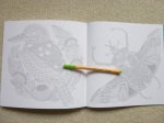
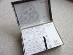
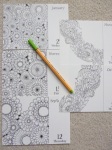
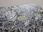
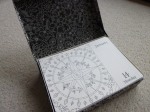
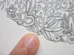
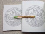
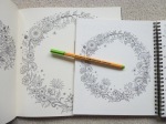
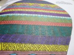
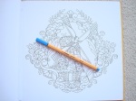
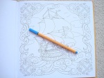
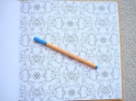
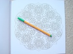
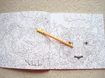
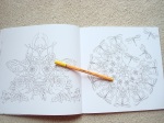
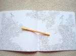
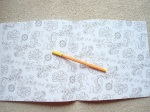
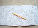
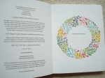
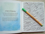
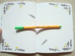
Millie Marotta’s Wildlife Wonders is published by Batsford Books who very kindly sent me a review copy. This is the sixth book in Millie’s animal-centred adult colouring book series and this time it contains no new images and instead it’s a compilation of Millie and the colouring community’s favourite images from her first five books. It’s the same size and shape (25cm square) as her previous books, paperback, with flexible card covers with black and white line drawings that hint at some of the wonderful creatures within the pages and a few of the illustrations are coloured with gold foiling scattered across the cover and the title. The spine is a lilac colour which compliments the other spine colours really well and they look gorgeous on the shelf together (see photo below). The covers don’t have French flaps this time but the inside covers are a lovely teal colour with white line drawings of animals all over them (this isn’t colourable and is printed on quite glossy card). The spine is glue and string-bound so it’s very durable but it does mean that a little of some of the images is lost into it until it eases up with a bit of use. The images are a mixture of single and double-page spreads, none of them are mirror images this time. The paper is bright white and lightly textured, it’s the same paper as the previous titles and doesn’t bleed but does shadow a little with water-based pens; pencils work beautifully and blend and shade really well.

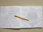
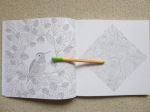
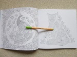
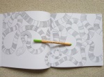
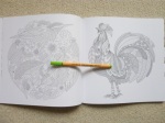
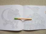
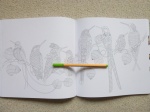
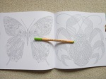
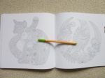
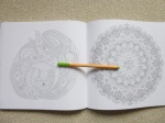
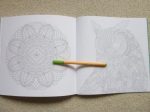
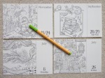
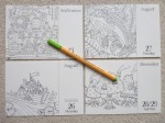
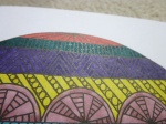
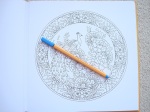
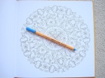
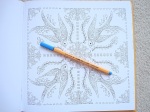
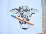
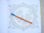
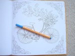
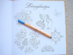
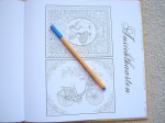
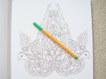
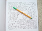
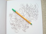
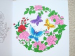
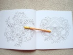
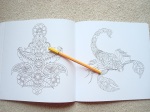
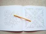
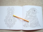
The book starts with a two-page introduction from Millie herself where she explains her illustration choices. Following this are a whopping 120 pages of the best illustrations from each of her 5 previous titles. This book really does contain absolutely everything from the common to the most exotic, animals you’ll easily recognise and those you’ll never have seen before, there is a mixture of all sorts! Everything is included from pheasants to an octopus, snakes to butterflies, chameleons to bats, jellyfish to parrots, elephants to mushrooms, seahorses to peacocks, crabs, bees, frogs, moths, snails, owls, and even an axolotl. This time there are no plain images; in the previous books there were a few pairs of images where there would be a detailed version and a simpler one that you could add your own details to if you wish, some of the detailed versions are included but no simpler ones this time. There also isn’t a list at the back of the book detailing the creatures of each page so you will have to guess a bit I’m afraid. Some people have criticised Millie’s previous books as being bird-heavy, this book really doesn’t feel that way with 40 of the images depicting birds and the other two thirds showing all manner of other creatures. The images are really varied but definitely feel more heavily detailed than some of her earlier books and with fewer scenery pages. As always, I’ve gone a bit extreme with this review and spent hours trawling through this book and all of the others to discover how many pages from each book are included and the totals are as follows: Animal Kingdom – 24; Tropical Wonderland/World – 27; Wild Savannah – 21; Curious Creatures – 24; Beautiful Birds and Treetop Treasures – 24.

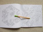
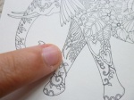
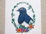
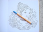
In terms of mental health, yet again, this book is fantastic. There is so much to look at, so much to discover, that it’s incredibly distracting and really focuses your mind on the illustrations themselves rather than any difficult thoughts or feelings you may be having. The image content is totally absorbing and nature-based images are the best for relieving symptoms of mental illness. This book is very intricate, but don’t let that scare you, you can use pencils, fine-nibbed felt tips, fineliners and gel pens, all with great effects and most of the images aren’t so detailed that you’re put off or overwhelmed. Many of the patterns drawn onto the animals can be coloured over in blocks as well making them less intricate and giving your colouring texture and pattern rather than outlined spaces to colour, so the possibilities are endless. If you have vision problems or issues with fine motor control then you may struggle with this book but for any of the rest of you I’d suggest giving this book a go and persevering into a more intricate world. The natural scenes definitely create a sense of calm and this will be one of my go-to books when I really need to focus on something and be distracted. It’s detailed enough that you have to focus and concentrate and this lends itself wonderfully to drowning out any anxious or disturbing thoughts you may want to shift. The line thickness is consistent throughout and is very thin so I’d advise colouring during the day or near a very good desk lamp. The images are wonderful, as always and it’s great to have a second opportunity to colour your favourites in a different colour scheme

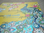
I can’t praise this book highly enough, I love Millie’s work and this book is a stunning compilation of the best images from her previous books. The illustrations lend themselves to whatever colour scheme you fancy whether that be realistic, rainbow, monochrome, black and white, mixed media, or anything else you can dream up, it really is beautiful and it would make a perfect first book if you can’t or don’t want to pick a themed one.

If you’d like to purchase a copy it’s available to pre-order here:
Amazon UK – Millie Marotta’s Wildlife Wonders
Book Depository Worldwide – https://www.bookdepository.com/Millie-Marottas-Wildlife-Wonders-Millie-Marotta/9781849945134/?a_aid=colouringitmom

Video Review and Full Flip Through

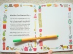
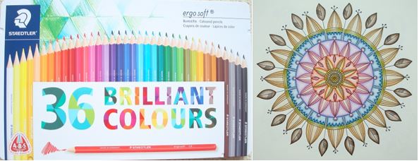
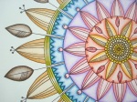
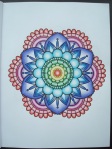
The image below was coloured using Prismacolor Premier Pencils. A video tutorial for colouring the grasshopper can be found here.

Johanna Basford Page A Day 2019 Coloring Calendar Written Review, Photos, Video Review and Flip Through

Johanna Basford 2019 Colouring Day-To-Day Calendar in a Keepsake Box – A Review

Disclaimer – Please read this disclosure about my use of affiliate links which are contained within this post.
Johanna Basford 2019 Colouring Day-To-Day Calendar in a Keepsake Box is published and was very kindly sent to me to review by Andrews McMeel Publishing. This page-a-day calendar arrives in shrink-wrapped plastic which keeps the keepsake box clean and free from damage. The keepsake box is made of thick ivory card which is covered all over (including the bottom) with a black-heavy flower and leaf design that almost looks like it is drawn in white rather than black. The pattern is most similar to designs from Enchanted Forest and the top and all four sides of the box have gold foiling accents. The box opens with a hinge-style (the lid remains attached at the top) with two pieces of black ribbon holding it open at a >90degree angle; the inside of the lid and the box are lined with black paper with white flower and foliage designs drawn in Johanna’s signature style; the box is fully colourable if you wish. A black ribbon allows easy access to lift out all of the loose calendar pages which aren’t bound in any way so it’s easy to pick out which ones to colour, move them around, leave them out to dry if using wet media and so on. The pages are the same size and format as any other page-a-day calendar, the illustration is on the left and takes up two thirds of the page and on the right at the top is a leafy-lettered title of the month and at the bottom is the date and day, above this in small text are written the important festivals and celebrations and the country they’re celebrated in; as with all others, Saturday and Sunday share a page so there are approximately 313 pages of colouring for you to complete over the year. The pages are pale cream (just like the 2018 edition) rather than bright white (they are less yellow than the Secret Garden book paper and more cream than the new ivory paper in Magical Jungle and Ivy and the Inky Butterfly; see photo below of the different paper colours), thin (slightly thicker than copier paper), and lightly textured, pencils don’t build up many layers on this paper but I’m sure those of you who are more talented than me will have more luck with this and create wonderful masterpieces; water-based pens do heavily shadow and may bleed through if you’re particularly heavy-handed but the images are printed single-sided so really you can use whatever mediums you like, these pages would be ideal for testing out new mediums or trialling colour schemes.

The illustrations themselves are all taken from Johanna Basford’s six currently published colouring books, Secret Garden, Enchanted Forest, Lost Ocean, Magical Jungle, Johanna’s Christmas, and Ivy and the Inky Butterfly, I have carefully looked through all of the images and there are no new images, all are directly from the original books. Some of them are the whole page scaled down, others are sections of the page printed at the original size, others are zoomed in sections which are printed larger than the original so there is a really good mix of detailed sections, larger spaced illustrations to practice blending and shading on, and whole pages which you’ll need your finest of fineliners and sharpest of pencils to colour accurately. The lid is designed to display the current day’s page in but it will hold plenty more pages than this so you could easily place a month’s worth in there before having to move them under the proceeding days’ pages.

In terms of mental health, this page-a-day calendar is fantastic because it provides you with a manageable size of project to attempt each day, you could colour the page in a few minutes or really take your time to try out new techniques and spend much longer, it’s entirely up to you. You could colour the day’s page ahead of time or on the day itself, you could even spend the next few months colouring the whole thing ready to look at your beautiful work throughout the coming year, or even to gift to someone else (what a labour of love that would be and it would make an incredible present if you could bear to part with your work, perhaps you could start if off for them to finish?). The pages are a great size to practice colour schemes for your copies of the actual books, or even to try out colouring mediums on a smaller page. The loose pages make it easy to access the page you need without having to move the whole block around all the time and it means you don’t have to worry at all about bleed through. At the end of the year you could even cut out all of the images and create collages, small framed pictures or gifts or even add them to cards or craft projects so this is a really versatile product that goes way beyond just being a calendar! There isn’t a treasure hunt element in this calendar and there are no written hints for drawing though there are plenty of spaces on a number of images to be able to add your own details or backgrounds to really make the pages your own but this of course isn’t necessary and it’ll look finished without the need to draw at all. This page-a-day calendar is perfect for fans of Johanna’s work and it is a beautiful new way of using her illustrations. The line thickness varies a little throughout from thin to spindly thin and the intricacy and detail levels are often much higher than in the books because many of the images are shrunk down to fit the pages so you will most definitely need very good vision and fine motor control to get the most out of this calendar if you’re wanting to colour it; you could of course leave it blank and just admire the illustrations because they really are beautiful to just look at with no need to add colour if that’s too challenging. The images aren’t arranged into any order and there are no duplicates, a number of the calendar pages show parts of the same original image but these are all of different aspects of it, with varying size or depicting different areas (see images below) and this is by no means the majority of the pages, most are of entirely separate illustrations or aspects within them, they also don’t appear to duplicate the images used in the 2017 or 2018 edition of this calendar so those of you who already have that won’t be disappointed by duplicates. The page size is much more manageable and less daunting to colour and this is ideal for those of you with fluctuating conditions or concentration levels because these pages are much quicker to finish and likely to cause less frustration, they’re also fantastic for trying out new things without worrying about ruining a whole page in your books.

I would highly recommend this page-a-day calendar to fans of Johanna’s work and to those who love to be organised. It’s a great size and format, ideal for those who find the full-size book pages too daunting. It’s also great for practising colour schemes or using new colouring mediums and it’ll be a lovely keepsake to work through from beginning to end and see how you’ve progressed over the year it runs for; you can even remove the images afterwards and frame or gift them or even use them in craft projects and the box will make a wonderful keepsake.

If you’d like to purchase a copy of this page-a-day colouring calendar, it’s available here:
Amazon UK – Johanna Basford 2019 Colouring Day-To-Day Calendar in a Keepsake Box
Book Depository Worldwide – https://www.bookdepository.com/Johanna-Basford-2019-Coloring-Day-Day-Calendar-Johanna-Basford/9781449492434/?a_aid=colouringitmom

Can’t get enough of Johanna’s images? Below are my reviews of her new colouring planner and wall calendar so you can be fully organised and colour to your heart’s content for the coming year!
Ivy and the Inky Butterfly 2019 Colouring Wall Calendar
Johanna Basford 2018-2019 16-Month Weekly Colouring Planner

Video Review and Flip Through

The page below was coloured using Faber Castell Pitt Pens.

Johanna Basford 16 Month Weekly Colouring Planner 2018-19 Written Review, Photos, Video Review and Flip Through

Johanna Basford 2018-19 16-Month Weekly Colouring Planner – A Review

Disclaimer – Please read this disclosure about my use of affiliate links which are contained within this post.
Johanna Basford 2018-19 16-Month Weekly Colouring Planner is published and was very kindly sent to me to review by Andrews McMeel Publishing. This planner is the perfect combination of organisation and colouring with space to write plans, appointments and notes, whilst also having weeks and weeks of colouring for you to do too. This planner is paperback with flexible pale cream card covers which have a beautiful black-heavy floral and foliage design on the front and back with a white floral design drawn on black on the insides of the covers, the front cover has gold foiling accents and the front and back cover have removable brown card strips with the information about the planner and the barcode etc printed on them. The planner is spiral-bound and measures 21.6 x 19.6cm, the covers aren’t especially sturdy so I’d be careful about travelling with it much and you’ll want to keep it safe somewhere rather than stuffing it in a bag or it’ll get damaged very quickly. This isn’t the best planner I’ve seen in terms of features and organisation, but for the combination of colouring and organising, it’s perfect and strikes a really good balance. The planner runs for 16 months and starts from the 27th of August 2018 all the way to the 5th of January 2019. The planner is printed double-sided and starts with a one-page overview of the year 2019 and then the planner itself starts with an image on the left of each double-page spread from one of Johanna’s six colouring books, images from all six (Secret Garden, Enchanted Forest, Lost Ocean, Magical Jungle, Johanna’s Christmas, and Ivy and the Inky Butterfly) are included, and the week’s days and dates with writing space for each on the right (this is in the same style as normal planners with added leafy accents and leafy lettering for the month title at the top). Each week runs from Monday to Sunday with equal space to write for each day, the dates are on the right and important festivals and bank holidays etc are written in small text on the left of the page, as well as the country it’s celebrated in. After the planner pages, which make up the vast majority of the book, there is a double-page spread with sections for each month of 2020 for you to add your advance plans to. Following this is a full page of 2018 dates and a full page of 2020 dates, followed by 5 lined pages where you can write notes (all with added leaf accents) and the final page is a colouring test page where you can test out your mediums to check for bleed through.

The paper this time is pale cream rather than bright white (it is the same paper as last time and it’s less yellow than the Secret Garden book paper and more cream than the new ivory paper in Ivy and the Inky Butterfly; see photo below of the different paper colours), lightly textured and medium thickness, sadly it does shadow a fair bit with water-based pens but it doesn’t bleed through; I’d strongly advise writing in pencil throughout or you’ll ruin the image on the reverse either with shadowing or indentation from ballpoint pens. Pencils work well on this paper so I’d suggest mostly colouring with pencils and using water-based pens if you don’t mind the shadowing showing through on the planner pages. A great selection of images from Johanna’s books are included with some being sections of original images at the original size and others being the whole page shrunk down to fit on the planner page so some of the illustrations are quite tricky to colour neatly but almost none look impossible as long as you use a good set of fineliners or sharp pencils. Because this is the third planner and the publisher has tried not to duplicate images it means that a number of my favourite images from her first few colouring books haven’t been included as they were in the first two planners, however, we’ve got new images from those as well as from the newest book, Ivy and the Inky Butterfly, and there are some lovely inclusions so there’s no disappointment to be had with this planner and it really is a great mix between organisation and colouring (two of my favourite things)!

In terms of mental health, this colouring planner is ideal. It gives you a manageable goal of colouring one page per week which could either be next week’s page so that it’s coloured ready for that week or this week’s page so you can colour as you plan. You could even colour it ahead if you’re quick but you’ll need to get a wriggle on! The pages are a great size to practice colour schemes for your copy of the actual books, or even to try out colouring mediums on a smaller page. The spiral-binding makes it easy to access the whole page and none of the images go into the spine, it’s also ideal because once you’ve finished using the planner at the end of 2019, the pages are easy to remove for framing or gifting if you want to get more use out of your works of art. There isn’t a treasure hunt element in this planner and there are no written hints for drawing though there are plenty of spaces on a number of images to be able to add your own details or backgrounds to really make the pages your own but this of course isn’t necessary and it’ll look finished without the need to draw at all. This planner is perfect for fans of Johanna’s work and it is a beautiful way of using her illustrations. The line thickness varies a little throughout from thin to spindly thin and the intricacy and detail levels are higher than in the books because many of the images are shrunk down to fit the pages so you will most definitely need very good vision and fine motor control to get the most out of this planner if you’re wanting to colour it; you could of course leave it blank and just admire the illustrations because they really are beautiful to just look at with no need to add colour if that’s too challenging. The images aren’t arranged into any order but a few have been cleverly chosen to fit celebrations like a heart for the week of Valentine’s Day and images from Johanna’s Christmas through December. The page size is much more manageable and less daunting to colour and this is ideal for those of you with fluctuating conditions or concentration levels because these pages are quicker to finish and likely to cause less frustration.

I would highly recommend this colouring planner to fans of Johanna’s work and to those who love to be organised. It’s a great combination of planner and colouring pages and the size and format is ideal for those who find the full-size book pages too daunting. It’s great for practising colour schemes or using new colouring mediums and it’ll be a lovely keepsake to work through from beginning to end and see how you’ve progressed over the 16 months it runs for; you can even remove the images afterwards and frame or gift them.

If you’d like to purchase a copy it’s available below:
Amazon UK – Johanna Basford 2018-19 16-Month Weekly Colouring Planner
Book Depository Worldwide – https://www.bookdepository.com/Johanna-Basford-2018-2019-16-Month-Coloring-Weekly-Planner-Calendar-Johanna-Basford/9781449492441/?a_aid=colouringitmom

Can’t get enough of Johanna’s illustrations and the ability to organise your life? Then check out the following reviews for the Ivy and the Inky Butterfly 2019 Wall Calendar and the 2019 Page-a-Day Calendar.

Video Review and Flip Through

The image below was coloured using Caran d’Ache Luminance Pencils and a Caran d’Ache Blender Pencil.

Ivy and the Inky Butterfly Coloring Wall Calendar 2019 Review, Photos and Video Flip Through

Ivy and the Inky Butterfly 2019 Colouring Wall Calendar – A Review

Disclaimer – Please read this disclosure about my use of affiliate links which are contained within this post.
Ivy and the Inky Butterfly 2019 Colouring Wall Calendar is published and was very kindly sent to me to review by Andrews McMeel Publishing. This calendar is beautiful and is the same format as the previous JB wall calendars. The calendar itself is the same size as most others at 12 inches square, making it significantly larger than Johanna’s books. It includes 13 of Johanna’s signature and most well-known designs from her sixth colouring book, Ivy and the Inky Butterfly (this calendar doesn’t include any new images), an illustration for each month of the year and one at the beginning for a 4-month overview of September to December 2018. I have included pictures of all of the calendar pages below so that you can decide if this is for you, as well as comparison photos of the book and calendar size. The whole calendar, including the covers, is made of thick pale cream paper which is good quality (it is less yellow than the Secret Garden book paper and more cream than the new ivory paper in Ivy and the Inky Butterfly; see photo below of the different paper colours) – I thought it was going to bleed with water-based pens but there was no bleed-through at all and only some shadowing when using my darker fineliners. Do bear in mind, when writing on the calendar I’d strongly advise using pencil so that you don’t get bleed through onto the next month’s image, or indentation from using a biro. The images are printed much larger in the calendar than in the book so this is a great purchase for those of you who found Johanna’s books just a little too detailed and small. You definitely can’t use alcohol markers because the images are all printed double-sided with the dates for the previous month on the back of the page which will get ruined by bleed-through if you colour ahead but would be fine if you colour month by month. The paper is quite smooth but has a little tooth and I didn’t have any issues with getting a few layers built up with my Caran d’Ache Luminance pencils. The dragon image below was coloured with Derwent Inktense pencils, activated with water and I experienced no bleed-through and only minimal buckling when I used a bit too much water. The calendar is spiral-bound so you can easily fold it back on itself for easier colouring as it’s a little unmanageable when it’s not folded in half. Each page has a small hole at the top, this is smaller than on normal calendars and doesn’t fit a nail through it so you’ll have to very carefully hang it up with string (be careful so you don’t rip the pages). The cover has signature gold foil accents and is fully colourable, as always, and each calendar page has lots of tiny leaf accents and each month has a leafy lettering title.

In terms of mental health, this calendar is ideal because not only does it give you hours of colouring fun and distraction, you can also easily display it on your wall to brighten up even the darkest of days and you’ll get satisfaction every day looking at all of your beautiful hard work. The much larger image size means it’s far more suitable for those of you who don’t have perfect vision or fine motor control. It’s a great project that will help motivate you with a deadline of making sure each image is ready for the first day of the following month. The pages could also be removed at the end of the year once you’re done with the calendar and could be easily framed or gifted to others to bring enjoyment for years to come. This time, there isn’t an inky treasure hunt. The book of Ivy and the Inky Butterfly is very significantly smaller than the calendar so the images have been increased a lot in size so the intricacy and detail levels are very much reduced. This is a bit of a shame for people who love Johanna’s work for its detail, but for those who prefer larger images and space to really go to town with blending and shading, it’s absolutely perfect and I think it’s my favourite calendar of Johanna’s to date! There is a really good variety of images, needing varying levels of concentration which can be used to keep you occupied and distracted when you’re feeling anxious or low, or requiring less focus if you need a more relaxing colouring experience. Johanna’s images are really good for practising mindfulness techniques because many require a lot of focus and time to complete meaning this calendar is ideal for those of us who are mentally ill and needing to zone out. The line thickness is medium/thin throughout so there some leeway when colouring.

I would highly recommend this for any colouring fan who needs a calendar in their life. Johanna fans won’t be disappointed with this calendar, it’s beautiful with a lovely selection of designs and great paper quality and it will brighten up the darkest of rooms and moods. It would make a fabulous gift either as it is, or fully coloured for someone and it’s not only useful for the coming year as a calendar, but for years to come when you can frame your pictures to continue the joy.

If you’d like to purchase a copy it can be found here:
Amazon UK – Ivy and the Inky Butterfly 2019 Colouring Wall Calendar
Book Depository Worldwide – https://www.bookdepository.com/Ivy-Inky-Butterfly-2019-Coloring-Wall-Calendar-Johanna-Basford/9781449492458/?a_aid=colouringitmom

Video Flip Through and Review

The magpie image below was coloured with Caran d’Ache Luminance pencils (my video tutorial showing how to ‘cheat’ at blending that I used throughout the image can be found here) and the dragon image was coloured with Derwent Inktense Pencils activated with water.

Spectrum Noir Sparkle Glitter Brush Pens – A Review and Video Tutorial

Disclaimer – Please read this disclosure about my use of affiliate links which are contained within this post.
Spectrum Noir Sparkle Glitter Brush Pens are created and kindly sent to me to review by Spectrum Noir. These pens are exactly what they state, brush pens containing coloured glitter pigments that can be used for colouring, crafting and anything in need of a bit of extra sparkle. The pens are available in 34 colours including a clear glitter one and can be purchased in a number of different themed and sized sets. The set I’m reviewing is one of the 12 pen sets in a carry case and mine is called Vintage Hues, there are three further themed 12 pen sets called Special Holiday Set Autumn/Winter and Spring/Summer and the pens can also be purchased in grouped sets of 6 and 3 making it easier and more economical to replace used up pens when you need to though they’re sadly not available open stock currently. The pens have a completely black barrel and lid and arrive with a plastic yellow ring around the centre which has to be removed in order to activate the pens, this is a bit of a tricky process as seen in my video below but as you work through the pens it does get easier. The end of the lid and centre of each pen is coloured indicating the colour of the ink and states the colour name on one side and Spectrum Noir Sparkle on the other, these colours are fairly accurate at showing the ink colour but do test them on scrap paper or create a colour chart before diving into colouring with them. The ink flow takes a while to settle down and you do need to regularly give them a gentle shake to ensure that the ink is mixing with the glitter or you can end up with some sparkle-free areas. To begin with, the ink comes out quite quickly and is very wet and easy to saturate your colouring page so it’s best to start working on pages with thicker paper first. The pens need to be opened carefully, the lids are well-fitting and close firmly but this also means that the lids can be a little stiff occasionally, you need to ease them off rather than yanking them as this can cause ink spillage. The brush tips are made of nylon fibres and are a good shape and seem hard-wearing, sadly one of mine arrived damaged (see photo below) and a word of warning, if the brush tip becomes damaged it will cause huge leakage problems rendering the pen difficult or even impossible to use as the ink leaks when the lid is closed and gets all over where your hand holds the pen and stains your skin for a while so do be really careful not to damage the brush tips.

The ink is water-based with lots of slivery glitter inside, it’s translucent and can therefore be used over colouring pages with the lines showing through your colouring. I don’t have the clear glitter pen but have researched it and it can be used to colour over almost any medium adding sparkle to any colour you fancy, I hope to get my hands on one soon because it seems like a great idea and by far the most versatile of the pens in this range. The pens themselves are a similar design to water brushes with a nice chunky barrel that is comfy to use for extended periods of time. The end of the barrel is squared but the holding part is round so there are no corners to dig in or dent your hand or fingers so they’re very comfy to use and the brush tip is strong and flexible and allows you to vary your brush stroke thickness from very thin to thicker with different amounts of pressure applied. The ink is more like using paint than a traditional water-based felt-tip or marker pen, it’s very wet so you will need to use it sparingly, especially on thin paper and work quite quickly to spread the colour where you want it so it doesn’t pool in one area. When flowing correctly, the pens rarely bleed or shadow through normal to thicker paper but do test in an inconspicuous area so that you don’t ruin an image.

From what I’ve seen on the Spectrum Noir website, the colour range is pretty good and covers a wide range of bright, dark, pastel and metallic colours however, they’re often grouped in sets quite oddly making it a bit tricky to get hold of the most useful colours without needing to buy a large number of sets. I would recommend checking out all of the different purchasing options so that you can get the colours you want without having to purchase too many colours that you’re not so keen on or less likely to use. The colours in the set I was sent are lovely but they’re mostly very dark, there is no orange, bright green or pink but two very similar purples and two very similar mustardy yellows so I do feel the colour selection across the sets could be a little better thought out. Having said that, these pens are great for accents and special features in a colouring page and because of the price, it’s unlikely that you’d want to colour whole pages with them so you’d probably only want to use a couple of colours per page which then makes them more useful as you can tailor your colour schemes to fit the colour of sparkle pens that you have access to. One thing to note is that the glitter isn’t permanent and so you’ll need to be careful when colouring to make sure your hand won’t keep going over it and rubbing it off. The glitter is quite shiny, certainly not the sparkliest I’ve seen, that award has to go to the Sakura Gelly Roll Stardust Glitter Gel Pen, but this glitter is nicely shiny and very pretty, especially in the light.

The pens can be used alone to add sparkly coloured accents to pages or you can spice things up and use some slightly more advanced techniques which I’ve shown in the second video below. They can be blended together to create gradients or could be blended on a paint palette or other shiny surface (a tile or something plastic) to create a new shade which you could then paint onto your work with a paintbrush. You can also make the colours lighter by adding water to your work and washing out the pigment a bit. As far as I can tell, anything you could do with normal water-based markers or watercolour paints/pencils, you can do with these so the sky is the limit!

Overall, these are beautiful pens in a wide range of colours and they do add a lovely shimmer to your pages and are ideal for glittery accents. They are a considered purchase for most due to their price point and therefore I’d suggest getting a small set in colours that you’re most likely to use or possibly the 3-pen clear glitter set so that you can make any colouring glittery and get used to how the pens work before splurging on a larger set.

If you’d like to purchase a small or larger set, they’re available here:
Amazon UK – Spectrum Noir Sparkle Gitter Brush Pens
Crafter’s Companion – Spectrum Noir Sparkle Glitter Brush Pens

First Impressions and How to Activate the Pens on First Use

Techniques and Tips Tutorial

The images below were coloured using Spectrum Noir Sparkle Glitter Brush Pens and some were blended or faded with water.

From Holland with Love - Click through to read my review, see photos of inside and watch a video flick through

From Holland With Love – A Review

From Holland With Love is illustrated and kindly sent to me to review by Masja van den Berg and is published by Pepper Books. This book is the sixth book published by Masja and her five previous titles were all variations of paisley-filled designs under the title of Mijn Wonderlijke Wereld (My Wondrous World). This sixth book is a little different and is more like a love letter, or love drawing if you will, from Masja to and about Holland. The book itself is 25.5cm square, it’s hardback this time with a beautiful glowing orange cover and a compilation image of various illustrations contained within the book in blue and white. The spine is glue and string bound and relatively difficult to get it to lie flat due to it being hardback. The pages are printed single-sided and are perforated meaning you don’t have to contend with the page gutter and try to colour into it and that you can remove the pages before or after colouring in order to frame or gift them. The paper is bright white, thick and lightly textured, pencils blend and layer beautifully and water-based pens shadow but don’t bleed through, alcohol markers will bleed through so do put a protective sheet behind your work to protect the next page. The illustrations contain lots of typically Dutch objects and scenery from clogs to windmills, tulips to traditional dress and a bicycle amongst other beautiful floral patterns, drawings of women and some lovely birds. The imagery is really varied and far less paisley-filled than the previous titles but don’t despair if you love those, they don’t feel like they’re missing from this work and the illustrations are really lovely and very pretty. At the back of the book are three pages of images that can be cut out for projects, a page of card toppers, a page of social media tags where you can add your name instead of having to watermark your photos and a page including 2 small postcard style designs all of which are illustrated and colourable.

In terms of mental health, this book is great, it’s not overwhelming to colour and has enough detail to be interesting and absorbing, without being overly complex or over-stimulating. The content is familiar, fun and cute and much of it could be coloured in any palette you choose and look equally fabulous. The line thickness is mostly consistent and remains thin with a few images drawn in a spindly thin line. The intricacy and detail levels vary and range from very intricate on some of the postcard size images and social media tags to larger, more open spaces in some of the colouring pages and everything in between, you’ll need moderately good vision and fine motor control for the majority of the images and better levels for a few of the most intricate pages. A few of the pages will require a high level of concentration but many won’t need you to be at your best and require less focus so this is a good book for those of you with varying concentration levels. The pages also consist of varying amounts of content which means they take differing lengths of time to complete and there are natural stopping points if you just want to colour one section. These images would look really beautiful framed and this book would be an ideal gift for those who live in Holland, are from there, or who just love all things Dutch, it’s so representative and beautiful, I’m sure it would be a very well-received gift!

Overall, I would highly recommend this book, it’s beautiful for those who love all things Dutch and those just wanting to colour more of Masja’s gorgeous illustrations. The production quality is very high and the images are really lovely to colour.

If you’d like to purchase a copy, it’s available to buy here:
Amazon UK – From Holland with Love
Masja’s Website – https://www.masjaswebshop.nl/

The image below was coloured with a single Prismacolor Premier Pencil and a Caran d’Ache Blender Pencil.

Mijn Wonderlijke Wereld Part 5 - Click through to read my review, watch my flick through and see internal photos

Worldwide Giveaway and Review – Mijn Wonderlijke Wereld (My Wondrous World) Part 5

Mijn Wonderlijke Wereld Part 5 was illustrated and kindly sent to me to review by Masja van den Berg. Masja has very kindly sent me an extra copy of this title and part 4 and I’m currently running a Worldwide giveaway for them both over on my FB page, click here to enter by midnight GMT on the 11th of November. This book is the fifth in her series of books and my reviews of her other titles can be found HERE and she’s already created 2 more books with different titles since these. Part 5 ventures further afield than the first three books and takes us on an exotic journey through the Orient with Chinese and Japanese art and animals featured. The book itself is paperback, nearly 24.5cm square, with a gorgeous turquoise cover with beautiful gold foiled accents on a Chinese dragon image found inside the book. The spine of the book is glue-bound and therefore a little tricky to get it to lie flat unless you break the spine which could eventually lead to pages loosening, however the pages this time are perforated which is ideal if you want to remove them for colouring or framing. The images are printed single-sided this time and all of the images are therefore single page designs. The paper is white, thick (thicker than all of her previous books) and lightly textured, it provides a good surface for blending and shading pencils, it doesn’t bleed or shadow with water-based pens and alcohol markers will be fine to use as long as you pop some protective sheets behind your work. The content is all drawn in Masja’s signature paisley style so while the images are Oriental themed, they’re very similar to the previous books and existing fans of her work won’t be disappointed. The images contain all manner of things from Chinese dragons, koi carp, ornaments, mandalas, patterns, cranes, cherry blossom, ponds, and more. The illustrations are very floral and delicate and contain a mixture of scenes and patterns, full page designs and centralised images.

In terms of mental health, this book is lovely, it’s very calming and absorbing without requiring too much concentration so it’s a great book for good and bad days. There’s a real variety in the amount of content on each page so you can easily choose a smaller, simpler design to focus on when you’re having a bad day, or a much more complex spread when you’re feeling well, none of the images are overwhelming as they’re all contained to one side so the book feels very accessible. The line thickness is pretty consistent throughout and is thin but not spindly thin so you’ll need fairly good vision and fine motor control but certainly not perfect. The intricacy and detail level varies a lot from larger open spaces to much smaller spaces where Masja has filled the creatures and designs with patterns though of course you can always colour over these small sections rather than within each one if you prefer to colour larger areas. There are plenty of spaces where you can create your own backgrounds or add your own imagery if you wish but this is by no means a requirement and the pages will look lovely regardless. Masja’s work is very soft and flowing, there aren’t any straight lines and this really helps to create a natural, calming world that you can escape into whilst colouring. The images have a great mixture of realism and imagination added to them so they look equally good coloured realistically or outlandishly and you could even mix the two throughout the book.

Overall, I would highly recommend this book to anyone who’s already a fan of the series, and those who are intrigued and new to it, the images are lovely, very cohesive, and really natural and calming and they look beautiful once splashed with realistic or imaginative colour schemes.

If you’d like to purchase a copy of this book, it’s available here: https://www.masjaswebshop.nl/

I’m also currently running a giveaway for a UK resident to win a copy of this, and book 5 in the series. The competition runs until midnight GMT on the 11th of November and can be entered here.

The image below was coloured using Stabilo 68 Fibre-Tips.

Mijn Wonderlijke Wereld Part 4 - Click through to read my review, see photos and watch my video flick through

Worldwide Giveaway and Review – Mijn Wonderlijke Wereld (My Wondrous World) Part 4

Mijn Wonderlijke Wereld Part 4 was illustrated and kindly sent to me to review by Masja van den Berg. Masja has very kindly sent me an extra copy of this title and part 5 and I’m currently running a Worldwide giveaway for them both over on my FB page, click here to enter by midnight GMT on the 11th of November. This book is the fourth in her series of books and my reviews of her other titles can be found HERE as well as my review of Part 5 HERE and she’s already created 2 more books with different titles since these. Part 4 ventures further afield than the first three books and takes us on an exotic journey through India and its animals. The book itself is paperback, nearly 24.5cm square, with a bright yellow cover with beautiful blue foiled accents on a peacock image found inside the book. The spine of the book is glue-bound and therefore a little tricky to get it to lie flat unless you break the spine which could eventually lead to pages loosening. The images are printed double-sided and are a mixture of single and double-page spreads. The paper is white, thick and lightly textured, it doesn’t bleed and only very minimally shadows with the darkest water-based pens and provides a good surface for blending and shading with pencils; alcohol markers should be avoided as they’ll ruin the reverse image and bleed through. The content is all drawn in Masja’s signature paisley style so while the images are Indian themed, they’re very similar to the previous books and existing fans of her work won’t be disappointed. The images contain all manner of things from giraffes and peacocks, to scarabs and elephants, scorpions and florals to parakeets and ponds. The illustrations are very floral and delicate and contain a mixture of scenes and patterns, full page designs and centralised images.

In terms of mental health, this book is lovely, it’s very calming and absorbing without requiring too much concentration so it’s a great book for good and bad days. There’s a real variety in the amount of content on each page so you can easily choose a smaller, simpler design to focus on when you’re having a bad day, or a much more complex double-page spread when you’re feeling well. The line thickness is pretty consistent throughout and is thin but not spindly thin so you’ll need fairly good vision and fine motor control but certainly not perfect. The intricacy and detail level varies a lot from larger open spaces to much smaller spaces where Masja has filled the creatures and designs with patterns though of course you can always colour over these small sections rather than within each one if you prefer to colour larger areas. There are plenty of spaces where you can create your own backgrounds or add your own imagery if you wish but this is by no means a requirement and the pages will look lovely regardless. Masja’s work is very soft and flowing, there aren’t any straight lines and this really helps to create a natural, calming world that you can escape into whilst colouring. The images have a great mixture of realism and imagination added to them so they look equally good coloured realistically or outlandishly and you could even mix the two throughout the book.

Overall, I would highly recommend this book to anyone who’s already a fan of the series, and those who are intrigued and new to it, the images are lovely, very cohesive, and really natural and calming and they look beautiful once splashed with realistic or imaginative colour schemes.

If you’d like to purchase a copy of this book, it’s available here: https://www.masjaswebshop.nl/

I’m also currently running a giveaway for a UK resident to win a copy of this, and book 5 in the series. The competition runs until midnight GMT on the 11th of November and can be entered here.

The image below was coloured using Stabilo 68 Fibre-Tips.

The Wellbeing Journal: Creative Activities to Inspire – A Review

Disclaimer – Please read this disclosure about my use of affiliate links which are contained within this post.
The Wellbeing Journal: Creative Activities to Inspire is published and kindly sent to me to review by Michael O’Mara Books. This journal has been created in partnership with the mental health charity, Mind, all royalties from the sale of the book will be donated to them and thus, by purchasing it, you can not only help yourself (more on this later), but also the countless number of us who are mentally ill in the UK and further afield who are supported by Mind and their tireless work to raise awareness and reduce stigma about mental illness. The book itself is 14.7 x 19cm (just smaller than A5), paperback, with flexible card covers with pictures of brightly coloured birds and branches. The journal is printed double-sided and contains a mixture of single and double-page spreads. The paper is bright white, smooth, and medium thickness, it shadows and occasionally bleeds with water-based pens and pencils don’t work brilliantly unless you use graphite or soft leads due to the smoothness. The majority of the pages in the journal have space to write or draw, some are plain with borders or corner imagery and others are lined, scattered throughout are pages filled with colourful patterns or bright drawings of plants and animals. There are also lots of written activities and self-help suggestions including: relaxing your body, drawing how you’re feeling, organising your time, identifying your stress triggers, and lots more, all of these things may seem simple to people who are well, but it’s often the most basic of tasks, especially anything that involves self-care that those of us who are mentally ill struggle with and it’s great to have prompts all written in the same place for us to refer to when needed. A few colouring pages are scattered through the journal and a number of inspiring and uplifting quotes that might help you look at the world a little differently or remind you that it’s not quite as dark or hopeless as you might feel.

In terms of mental health, this journal couldn’t be much better, it’s been designed with mental health in mind and the tips included are genuinely useful for helping yourself to feel just a little bit better. Journaling is often credited as being great for mental health, it’s not something I’ve ever managed to regularly stick at but I certainly find blogging helps me make sense of things and writing things down can be really useful for this so having a dedicated space to do that interspersed with tips, quotes and activities to keep you perked up is ideal. This journal would be a great present for yourself (get started on the self-care journey by investing in this as something that can help you help yourself), or for others around you who might be struggling with self-care or mental health, it’s perfect for letting someone know you’re thinking of them and starting the conversation about mental health and letting them know that it’s ok not to be ok and it’s also ok to talk about it. The journal is not only a fabulous place to write down your thoughts, feelings, and symptom diary, you could also use it as a place to write down additional self-care tips, strategies, and activities, you could even get people around you who care about you to write nice messages in it for you to read when you’re having symptomatic days and need a boost! The journal is a great size for popping in your bag for journaling on the move or having a portable self-help guide. The tips included are sadly not likely to cure you, they may not even make a huge difference to how you’re feeling, but without trying them, you’ll never know, and starting to care about yourself and for yourself is notoriously difficult when you’re very unwell, therefore having written suggestions of basic things you can try can be a really useful tool for helping yourself feel just a little bit better, even just for a moment!

Overall, I would highly recommend this journal, the paper quality is slightly disappointing but other than that I can’t fault it, the content is great, with a good mix of activities and tips, and space for writing or drawing and if nothing else, the bright colours printed throughout might just brighten your day for the briefest of moments. It would make a wonderful present to yourself or others and better still, by purchasing it you’re helping support a wonderful mental health charity, it doesn’t get much better than that!

If you’d like to purchase a copy it’s available here:
Amazon UK – The Wellbeing Journal: Creative Activities to Inspire
Book Depository Worldwide – https://www.bookdepository.com/The-Wellbeing-Journal/9781782438007/?a_aid=colouringitmom

The image below was coloured with Stabilo Point 88 Fineliners.

Staedtler Ergosoft Pencils: 36 Set Click through to see the 12 new shades and read my review!

Staedtler Ergosoft Triangular Coloured Pencils: 36 Colours – A Review

Disclaimer – Please read this disclosure about my use of affiliate links which are contained within this post.
Staedtler Ergosoft Triangular Coloured Pencils: 36 Set are made and kindly sent to me to review by Staedtler, a well-known German Stationery brand. These pencils are endorsed by Johanna Basford (colouring queen) so I was very excited to see what all the fuss is about and if they’d live up to expectations. The pencils are wax-based, I usually prefer oil-based but these (and Prismacolor Premiers) are definitely changing my mind. They have triangular barrels which are entirely coated in the exact colour of the pencil lead so they’re very easy to identify with little need for a colour chart. Each side of the pencil carries printed information: Staedtler ergosoft, space to write your name (ideal for kids or those going to art classes who want to identify their own supplies easily), and the colour number. The pencils arrive pre-sharpened and are very easy to sharpen in a normal sharpener, despite the triangular shape and they sharpen to a really nice point. The pencils are now available in 36 different colours and I was sent the 36 set to review which come in a single layer tin (ideal for having out whilst colouring and not losing your pencils). Other sets available are the 12 set in a blue stand-up box, the 12 set in a cardboard box, the 24 set in a Johanna Basford themed cardboard box and 24 set in a blue stand-up box, the pencils are also available as open stock meaning you can order one or two to trial before buying a full set if you’re unsure. The ergosoft pencils are also available in watercolour so do check what you’re ordering, I will be reviewing the watercolour ergosoft pencils at a later date (the major visible difference between the two is that the watercolour pencils have a blue barrel and a coloured tip – see photo below).

The pencils themselves are smooth to touch and the ergonomic triangular design makes them very comfortable to hold which is ideal for those of us with joint problems, issues with grip strength or easily dented fingers, I have lots of problems with the shape of pens and pencils, especially when colouring for long periods of time for reviewing, and these are one of the comfiest sets I’ve come across. The pencil leads have a white coating which adheres the leads to the wooden pencil sheath and this protective coating helps to reinforce the lead core in order to prevent breakage. I have used these pencils for a long time and have had no issues with breakage or problems with sharpening so these are very well-made. The leads are quite hard but they have a good vibrant pigment meaning you get a bright colour without needing a lot of pressure. However, because the leads are quite hard, you do need to use quite a bit of pressure when colouring toothier paper so I’d advise these for smoother paper if you have joint problems or you’re going to have to press quite hard to get a bold, full colour with no white gaps. I also noticed that while the pigment is very vibrant, you do get a wax bloom when using the hardest pressure and this makes blending more difficult than with oil-based pencils because you can’t get many layers before the wax bloom builds up so much that it interferes with colour lay down.

The pencils do blend fairly well together but you will need to be careful with your layering because the wax builds up quickly. Because the pigment is so bright, it’s quite difficult to get a pale even coverage with a thin layer on toothy paper so these pencils are much better for vibrant, burnished colouring, rather than pale, thin layers. They erase very well, even when coloured and burnished, obviously some pigment is left but a surprising amount is removed with very little effort so these pencils would be ideal for those who regularly colour over the lines, or who want to create highlights in their work. These pencils are in the mid-range price category and vary hugely in price. They’re quite expensive when full-price but when on sale they’re much more affordable and better value for money and if you can get a set on sale then I’d highly recommend them. These are definitely a great wax-based pencil.

The pencils used to only be available in 24 colours and there have been lots of questions in the colouring community about what shades are now included in the new 36 set. A really good range of colours have been added across the spectrum and pretty much one of each colour has been added in to help fill in the gaps that were there before so there is now a better range of greens, we have a lilac, a beautiful turquoise and two new browns amongst others. You can see the added colours in the photos below as well as the mandala page which I coloured exclusively with the 12 new colours, they look a little strange on their own because none of them are core colours, they’re all in-between shades to fill in the gaps but in conjunction with the other 24 pencils they look beautiful and the set covers a really good selection of colours with very few shades now missing that you can’t ‘mix’ by combining a couple of the pre-existing colours. For those who already have the 24 set, who are wondering whether it’s worth investing in this new set (sadly the 12 new colours aren’t available as a set on their own though you can buy all of them open stock), I would suggest that yes, it’s definitely worth getting them, the new shades are really useful, the tin is a great way of storing them and having extra colours is always a huge bonus, I think we’re all hoping that Staedtler will add further colours at a later point though this hasn’t been announced but there are 60 colours in their watercolour set so we can dream!

If you’d like to purchase a set, they’re available here:
Amazon UK:
Set of 24 in blue stand up box
Set of 12 in blue stand up box
Set of 36 colours in tin