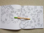
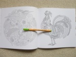
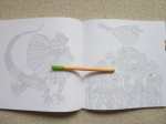
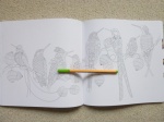
Nature

Mental Health Awareness Week – Awareness is No Longer Enough

It’s Mental Health Awareness Week again and this year the tone appears to be changing. Not the tone of the government or most of the charities, but from campaigners and sufferers of mental illness there’s a distinct change occurring, a tiredness, a frustration and a building anger. This year’s theme is Nature which seems innocuous enough but honestly, who is it helping? For years, we’ve known that nature and being in green spaces helps improve mood etc etc. And yet, we are increasingly building on green spaces, packing people in like sardines so they’ve got no views, no parks, no wildlife around them and then during awareness weeks we tell them to go and seek out the nature that’s been so cruelly stripped away from their neighbourhood. How? Where? With what funds?

One of the biggest problems I have with this week is that it’s not designated to a proper cause. It’s called Mental Health Awareness Week but mostly it’s Mental Illness Awareness Week. Really, there need to be two. But much more than that, people need educating on the difference. We all have mental health, like we all have physical health, we all need to take care of our mental health just like we need to look after our bodies but mental illness is illness like any other. It’s when something’s gone wrong, off kilter, and we need access to diagnosis, treatment and support in order to regain wellness again. Nature is not a substitute for support, nor is it a treatment for mental illness. It’s a good tool to help keep mentally healthy and performing at your best but if you’re mentally ill, a walk or a roll around in some grass isn’t going to cut it where medication or therapy are needed.

Nature isn’t accessible to everyone. For so many reasons and in so many ways. Not just because it can be difficult to find when you live in particularly urban areas but also for those with limited time or resources and most notably for me, because I’m agoraphobic. My condition means that I don’t cope well with being outside so nature is pretty inaccessible to me. Lack of access to nature isn’t what’s keeping me ill, it’s not the cure for my conditions and yet all I’m really seeing on social media and the news this week is about how nature can help alleviate symptoms and while this is true in mild cases, it’s really not effective for those of us with severe symptoms. Most days I’m not well enough to even go out of my front door, let alone go into nature for a walk or a picnic. I live in a flat so I don’t have a garden I can go to. I’m very lucky to have a lovely view and can see a local park and the South Downs in the distance, I see squirrels and seagulls and foxes and people walking their dogs but it’s all through panes of glass. I’ve tried to follow tips and bring the outside inside and have an orchid and I’m growing some tomato and chilli plants. Surprisingly enough, despite all of this, my anxiety isn’t better and my agoraphobia still isn’t cured.

What I need is therapy. I don’t need awareness so much as I need access to support. I need to stop being threatened with discharge from my mental health team. I need support and treatment to exist in accessible ways that don’t require me to leave my home, the thing I need therapy in order to do! I need options that aren’t just CBT which I’ve exhausted over the years and which doesn’t work for people like me. I need waiting lists to be shorter. I need to not be waiting 3 years or more for an assessment that may still not lead to any new treatment options. I need doctors, MPs, and society as a whole to fight for funding so that instead of churning out the same “It’s OK Not To Be OK” and “Be Kind”, and “Reach Out For Help If You’re Struggling” slogans year on year, change actually occurs and people like me can finally access treatment and support without having to wait until these conditions possibly kill us. Fighting my own mental illness is hideously hard but fighting society at large as well is impossible. I’ve been blogging for 6.5 years and nothing has changed. Services in my area have been cut, doctors are retiring or leaving, appointments get shorter and spaced further apart and the threat of discharge gets bandied about more regularly. I’m still just as ill as when I first went to the doctors. I’ve still not received any therapy on the NHS. I can’t be medicated because all of the medications made me worse. I’ve just been left. The support I’m offered is an up to 30 minute call once every 6 months with my psychiatrist. He doesn’t know my Grandad who I was a carer for for 4 years has died, he doesn’t know that I’ve had physical health problems that have majorly affected my sleep for almost 3 months, he doesn’t know I’ve suffered from intermittent suicidal ideation, or that the waiting list for the assessment he’s sent me for has been extended by another year. Why? Because my next appointment isn’t until June and I last spoke to him before Christmas.

Nature’s great but it’s not a substitute for treatment. Awareness Weeks have had their day. What we really and truly need is Action Weeks. And then actual action. I no longer care about whether people accept that I have an anxiety disorder or realise that it’s not my fault or that I shouldn’t be ashamed of it. I know that awareness has its place for all of the people who are coming up behind me who are starting to suffer symptoms that they don’t understand or who are having experiences they’ve never had before. I know we need to make people aware but the whole point of awareness always used to be so that you sought help early enough because it’s been well-documented for a long time that the earlier you intervene in mental illness, the better the outcome and the less intervention is usually needed. But support is so sparse now that awareness is almost useless. It’s all well and good suspecting you have a mental illness and going to speak to your GP about it but then what? Almost all of the doors that used to open are firmly nailed shut thanks to funding cuts. We keep hearing about a pandemic of mental illness, but there’s no vaccine coming for this and social distancing will surely worsen the effects. Knowing what’s wrong with you is the first step but without a second you’re still stranded. Alone. Frightened. Unable to get better. And sorry to be a cynic, but walks or visiting gardens is going to be of little use to people suffering from psychosis or eating disorders or just about any mental illness that’s actually at a diagnosable level of severity.

I’ve been in two minds about whether to even post about this because I really don’t like posting negative or angry things, especially about public events or things that are aiming to help but this is falling so short. It’s like the Clap for Carers. It’s all well and good clapping but it’s not paying people’s bills, it’s not actually making a meaningful difference and it changes nothing in the grand scheme of things. Awareness weeks have had their day and could still be useful now if they were followed up with action but all the time we’re focusing on airy-fairy topics like nature and deeming that to improve everyone’s mental illnesses, we’re falling dangerously short and without radical change this pandemic is going to last a lot longer than the Covid-19 one will. We don’t need Awareness Weeks. We need action!

Worlds Within Worlds – A Review

Disclaimer – Please read this disclosure about my use of affiliate links which are contained within this post.
Worlds Within Worlds is illustrated by Kerby Rosanes and published and kindly sent to me to review by Michael O’Mara. This book is the seventh title by Kerby and is not part of the Morphia series albeit it’s drawn in a very similar style but without the signature alien creatures and swirls of the earliest Morphia titles.

The book is 25cm square, the same size as Kerby’s previous titles and most other bestsellers. It’s paperback with black covers and white lettering. The images on the front and back covers are partially coloured and are both contained within the book. The spine is glue and string-bound and quite tight on arrival, it takes a bit of work to get it lying flat however you shouldn’t need to crack the spine to colour the entirety of each image. The majority of images don’t enter the gutter so it’s not a big issue and it will ease up with use. The paper is bright white and medium thickness, it has a light tooth and allows for blending and shading. I used Prismacolor Premier Pencils which blended very well. When using heavy pressure, some of the image on the reverse page did transfer to the opposite page so you may want to put a sheet of scrap paper under your work in order to prevent this, however it’s easily erased if it does happen. The book begins with a name plate spread and information about the new search and find element of the book, a key hidden on a tiny image of a main feature of the proceeding image hidden within each colouring design. The book then contains 83 pages of illustrations printed double-sided which are a mixture of single pages, paired designs and double-page spreads. The image content is extremely wide ranging and because there is no specific theme, it really does contain a bit of everything including themes that he’s previously drawn in his earlier titles. None of the images are repeats, a few of them are just the same subject, drawn differently including fish, nautilus, dragon, bees, skull, and stags. The vast majority of the images are of completely different subjects and all of them are drawn in a very different way from previously. The premise of the book is exactly as the title suggests of worlds within worlds including cities within Russian dolls, rabbit warrens in rabbits, terrariums containing fields and windmills, underwater asteroids and so much more. The imagery is so inventive and as with all of Kerby’s work, it constantly surprises you and each time you look at it you notice something new that you hadn’t spotted before. Kerby’s artwork is full of the weird and wonderful and although it can often be very tricky to know where to start, no matter what colour palette you choose, you’re sure to create a masterpiece, it’s almost impossible not to with line drawings like this!

In terms of mental health, this book is fantastic. It offers so much choice in image theme and the content can’t help but inspire you! I often feel very overwhelmed when looking at Kerby’s work and trying to choose an image to colour because they’re quite an undertaking because of the amount of stuff crammed into each drawing but I didn’t feel that way about this book and the page I coloured was the page I chose as my favourite on my first flick-through of the book which is pretty much unheard of for me! The images contain a wide range of intricacy and detail levels and although none could ever be described as simple, there is a good variety ranging from pages absolutely packed with content and hundreds of individual component parts all overlapping each other which can be quite difficult to visually distinguish, to much larger, less complicated images where a centralised object takes centre-stage and there are a few internal or surrounding details. On flicking through the book, these differences are apparent and it means that you can use this book during lots of different symptom levels and pick simpler images to colour on days where your concentration isn’t up to scratch and attack a much more complicated design on days where you’re really able to focus and not inadvertently identify things as background that shouldn’t be. This book is hugely distracting, even just to look through and it’s certainly helped me over the last week when I’ve struggled to focus on much at all and really needed a distraction, colouring my page took far longer than I expected but I’ve really enjoyed it and it’s certainly kept me busy and kept my mind occupied which I’ve been very grateful for. It’s a great book to get you out of your comfort zone because nothing is as it seems and you absolutely don’t need to stick to conventional or realistic colour schemes if you don’t want to.

I would highly recommend this book. It’s a great title to begin with to delve into the world of Kerby’s artwork and for those of us who’ve been fans for years, it’s a wonderful new title and theme to add to his previous works. The images are just incredible and feel very exciting and fresh, you’d never guess this was the 6th book of new images, it feels like a show-stopping debut! I can’t recommend it highly enough and although I often find that new books are my favourite of an illustrator’s, this isn’t just my favourite Kerby book because it’s new, it’s by far my favourite imagery of his and an absolute must-have for followers and fans of his work!

If you’d like to purchase a copy, it’s available here:
Amazon UK – Worlds Within Worlds
Book Depository Worldwide – https://www.bookdepository.com/Worlds-Within-Worlds-Kerby-Rosanes/9781912785124/?a_aid=colouringitmom

The image below was coloured using Prismacolor Premier Pencils.

My video review and flick through can be found here.

Colourmorphia – A Review

Disclaimer – Please read this disclosure about my use of affiliate links which are contained within this post.
Colourmorphia is illustrated by Kerby Rosanes and published and kindly sent to me to review by Michael O’Mara. This book is the sixth and final title in the Morphia series and this time it’s a compilation of all of the best pages from the previous five titles with no new artwork contained. The five titles that the images are from are Animorphia, Imagimorphia, Mythomorphia, Fantomorphia, and Geomorphia. I haven’t yet reviewed the last two titles but I have copies and will be reviewing them soon.

The book is 25cm square, the same size as Kerby’s previous titles and most other bestsellers. It’s paperback with white covers and white lettering with a blue background down the left side of the front cover. The images on the front and back covers are partially coloured and are both contained within the book. The spine is glue and string-bound and very tight on arrival, it takes a lot of work and manipulation to get it to start lying flat so you’re likely to need to crack the spine if you want to colour the entirety of each image however very few images enter the gutter so it’s not a huge issue and it will ease up with use. The paper is bright white and medium thickness, it has a light tooth and allows for blending and shading. I used Caran d’Ache Luminance Pencils and a black Faber Castell Pitt Pen to colour my image and despite doing two layers of the pen for my background, I experienced absolutely no bleed-through or shadowing and almost no ink transfer even though I used heavy pressure when colouring some sections. The book begins with a 16-page introduction including coloured pages from some of the colouring community which provide great inspiration and Kerby has written a short commentary on each piece explaining how it was created and why he likes it and chose it for the book. Each of these coloured pages are contained as line drawings in the book so that you can use those as inspiration or interpret them in your own way. The book then contains 78 pages of illustrations printed double-sided which are a mixture of single and double-page spreads. The image content is the most wide-ranging of all of Kerby’s titles because there is no theme and so it ranges from landscapes to mythical creatures, animals to buildings, objects to the surreal and everything in between. Many of the colouring community’s favourite images are included and so this is a great title to purchase to get a second chance to colour those special images that you’ve previously finished in the original books. Alternatively, if you didn’t like one or two of the themed books quite so much, this might have just the right amount of each theme to satisfy your tastes and as a starter book to Kerby’s work, it’s absolutely perfect! It’s also a brilliant way to round off the Morphia series as this book really feels like a celebration of his work.

The images themselves are so varied and include his doodles and cloudy swirls as well as all sorts of hidden objects though this time there is no search and find feature at the back of the book. Some of the vast quantity of things pictured include: gem beetles, an anchor, a kraken, a rhinoceros, stags, castles, multiple dragons, a crow, jellyfish, swans, a dinosaur skull, owls, and so much more. Best of all, at least in my opinion, although there are no new images, the back halves of the cover designs of Fantomorphia and Geomorphia are contained which is a lovely addition because those were sorely missed in the original titles as they were printed single-sided and as single-page designs with the back halves missing within the books, it’s lovely to be given the opportunity to colour those images in full, as they were originally drawn and designed by Kerby. There is a huge range of morphing sections within the book from Kerby’s signature doodles and swirls to steampunk influences, plant life, mechanical elements and bizarre collections of objects as well as scenes morphing from one thing into another as seen in the elephant page where his trunk and tusks morph into the trunk of a tree and the back half of a polar bear becomes an iceberg. Kerby’s artwork is full of the weird and wonderful and although it can often be very tricky to know where to start, no matter what colour palette you choose, you’re sure to create a masterpiece, it’s almost impossible not to with line drawings like this!

In terms of mental health, this book is fantastic. Not only does it offer more choice in image theme than any of his other titles, it also offers colour inspiration at the front and a second-chance to colour images from the previous titles. The images contain a wide range of intricacy and detail levels and although none could ever be described as simple, there is a good variety ranging from pages absolutely packed with content and hundreds of individual component parts all morphing into each other which can be quite difficult to visually distinguish, to much larger, less complicated images where a centralised creature takes centre-stage and there are a few surrounding details. On flicking through the book, these differences are apparent and it means that you can use this book during lots of different symptom levels and pick simpler images to colour on days where your concentration isn’t up to scratch and attack a much more complicated design on days where you’re really able to focus and not inadvertently identify things as background that shouldn’t be (like I did on my skull page). This book is hugely distracting, even just to look through and it’s certainly helped me over the last week when I’ve struggled to focus on much at all and really needed a distraction, colouring my page took far longer than I expected but I’ve really enjoyed it and it’s certainly kept me busy and kept my mind occupied which I’ve been very grateful for. It’s a great book to get you out of your comfort zone because nothing is as it seems and you absolutely don’t need to stick to conventional or realistic colour schemes; the inspiration pages at the start prove that point brilliantly. I’ve never liked skulls and never wished to colour one at all but the coloured page at the beginning was so beautiful that I felt inspired to go against my norms and have a go at creating something similar and I’m so pleased that I did!

I would highly recommend this book. It’s a great title to begin with to delve into the world of Kerby’s artwork and for those of us who’ve been fans for years, it’s a wonderful celebration of all of his best work and a great opportunity to re-colour some previously finished illustrations. The content is wide-ranging and exciting and the paper is great to work on. It’s a really lovely book!

If you’d like to purchase a copy, it’s available here:
Amazon UK – Colourmorphia
Book Depository Worldwide – https://www.bookdepository.com/Colourmorphia-Kerby-Rosanes/9781912785056/?a_aid=colouringitmom

The image below was coloured using Caran d’Ache Luminance Pencils and the background was coloured with two layers of black Faber Castell Pitt Pen.

My video review and flick through can be found here.

Sprookjesbos - written review, video review, and photos of the Dutch edition of Croatian book, Vilin San by Tomislav Tomic

Sprookjesbos (Dutch Edition of Vilin San) – A Review

Disclaimer – Please read this disclosure about my use of affiliate links which are contained within this post.
Sprookjesbos is published and very kindly sent to me to review by BBNC Uitgevers. Sprookjesbos is the Dutch edition of the Croatian book, Vilin San, a comparison post and video of the two can be found here. It is the second book by Tomislav Tomic, illustrator of Zemlja Snova. The title translates to Fairytale Forest. This book sadly only has half the number of images although they are equally, if not even more beautiful than Zemlja Snova. The book itself is 25cm square, paperback with flexible card covers, the cover shows a partially coloured image from inside the book and the inside covers are plain white. The spine is glue and string-bound and seems quite sturdy and durable and with a bit of work it’ll open up pretty flat, especially over time. The book has 68 pages (37 pages of images). The paper is cream, thick and lightly textured, it’s the same paper as this publisher always uses, it’s great for pencils though it can be a bit tricky with oil-based pencils like Faber-Castell Polychromos and Holbeins but Prismacolor Premiers work brilliantly. Water-based pens don’t shadow or bleed though do test in an inconspicuous area because we all colour differently and you don’t want to ruin a picture if there’s one on the reverse. The majority of the pages in this edition are printed single-sided; the double-page spreads are kept that way and therefore 12 of the pages (6 pairs) are printed double-sided but the rest are all printed single-sided meaning that you can use heavier mediums without worrying about bleed through, just pop a protective sheet behind your work to prevent any damage to the proceeding pages. Vilin San had a loose fold-out poster included but sadly, Sprookjesbos doesn’t include the poster or the imagery from it and so you’re only able to get that by purchasing Vilin San. The images themselves are very similar to those found in Zemlja Snova/Dromenvanger so if you liked that book then you’ll love this one too, all of the artwork is original and new to this book (its identical to Vilin San) though it feels familiar because of the content being similar. The illustrations contain fairies, dragons, mushrooms, butterflies, gnomes, birds, sea creatures, mice, palaces and more. The pages are all drawn as scenes and range from underwater scenes to dragons flying, fairies sleeping to hedgehogs being led through a mushroom-lined path, palace scenescapes to fantastical flying birds and so much more. Tomislav has created the drawings very considerately by leaving borders around many and those spanning a double-page having little content near the spine making it much easier to fully colour the page without any frustration of trying to access imagery in the book gutter. The illustrations are all very ornate and really beautiful to look at, this illustrator’s work really is some of the best in the world! As with Vilin San, there are no issues with images being incorrectly paired up, one of the double-page spreads is placed in a different place in the book compared to Vilin San but this has absolutely no impact on the enjoyment of the book.

In terms of mental health, this book is great for those with a good attention span. If you get overwhelmed by busy or intricate images then this won’t be for you but if you love immersive imagery that truly transports you to another place then look no further, this book is absolutely perfect. It offers so much to look at that it’s the perfect distraction for even the most persistent symptoms and it just draws you in to a magical fantastical world filled with mythical creatures, princes and princesses, castles, fairies and more. This book will be ideal for those of you who love fantasy colouring and also nature because so much of it is animal and scene-based so it’s combined two of our favourite things into one incredible book! The smaller number of pages means that it’s less daunting for those wanting to complete a whole book. The line thickness is consistent throughout and remains thin with some spindly thin details. The intricacy and detail levels remain very high throughout so you will certainly need very good vision and fine motor control to enjoy this book if you’re wanting to colour within each outlined section though it won’t need to be quite so good if you’re wanting to colour over some areas and leave the lines underneath as texture. I would highly recommend investing in a T’Gaal sharpener so that you can keep your pencils as sharp as possible! The illustrations are absolutely packed with detail and things to look at and notice, despite having Zemlja Snova for almost two years now, I’m still noticing new things and spot things I’ve never seen before when looking at other people’s finished pages and I’m absolutely certain this will be the case with Sprookjesbos too. The imagery is honestly spectacular, there aren’t many books I’m blown away by now but this one really is incredible, each image is a work of art, there are no filler pages, no random half-finished art, each page has clearly been painstakingly created and each will take hours, if not days to complete. The pages in this book aren’t quick to finish but there are lots of natural stopping points within each image so that you still get a sense of accomplishment without managing to finish a page in one sitting and these all range in size from a tiny bird or gnome all the way up to a forest of trees or giant dragon so you can pick a project of the right size for each colouring session! I adore this book, even just flicking through the pages gets me out of my head and calms my anxiety down and colouring it is just so much fun because you can use any colours you fancy from more natural colours to fantastical colours like blue for tree trunks and oranges or purples for leaves, in a fantasy world the only limit is your imagination and these images will look amazing no matter what colours you choose!

Overall, I can’t recommend this book highly enough, it’s a shame that it’s half the number of pages and even more of a shame that the poster imagery isn’t included this time and that the price doesn’t reflect this and is the same as Dromenvanger but those criticisms aside, the book and the artwork itself is truly perfect and gorgeous in every way. Tomislav’s artwork is some of the best I’ve ever seen and I really hope he’ll continue to make many more books because no matter how many times I flip through the same pages, I’m still as drawn in and transported as I was the first time I saw each illustration and that’s a really impressive feat!

If you’d like to purchase a copy then you can order it from the publisher’s site here or from any of the other Dutch sites below, not all of them ship everywhere so you might have to do a bit research. The easiest way to access these sites if you don’t read Dutch is to access them though Google Chrome and then hit the translate button on each page, it makes it really quick and easy to understand. It’s not currently available to purchase on Amazon UK but the listing can be found here and you can sign up for email alerts to be the first to know if it becomes available – Sprookjesbos
https://www.bbnc.nl/sprookjesbos?search=sprookjesbos
https://www.bol.com/nl/p/sprookjesbos/9200000095550239/?suggestionType=browse&bltgh=imC0m1ReS55T4YWuif5OWg.1.2.ProductTitle
https://www.bookspot.nl/boeken/sprookjesbos-tomislav-tomic-9789045323527
https://www.boekhandelsmit.nl/9789045323527/tomic-tomislav/sprookjesbos/
https://www.libris.nl/boek/?authortitle=tomislav-tomic/sprookjesbos–9789045323527/
http://www.dinternet.nl/Boek/Tomislav–Tomic/Sprookjesbos/9789045323527.html

Video Review and Flip Through

Millie Marotta’s Wildlife Wonders – A Review

Disclaimer – Please read this disclosure about my use of affiliate links which are contained within this post.
Millie Marotta’s Wildlife Wonders is published by Batsford Books who very kindly sent me a review copy. This is the sixth book in Millie’s animal-centred adult colouring book series and this time it contains no new images and instead it’s a compilation of Millie and the colouring community’s favourite images from her first five books. It’s the same size and shape (25cm square) as her previous books, paperback, with flexible card covers with black and white line drawings that hint at some of the wonderful creatures within the pages and a few of the illustrations are coloured with gold foiling scattered across the cover and the title. The spine is a lilac colour which compliments the other spine colours really well and they look gorgeous on the shelf together (see photo below). The covers don’t have French flaps this time but the inside covers are a lovely teal colour with white line drawings of animals all over them (this isn’t colourable and is printed on quite glossy card). The spine is glue and string-bound so it’s very durable but it does mean that a little of some of the images is lost into it until it eases up with a bit of use. The images are a mixture of single and double-page spreads, none of them are mirror images this time. The paper is bright white and lightly textured, it’s the same paper as the previous titles and doesn’t bleed but does shadow a little with water-based pens; pencils work beautifully and blend and shade really well.

The book starts with a two-page introduction from Millie herself where she explains her illustration choices. Following this are a whopping 120 pages of the best illustrations from each of her 5 previous titles. This book really does contain absolutely everything from the common to the most exotic, animals you’ll easily recognise and those you’ll never have seen before, there is a mixture of all sorts! Everything is included from pheasants to an octopus, snakes to butterflies, chameleons to bats, jellyfish to parrots, elephants to mushrooms, seahorses to peacocks, crabs, bees, frogs, moths, snails, owls, and even an axolotl. This time there are no plain images; in the previous books there were a few pairs of images where there would be a detailed version and a simpler one that you could add your own details to if you wish, some of the detailed versions are included but no simpler ones this time. There also isn’t a list at the back of the book detailing the creatures of each page so you will have to guess a bit I’m afraid. Some people have criticised Millie’s previous books as being bird-heavy, this book really doesn’t feel that way with 40 of the images depicting birds and the other two thirds showing all manner of other creatures. The images are really varied but definitely feel more heavily detailed than some of her earlier books and with fewer scenery pages. As always, I’ve gone a bit extreme with this review and spent hours trawling through this book and all of the others to discover how many pages from each book are included and the totals are as follows: Animal Kingdom – 24; Tropical Wonderland/World – 27; Wild Savannah – 21; Curious Creatures – 24; Beautiful Birds and Treetop Treasures – 24.

In terms of mental health, yet again, this book is fantastic. There is so much to look at, so much to discover, that it’s incredibly distracting and really focuses your mind on the illustrations themselves rather than any difficult thoughts or feelings you may be having. The image content is totally absorbing and nature-based images are the best for relieving symptoms of mental illness. This book is very intricate, but don’t let that scare you, you can use pencils, fine-nibbed felt tips, fineliners and gel pens, all with great effects and most of the images aren’t so detailed that you’re put off or overwhelmed. Many of the patterns drawn onto the animals can be coloured over in blocks as well making them less intricate and giving your colouring texture and pattern rather than outlined spaces to colour, so the possibilities are endless. If you have vision problems or issues with fine motor control then you may struggle with this book but for any of the rest of you I’d suggest giving this book a go and persevering into a more intricate world. The natural scenes definitely create a sense of calm and this will be one of my go-to books when I really need to focus on something and be distracted. It’s detailed enough that you have to focus and concentrate and this lends itself wonderfully to drowning out any anxious or disturbing thoughts you may want to shift. The line thickness is consistent throughout and is very thin so I’d advise colouring during the day or near a very good desk lamp. The images are wonderful, as always and it’s great to have a second opportunity to colour your favourites in a different colour scheme

I can’t praise this book highly enough, I love Millie’s work and this book is a stunning compilation of the best images from her previous books. The illustrations lend themselves to whatever colour scheme you fancy whether that be realistic, rainbow, monochrome, black and white, mixed media, or anything else you can dream up, it really is beautiful and it would make a perfect first book if you can’t or don’t want to pick a themed one.

If you’d like to purchase a copy it’s available to pre-order here:
Amazon UK – Millie Marotta’s Wildlife Wonders
Book Depository Worldwide – https://www.bookdepository.com/Millie-Marottas-Wildlife-Wonders-Millie-Marotta/9781849945134/?a_aid=colouringitmom

Video Review and Full Flip Through

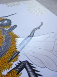
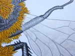
The image below was coloured using Prismacolor Premier Pencils. A video tutorial for colouring the grasshopper can be found here.

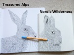
Treasured Alps, Threatened Alps - Click through to read my review, see photos and watch my video flick through

Treasured Alps, Threatened Alps: Colour, Explore, Protect – A Review

Disclaimer – Please read this disclosure about my use of affiliate links which are contained within this post.
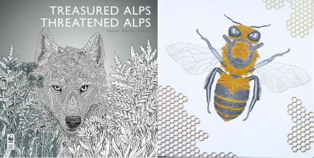
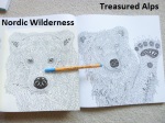
Treasured Alps, Threatened Alps is illustrated by Claire Scully of The Menagerie series, written by Jacopo Pasotti and published by Bergli Books, it is from my personal collection. This book has been created to highlight the plight of a number of endangered species of animals, plants and landmarks in the alps and a portion of the purchase price is donated to the World Wildlife Fund though sadly it doesn’t state how much from each book is donated. The book is expensive compared to most and therefore a considered purchase but I can honestly tell you that it’s worth the price. I’ve been umming and ahhing over purchasing it since it was published in November and I finally bit the bullet a few weeks ago and I truly love it. It’s absolutely huge at nearly 30cm square and it’s really thick due to the paper used. The book is paperback with flexible card covers with a beautiful wolf image on the front that is indicative of the content but not actually included inside the book. The spine is glue and string bound and very sturdy and durable, it’s a little tricky to get the book to lie flat due to it’s thickness but some careful pressure will help this. The 50 images of plants, animals and landscapes are all printed single-sided with information about each one on the opposite page written in English, German, French, and Italian. Each is numbered and named with a brief description of them, their habitat and the reason they’re endangered so you get to learn about each one as you colour it. The paper is bright white, thick and lightly textured, it’s really nice to colour on with pencils, water-based pens don’t bleed or shadow and I’ve even used watercolour paints with a sparing amount of water with great success as you can see in the photos below so you can use any medium you fancy, even alcohol markers if you put protective sheets behind your work and don’t mind bleed-through onto the proceeding page’s information. The image content is mostly animals but also contains 9 images of plants and 4 images of landscapes. These illustrations range from insects including various beetles and butterflies to small mammals and birds including the dormouse and kingfisher all the way up to much larger mammals including wolves and bears. There are recognisable animals that you’ll already know about as well as much less known animals, beautiful images of plants showing them like wildlife guides do or in situ as well as a few landscape images of specific areas that are under threat. None of the images in this book are duplicated in any others, although a few of the animals have been previously illustrated in other books (e.g. bear, wolf, owl), all of this artwork is original so even if you have all of Claire’s books like I do, you won’t be getting repeats!

In terms of mental health, this book is great, it’s really absorbing and all of the images are nature-based which is inherently very calming. All of the illustrations are drawn in Claire’s beautiful signature style, this is very detailed and intricate but don’t be put off, you can always colour over the sections rather than within each one separately and this makes the images much easier to colour. The animals images are by far the most detailed, but the plant images are a fair bit less intricate with far fewer details so there is some range in these levels for your good and bad days. The line thickness is thin throughout, just like always with her art so you will need pretty good vision and fine motor control but not perfect if you’re happy to colour over sections. The artwork is all very natural and really beautiful to look at, even uncoloured it’s just stunning and I’ve spent more time than I care to admit just poring over the pages. The pictures are huge and can take ages to colour if you wish so you can really take your time over them; many have natural stopping points for those with concentration issues who like to finish sections but on the whole these images do require a fair bit of concentration and focus. They look equally amazing coloured in realistic or outlandish colour schemes so you don’t need to feel restricted just because they’re drawn quite realistically. Because the images are printed single-sided, you can really branch out with using mediums you might otherwise struggle to use in books, the paper is really good quality and can take a lot more than most and you can easily use mixed media too with some really great effects and to top it all off, you could carefully remove your finished pages and frame them to gift or display if you wish. The images are beautiful and they really do transport you to the alps, you can practically feel the chill in the air and hear the ringing of cow bells and if you want to fully immerse yourself and gorge on Swiss chocolate whilst colouring then I’d highly recommend that too, it’s all part of the experience!

Overall, I would highly recommend this book, the artwork is beautiful, the cause is really important and best of all the production quality of the book is really high so although it’s expensive, you’re still getting a lot of book for your money and not once have I regretted the cost. If you like Claire’s work then this book is an absolute must-have!

If you’d like to purchase a copy it’s available here:
Amazon UK – Treasured Alps, Threatened Alps
Book Depository Worldwide – https://www.bookdepository.com/Treasured-Alps–Threatened-Alps/9783038690276/?a_aid=colouringitmom

Video Flick-Through

The image below was coloured with Faber-Castell Polychromos Pencils, Staedtler Triplus Fineliners, and the metallic areas were coloured with Kuretake Gansai Tambi “Starry Colors” metallic watercolour paints using very fine brushes for the honeycomb.

Vilin San (Fairy’s Dream) – A Review and WORLDWIDE GIVEAWAY

Disclaimer – Please read this disclosure about my use of affiliate links which are contained within this post.
Vilin San is published and very kindly sent to me to review by Fokus, they have also sent me a second copy to give away and you can enter my Worldwide Giveaway until 23.59 GMT on the 31st of January by clicking this link and following the instructions. Vilin San is a Croatian book and the title translates to Fairy’s Dream, it’s illustrated by Tomislav Tomic, the illustrator of hugely popular Zemlja Snova (Dreamland) and the Dutch edition, Dromenvanger. This book sadly only has half the number of pages but it does come with an exciting added extra and is equally if not even more beautiful than Zemlja Snova. It arrives wrapped in plastic to keep it protected from damage and to keep all parts together (more on this later). The book itself is 25cm square, paperback with flexible card covers, (these are a little thinner and much bendier than Zemlja Snova’s covers) and two-third French flaps which open out to reveal a white line drawing on a blue/purple background, the cover shows a partially coloured image from inside the book. The spine is glue and string-bound and seems quite sturdy and durable and with a bit of work it’ll open up pretty flat, especially over time. The book only has 40 pages, Zemlja Snova had 84, oddly, it’s less than half the thickness, the publishers have said that the paper is identical in both books however it does seem a little whiter, especially than my original edition of Zemlja Snova (the one with the pages out of order) but paper stocks do visually differ sometimes and it does feel and behave the same way so I’m fairly confident in saying the paper is identical. The paper is bright white, thick and lightly textured, water-based pens shadow heavily and may even bleed through so I’d steer clear of these and stick to watercolours with very sparing amounts of water and mostly pastels and pencils which work really well on this paper. The pages are printed double-sided and are a mixture of single (23) and double-page spreads (7 = 14 pages) and also contained is a loose 4 page fold-out poster which is the same size as 2 double-page spreads joined together end to end (see photo below). The images themselves are very similar to those found in Zemlja Snova so if you liked that book then you’ll love this one too, all of the artwork is original and new to this book though it feels familiar because of the content being similar. The illustrations contain fairies, dragons, mushrooms, butterflies, gnomes, birds, sea creatures, mice, palaces and more. The pages are all drawn as scenes and range from underwater scenes to dragons flying, fairies sleeping to hedgehogs being led through a mushroom-lined path, palace scenescapes to fantastical flying birds and so much more. Tomislav has created the drawings very considerately by leaving borders around many and those spanning a double-page having little content near the spine making it much easier to fully colour the page without any frustration of trying to access imagery in the book gutter. The illustrations are all very ornate and really beautiful to look at, this illustrator’s work really is some of the best in the world! For those who are wondering about the image order, there was an issue with 3 double-page spreads being split up in the first edition of Zemlja Snova, this has since been corrected in subsequent editions and I’m pleased to confirm that there are no issues with image order in Vilin San, all of the double-page spreads are matched up as they should be so there’s no need to worry.

In terms of mental health, this book is great for those with a good attention span. If you get overwhelmed by busy or intricate images then this won’t be for you but if you love immersive imagery that truly transports you to another place then look no further, this book is absolutely perfect. It offers so much to look at that it’s the perfect distraction for even the most persistent symptoms and it just draws you in to a magical fantastical world filled with mythical creatures, princes and princesses, castles, fairies and more. This book will be ideal for those of you who love fantasy colouring and also nature because so much of it is animal and scene-based so it’s combined 2 of our favourite things into one incredible book! The smaller number of pages means that it’s less daunting for those wanting to complete a whole book and the poster is great for those who like to work on a much larger project and display it afterwards as it would look fabulous framed once finished and it easily folds away to be tucked into the back of the book away from any damage which is really handy whilst you’re working on it! The line thickness is consistent throughout and remains thin with some spindly thin details. The intricacy and detail levels remain very high throughout so you will certainly need very good vision and fine motor control to enjoy this book if you’re wanting to colour within each outlined section though it won’t need to be quite so good if you’re wanting to colour over some areas and leave the lines underneath as texture. I would highly recommend investing in a T’Gaal sharpener so that you can keep your pencils as sharp as possible! The illustrations are absolutely packed with detail and things to look at and notice, despite having Zemlja Snova for over a year now, I’m still noticing new things and spot things I’ve never seen before when looking at other people’s finished pages and I’m absolutely certain this will be the case with Vilin San too. The imagery is honestly spectacular, there aren’t many books I’m blown away by now but this one really is incredible, each image is a work of art, there are no filler pages, no random half-finished art, each page has clearly been painstakingly created and each will take hours if not days to complete. The pages in this book aren’t quick to finish but there are lots of natural stopping points within each image so that you still get a sense of accomplishment without managing to finish a page in one sitting and these all range in size from a tiny bird or gnome all the way up to a forest of trees or giant dragon so you can pick a project of the right size for each colouring session! I adore this book, even just flicking through the pages gets me out of my head and calms my anxiety down and colouring it is just so much fun because you can use any colours you fancy from more natural colours to fantastical colours like blue for tree trunks and oranges or purples for leaves, in a fantasy world the only limit is your imagination and these images will look amazing no matter what colours you choose!

Overall, I can’t recommend this book highly enough, it’s a shame that it’s half the number of pages and even more of a shame that the price doesn’t reflect this and is the same as Zemlja Snova but those criticisms aside, the book and the artwork itself is truly perfect and gorgeous in every way. Tomislav’s artwork is some of the best I’ve ever seen and I really hope he’ll continue to make many more books because no matter how many times I flip through the same pages, I’m still as drawn in and transported as I was the first time I saw each illustration and that’s a really impressive feat!

If you’d like to purchase a copy then you can order it from the publisher’s site here. I would strongly advise against ordering from Etsy or third-party Amazon sellers because the prices there seem to be extortionate. The easiest and cheapest way of getting hold of a copy is to join a group order as this reduces the cost of shipping per book to a more reasonable level. I run a FB fan group for Tomislav’s work and there we also organise a lot of group orders to various countries worldwide including the UK, many other European countries, the US, Australia, Canada, and New Zealand, please do join the group if you’d like to sign up to one of these orders or just to share your coloured pages or look for inspiration, we’d love to have you!

Don’t forget, I’m currently running a Worldwide Giveaway for a copy of this book, to enter click here and follow the instructions before it closes at 23.59 GMT on the 31st of January.

Photos of the book can be found directly below the videos.

Unboxing, Flip Through and Review

Silent Flip Through

Mysterious Planets - Click through to see photos, video and read my written review.

Mysterious Planets Coloring Book – A Review

Disclaimer – Please read this disclosure about my use of affiliate links which are contained within this post.
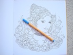
Mysterious Planets Coloring Book is illustrated by Ai Kohno and published and kindly sent to me to review by St Martin’s Press. This book is paperback with flexible card covers and a glossy paper dustjacket which can be removed to prevent damage or scuffing and reveals black line drawings of the planets from inside the book on the brown card covers. The book measures 25cm square and the images are printed double-sided. The spine is glue and string-bound making it durable and strong. The images are a mixture of single and double-page spreads so some do enter the spine but the majority of the image can be reached once the spine has eased up a little. The paper is bright white, medium/thick and lightly textured, it doesn’t bleed but does shadow a little with water-based pens though this is very minimal but do be careful; pencils work well on the paper and layer and blend well. The illustrations are separated into chapters which are each dedicated to a type of planet, there are 7 chapters in total, 6 different planets (Forests, Sea, Snow, Flowers, Sweets, and Magic) and the final chapter is back in the little girl’s bedroom. At the back of the book are 7 pages of illustrated letters printed with a pale peach background, all of which are fully colourable. The images contain all manner of things from forest scenes, animals, buildings, ocean scenes, realistic imagery, outlandish scenes, fish and sea creatures, a Christmas sleigh, snowflakes, vases of flowers, cupcakes, gingerbread houses, slices of pie, portraits, a dinner party, and one page is printed on vellum-style paper which is translucent and has a jewelled frame and crown printed on it that when laid on either side perfectly frames the left and right image of a goose and a girl which is very clever and extremely unique, I’ve never seen anything like this in a colouring book before.

In terms of mental health, this book is pretty good, it’s not realistic or based on reality and so it offers a good level of escapism and is ideal for those who feel required to colour realistically because you can really go to town with your colours and use whatever scheme you fancy. The line thickness is consistent throughout and remains thin, it’s not quite black and is more of a dark grey though it’s still very visible but contrasts a bit less than normal colouring books do. The intricacy and detail levels vary a little but mostly remain at a moderate level, none of the images are hugely intricate but they’re not full of large open spaces either, it’s a very good intermediate sort of level and therefore the book would suit those with moderate to good vision and fine motor control. The content is lovely and very whimsical, older children would surely like it and it’s quite child-friendly but not childish. It would be a great book for those with a good imagination who like to have prompts for escapism, you can easily imagine yourself travelling to each of these planets and lands and this is sure to help you forget about your symptoms and feel just a little bit happier and calmer for a while. Books like this are great for reminding us of carefree days as children, it certainly reminded me of many happy times reading the Enid Blyton Faraway Tree stories and my particular favourite land there, The Land of Take What You Want and I would always imagine sweets and chocolates and all of my favourite things. There is space where you can add your own backgrounds and imagery if you wish but this is by no means compulsory and the images will certainly look finished without any additions besides colour.

Overall, this is a lovely book, the content is wide-ranging and interesting and ideal for both children and adult colourists. You can really go to town with outlandish colour schemes and let your imagination run wild.

If you’d like to purchase a copy it’s available here:
Amazon UK – Mysterious Planets Coloring Book
Book Depository Worldwide – https://www.bookdepository.com/Mysterious-Planets-Ai-Kohno/9781250117274/?a_aid=colouringitmom

The image below was coloured with Stabilo 68 Fibre-Tip Pens.

From Holland with Love - Click through to read my review, see photos of inside and watch a video flick through

From Holland With Love – A Review

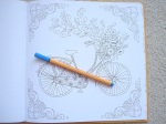
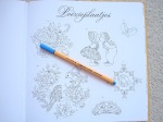
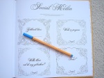
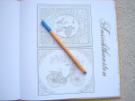
From Holland With Love is illustrated and kindly sent to me to review by Masja van den Berg and is published by Pepper Books. This book is the sixth book published by Masja and her five previous titles were all variations of paisley-filled designs under the title of Mijn Wonderlijke Wereld (My Wondrous World). This sixth book is a little different and is more like a love letter, or love drawing if you will, from Masja to and about Holland. The book itself is 25.5cm square, it’s hardback this time with a beautiful glowing orange cover and a compilation image of various illustrations contained within the book in blue and white. The spine is glue and string bound and relatively difficult to get it to lie flat due to it being hardback. The pages are printed single-sided and are perforated meaning you don’t have to contend with the page gutter and try to colour into it and that you can remove the pages before or after colouring in order to frame or gift them. The paper is bright white, thick and lightly textured, pencils blend and layer beautifully and water-based pens shadow but don’t bleed through, alcohol markers will bleed through so do put a protective sheet behind your work to protect the next page. The illustrations contain lots of typically Dutch objects and scenery from clogs to windmills, tulips to traditional dress and a bicycle amongst other beautiful floral patterns, drawings of women and some lovely birds. The imagery is really varied and far less paisley-filled than the previous titles but don’t despair if you love those, they don’t feel like they’re missing from this work and the illustrations are really lovely and very pretty. At the back of the book are three pages of images that can be cut out for projects, a page of card toppers, a page of social media tags where you can add your name instead of having to watermark your photos and a page including 2 small postcard style designs all of which are illustrated and colourable.

In terms of mental health, this book is great, it’s not overwhelming to colour and has enough detail to be interesting and absorbing, without being overly complex or over-stimulating. The content is familiar, fun and cute and much of it could be coloured in any palette you choose and look equally fabulous. The line thickness is mostly consistent and remains thin with a few images drawn in a spindly thin line. The intricacy and detail levels vary and range from very intricate on some of the postcard size images and social media tags to larger, more open spaces in some of the colouring pages and everything in between, you’ll need moderately good vision and fine motor control for the majority of the images and better levels for a few of the most intricate pages. A few of the pages will require a high level of concentration but many won’t need you to be at your best and require less focus so this is a good book for those of you with varying concentration levels. The pages also consist of varying amounts of content which means they take differing lengths of time to complete and there are natural stopping points if you just want to colour one section. These images would look really beautiful framed and this book would be an ideal gift for those who live in Holland, are from there, or who just love all things Dutch, it’s so representative and beautiful, I’m sure it would be a very well-received gift!

Overall, I would highly recommend this book, it’s beautiful for those who love all things Dutch and those just wanting to colour more of Masja’s gorgeous illustrations. The production quality is very high and the images are really lovely to colour.

If you’d like to purchase a copy, it’s available to buy here:
Amazon UK – From Holland with Love
Masja’s Website – https://www.masjaswebshop.nl/

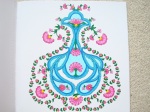
The image below was coloured with a single Prismacolor Premier Pencil and a Caran d’Ache Blender Pencil.

Mijn Wonderlijke Wereld Part 5 - Click through to read my review, watch my flick through and see internal photos

Worldwide Giveaway and Review – Mijn Wonderlijke Wereld (My Wondrous World) Part 5

Mijn Wonderlijke Wereld Part 5 was illustrated and kindly sent to me to review by Masja van den Berg. Masja has very kindly sent me an extra copy of this title and part 4 and I’m currently running a Worldwide giveaway for them both over on my FB page, click here to enter by midnight GMT on the 11th of November. This book is the fifth in her series of books and my reviews of her other titles can be found HERE and she’s already created 2 more books with different titles since these. Part 5 ventures further afield than the first three books and takes us on an exotic journey through the Orient with Chinese and Japanese art and animals featured. The book itself is paperback, nearly 24.5cm square, with a gorgeous turquoise cover with beautiful gold foiled accents on a Chinese dragon image found inside the book. The spine of the book is glue-bound and therefore a little tricky to get it to lie flat unless you break the spine which could eventually lead to pages loosening, however the pages this time are perforated which is ideal if you want to remove them for colouring or framing. The images are printed single-sided this time and all of the images are therefore single page designs. The paper is white, thick (thicker than all of her previous books) and lightly textured, it provides a good surface for blending and shading pencils, it doesn’t bleed or shadow with water-based pens and alcohol markers will be fine to use as long as you pop some protective sheets behind your work. The content is all drawn in Masja’s signature paisley style so while the images are Oriental themed, they’re very similar to the previous books and existing fans of her work won’t be disappointed. The images contain all manner of things from Chinese dragons, koi carp, ornaments, mandalas, patterns, cranes, cherry blossom, ponds, and more. The illustrations are very floral and delicate and contain a mixture of scenes and patterns, full page designs and centralised images.

In terms of mental health, this book is lovely, it’s very calming and absorbing without requiring too much concentration so it’s a great book for good and bad days. There’s a real variety in the amount of content on each page so you can easily choose a smaller, simpler design to focus on when you’re having a bad day, or a much more complex spread when you’re feeling well, none of the images are overwhelming as they’re all contained to one side so the book feels very accessible. The line thickness is pretty consistent throughout and is thin but not spindly thin so you’ll need fairly good vision and fine motor control but certainly not perfect. The intricacy and detail level varies a lot from larger open spaces to much smaller spaces where Masja has filled the creatures and designs with patterns though of course you can always colour over these small sections rather than within each one if you prefer to colour larger areas. There are plenty of spaces where you can create your own backgrounds or add your own imagery if you wish but this is by no means a requirement and the pages will look lovely regardless. Masja’s work is very soft and flowing, there aren’t any straight lines and this really helps to create a natural, calming world that you can escape into whilst colouring. The images have a great mixture of realism and imagination added to them so they look equally good coloured realistically or outlandishly and you could even mix the two throughout the book.

Overall, I would highly recommend this book to anyone who’s already a fan of the series, and those who are intrigued and new to it, the images are lovely, very cohesive, and really natural and calming and they look beautiful once splashed with realistic or imaginative colour schemes.

If you’d like to purchase a copy of this book, it’s available here: https://www.masjaswebshop.nl/

I’m also currently running a giveaway for a UK resident to win a copy of this, and book 5 in the series. The competition runs until midnight GMT on the 11th of November and can be entered here.

The image below was coloured using Stabilo 68 Fibre-Tips.