Staedtler

Treasured Alps, Threatened Alps - Click through to read my review, see photos and watch my video flick through

Treasured Alps, Threatened Alps: Colour, Explore, Protect – A Review

Disclaimer – Please read this disclosure about my use of affiliate links which are contained within this post.
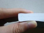
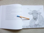
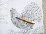
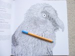
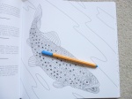
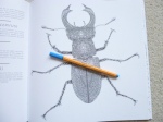
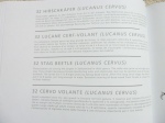
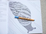
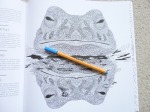
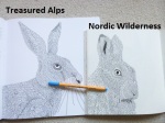
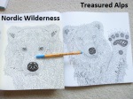
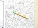
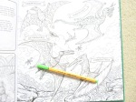
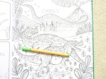
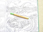
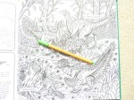
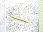
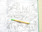
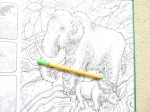
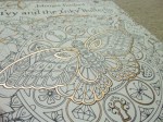
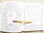
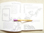
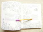
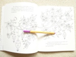
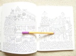
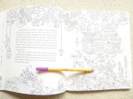
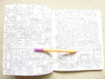
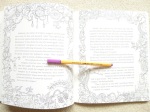
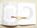
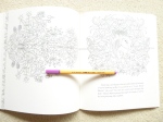
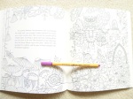
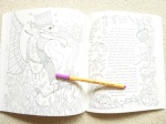
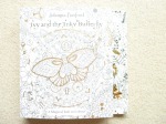
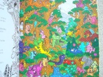
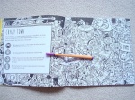
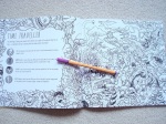
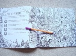
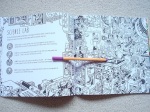
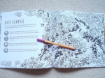
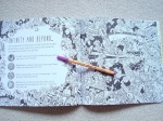
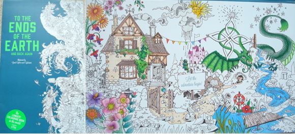
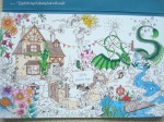
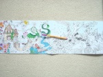
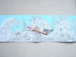
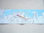
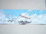
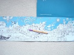
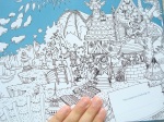
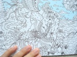
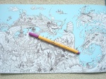
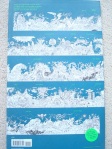
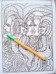
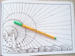
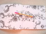
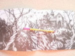
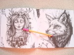
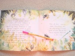
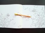
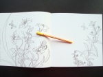
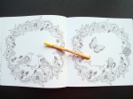
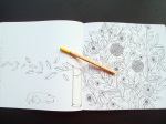
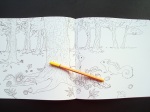
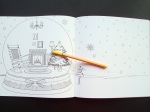
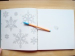
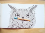
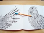
Treasured Alps, Threatened Alps is illustrated by Claire Scully of The Menagerie series, written by Jacopo Pasotti and published by Bergli Books, it is from my personal collection. This book has been created to highlight the plight of a number of endangered species of animals, plants and landmarks in the alps and a portion of the purchase price is donated to the World Wildlife Fund though sadly it doesn’t state how much from each book is donated. The book is expensive compared to most and therefore a considered purchase but I can honestly tell you that it’s worth the price. I’ve been umming and ahhing over purchasing it since it was published in November and I finally bit the bullet a few weeks ago and I truly love it. It’s absolutely huge at nearly 30cm square and it’s really thick due to the paper used. The book is paperback with flexible card covers with a beautiful wolf image on the front that is indicative of the content but not actually included inside the book. The spine is glue and string bound and very sturdy and durable, it’s a little tricky to get the book to lie flat due to it’s thickness but some careful pressure will help this. The 50 images of plants, animals and landscapes are all printed single-sided with information about each one on the opposite page written in English, German, French, and Italian. Each is numbered and named with a brief description of them, their habitat and the reason they’re endangered so you get to learn about each one as you colour it. The paper is bright white, thick and lightly textured, it’s really nice to colour on with pencils, water-based pens don’t bleed or shadow and I’ve even used watercolour paints with a sparing amount of water with great success as you can see in the photos below so you can use any medium you fancy, even alcohol markers if you put protective sheets behind your work and don’t mind bleed-through onto the proceeding page’s information. The image content is mostly animals but also contains 9 images of plants and 4 images of landscapes. These illustrations range from insects including various beetles and butterflies to small mammals and birds including the dormouse and kingfisher all the way up to much larger mammals including wolves and bears. There are recognisable animals that you’ll already know about as well as much less known animals, beautiful images of plants showing them like wildlife guides do or in situ as well as a few landscape images of specific areas that are under threat. None of the images in this book are duplicated in any others, although a few of the animals have been previously illustrated in other books (e.g. bear, wolf, owl), all of this artwork is original so even if you have all of Claire’s books like I do, you won’t be getting repeats!

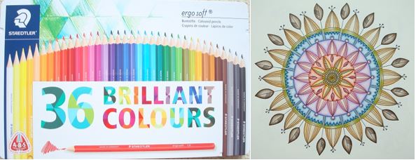
In terms of mental health, this book is great, it’s really absorbing and all of the images are nature-based which is inherently very calming. All of the illustrations are drawn in Claire’s beautiful signature style, this is very detailed and intricate but don’t be put off, you can always colour over the sections rather than within each one separately and this makes the images much easier to colour. The animals images are by far the most detailed, but the plant images are a fair bit less intricate with far fewer details so there is some range in these levels for your good and bad days. The line thickness is thin throughout, just like always with her art so you will need pretty good vision and fine motor control but not perfect if you’re happy to colour over sections. The artwork is all very natural and really beautiful to look at, even uncoloured it’s just stunning and I’ve spent more time than I care to admit just poring over the pages. The pictures are huge and can take ages to colour if you wish so you can really take your time over them; many have natural stopping points for those with concentration issues who like to finish sections but on the whole these images do require a fair bit of concentration and focus. They look equally amazing coloured in realistic or outlandish colour schemes so you don’t need to feel restricted just because they’re drawn quite realistically. Because the images are printed single-sided, you can really branch out with using mediums you might otherwise struggle to use in books, the paper is really good quality and can take a lot more than most and you can easily use mixed media too with some really great effects and to top it all off, you could carefully remove your finished pages and frame them to gift or display if you wish. The images are beautiful and they really do transport you to the alps, you can practically feel the chill in the air and hear the ringing of cow bells and if you want to fully immerse yourself and gorge on Swiss chocolate whilst colouring then I’d highly recommend that too, it’s all part of the experience!

Overall, I would highly recommend this book, the artwork is beautiful, the cause is really important and best of all the production quality of the book is really high so although it’s expensive, you’re still getting a lot of book for your money and not once have I regretted the cost. If you like Claire’s work then this book is an absolute must-have!

If you’d like to purchase a copy it’s available here:
Amazon UK – Treasured Alps, Threatened Alps
Book Depository Worldwide – https://www.bookdepository.com/Treasured-Alps–Threatened-Alps/9783038690276/?a_aid=colouringitmom

Video Flick-Through

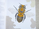
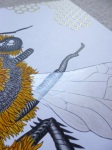
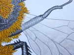
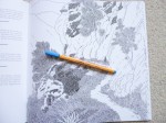
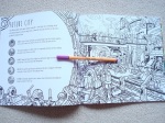
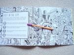
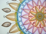
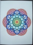
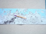
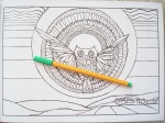
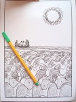
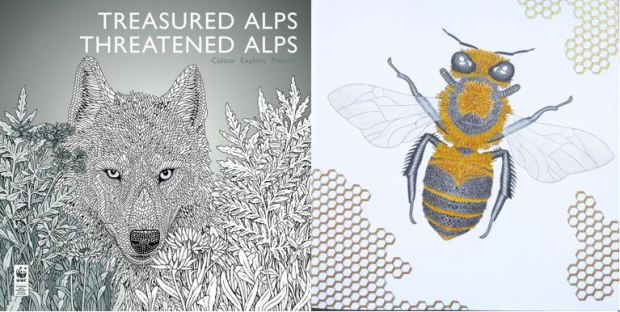
The image below was coloured with Faber-Castell Polychromos Pencils, Staedtler Triplus Fineliners, and the metallic areas were coloured with Kuretake Gansai Tambi “Starry Colors” metallic watercolour paints using very fine brushes for the honeycomb.

The Book of Prehistoric Beasts – A Review

Disclaimer – Please read this disclosure about my use of affiliate links which are contained within this post.
The Book of Prehistoric Beasts is illustrated by Angela Rizza, published and kindly sent to me to review by Buster Books. This book is enormous, at a whopping 29cm square, it’s hardback with gorgeous deep green covers and all printing on both covers is silver foiled so it’s a really luxurious feeling book! The spine is glue and string-bound and very durable, it’s a little tricky to get to the very centre of the images but this is only a few millimetres. The images are printed single sided and on the back of each page is lots of information about each creature that is pictured including its name, size, diet, what it looked like, when it lived and facts about its environment. The paper is bright white, medium thickness and smooth, it takes soft pencils well but harder pencils may be a struggle to build up layers for blending due to the lack of tooth; alcohol makers will bleed through the page which you may not mind if you don’t wish to read the information on the back, and water-based pens don’t bleed or shadow, though do test them in an inconspicuous area to check. The book starts with a double-page spread showing the timeline of creatures and they’re shown in this order through the book from the earliest period, Devonian, 419.2 million years ago, all the way up to Quaternary, 2.6 million years ago. The images are split into 4 chapters including different time periods: Devonian, Carboniferous and Permian; Triassic and Jurassic; Cretaceous; and Tertiary and Quaternary. The images themselves are all full page spreads, each containing a few prehistoric creatures. A huge number of creatures are pictured, 87 in fact, and these mainly consist of dinosaurs but do include other, older creatures (I’m not sure if these class as dinosaurs) and younger creatures; the beasts include: gigantoscorpio, dimetrodon, ammonite, icthyosaurus, brachiosaurus, archaeopteryx, microraptor, tyrannosaurus, quetzalcoatlus, mononykus, triceratops, basilosaurus, megalodon, glyptodon, mammuthus, smilodon and gigantopithecus, and so many more, all of the creatures are pictured on the double-page timeline at the beginning of the book and then shown drawn in their habitats and to scale in the colouring pages. This book is every dinosaur-lovers’ dream, my brother was obsessed with dinosaurs growing up and I was therefore forced into knowing an awful lot more about them than I wanted to at the time, knowledge that has come in handy for many random reasons since and this book definitely covers all of the most well-known dinosaurs and prehistoric creatures, as well as others that you may never have heard of and can start to research if you wish.

In terms of mental health, you’re unlikely to find a more distracting book. The production quality is very high and from the cover and the very first page, you’re transported back in time to millions of years ago where gigantic beasts roamed the land and the landscape was unrecognisable, you instantly become immersed in this world as you learn facts about the animals and start to colour them and their habitats. It’s not calming as such, not in the same was as colouring landscapes and more familiar animals, but it’s really is very distracting and absorbing which is great for those of us with anxious, racing minds. The line thickness is consistent throughout and remains medium and thin. The intricacy and detail levels are quite variable depending on the creature and its landscape but there are a lot of details drawn in as well as a lot of dotted shading (ideal for beginner colourists who want to learn more about colouring realistically and learning where light and shade should be), therefore you will need moderate to good levels of vision and fine motor control to enjoy this book. This book is actually published with kids in mind though they’ll need to be quite mature and artistic to get the most out of it and have a good reading age as there are a lot of tricky animal names to contend with, at a guess, I’d suggest this book for kids aged 8 and above and I’d highly recommend it for big kids (adults!) too because we could all do with learning just a little bit more about the fascinating world of dinosaurs. The illustrations have been very cleverly curated to mostly include more than one creature and sometimes all of them are land or sea creatures and other time part of the image is above ground and other sections are underwater. None of the images feel random, haphazard or badly staged, they’re all really well-drawn and feel quite like uncoloured versions of the images found in regular dinosaur fact books and encyclopaedias. The scenes and animals are drawn pretty realistically and mostly don’t have patterns added to them unless it’s assumed they had those in real life, obviously there may be some inaccuracies as with most historic representations of velociraptors which show them featherless and significantly larger than they possibly could have been, but the artist has clearly worked hard to make these look as realistic as possible within the confines of the majority only being found as fossilised skeletons and a lot of guesswork having to be done about their external features, colouring and patterns.

Overall, this is a great book for those who already love prehistoric beasts, and those wanting to know more. The book is ideal for children and adults and the pages look amazing once coloured and you could even remove them from the book and frame them for you dinosaur-fanatic children (or yourself) if you wish, they’d look great as a series on the wall in a bedroom or playroom or even a classroom! The paper is pretty good and the facts and information about each beast is a huge added bonus.

If you’d like to purchase a copy of the book, it’s available here:
Amazon UK- The Book of Prehistoric Beasts
Book Depository Worldwide – https://www.bookdepository.com/The-Book-of-Prehistoric-Beasts-Jonny-Marx-Angela-Rizza/9781780554976/?a_aid=colouringitmom

The image below was coloured using Prismacolor Premier Colored Pencils.

Ivy and the Inky Butterfly: A Magical Tale to Colour (UK Edition) – A Review

Disclaimer – Please read this disclosure about my use of affiliate links which are contained within this post.
Ivy and the Inky Butterfly: A Magical Tale to Colour is illustrated and very kindly sent to me to review by Johanna Basford, it is published by Virgin Books. I have also been sent a US edition of the book and will write a comparison post just as soon as I can, do subscribe to my blog on the right-hand side to be the first to know when it’s live. This book is the sixth colouring book illustrated by colouring queen, Johanna Basford and this meant it was time for a bit of a change, this time it’s a different shape, somewhat different style and contains a story that she’s written based on a bedtime story she’s told her daughter Evie but what isn’t different is the charm, beauty and wonderfulness that we’ve come to expect from Johanna’s books, this book has those in spades!

The book itself measures 21.5 x 25cm making it the same height as the UK editions of Magical Jungle and Johanna’s Christmas but almost 4cm narrower as it’s not square. It’s paperback with flexible card covers with ½ French Flaps which open out front and back to reveal a flower, leaf and butterfly design that is fully colourable, this isn’t waxy and is very smooth so it should be fully colourable with most mediums including pencils and water-based pens, be very careful with alcohol markers bleeding through to the external covers. The spine and covers are white with black text, the cover has coppery/bronze foiling accents which is quite subtle and very luxurious and aids the traditional storybook feeling! The spine is glue and string-bound which makes it very durable and easier to open out flat so you can reach the majority of the gutter and colour it. The paper is the same as that used in UK editions of Magical Jungle and Johanna’s Christmas, this paper was found through a global hunt and it’s beautiful, it is not the same paper as used in the US editions of these books which was created specifically for Johanna’s books and named after her. The paper is a very pale ivory colour, it’s a medium thickness and lightly textured and it’s perfect for pens and pencils; pencils are a dream to blend and shade with and pens go on really smoothly, they don’t bleed through unless you use alcohol markers and water-based pens only shadow if you colour too much in one spot, as always, do check all of your mediums on the colour palette test page to check how your mediums behave.

Upon opening the book, you find the beautiful title page, followed by the introduction and name page, the copyright page is at the back at the bottom of the End page. There isn’t an official treasure hunt in this book but Johanna has hidden over 200 butterflies throughout the pages for you to find, some are very obvious and some are much better hidden and there aren’t any answers or clues to where they are so you may be left scratching your head if you can’t find them all. The images are printed double-sided throughout, I know lots of people aren’t a fan of this but it really wouldn’t have worked with single-sided pages as the story wouldn’t have flowed and the book would have weighed a ton, as it is it contains 120 pages so it’s much thicker than all of the previous titles and has so much content packed in that this could be a lifetime project!  The story has been written by Johanna and it’s thoroughly lovely, exciting and far more complex than I expected. I’m not sure what age range it’s aimed at but there is some fairly complex language included so at a guess I’d suggest probably age 6-8 and above, and possibly older if the children are wanting to read it themselves, depending on their reading ability. The text isn’t on every page and those it is on it’s been very cleverly incorporated and illustrated around so that it doesn’t feel like a colouring book with text shoe-horned it, it feels like an illustrated storybook with images on every page and text on the vast majority. The images vary a huge amount, this book has by far the largest range of content of any of Johanna’s books and it’s absolutely packed with different items to really challenge you to learn to colour all sorts of types of things including gems, metal, feathers, fur, skin, water, and so much more. The images are also drawn in a huge range of styles including ribbons, centralised images, full double-page scenes, mandalas, symmetrical sections, portrait-style images, illuminated manuscripts, borders, frames and more. The content of the images matches the story and without giving too much away, this involves Ivy following an Inky Butterfly out of a portrait, through a hidden door and into a magical world where she meets some lovely friends and creatures and encounters a gigantic flower garden, a magpie shop owner, a mouse, elves, dragons and more. The images contain all manner of things including flowers, leaves, mushrooms, food, lanterns, trinkets, bees, tree houses, stilted water houses, jewellery, maps, stars, berries, a griffin, treasure, and owl, I could go on forever! This book does still have a lot of flowers, leaves and trees but there are so many other things interspersed that you can certainly give your green pencils and pens a bit of a rest and start learning all sorts of techniques to really challenge yourself and make things look realistic if you wish. The images are truly beautiful, I’ve spent more hours than I care to admit flicking through this book for the last few days and every single time I find more items I didn’t notice before. One thing I really noticed and which I’m absolutely in love with about this book is the subtle nods to all of Johanna’s previous books, from a picture of flamingos on the wall in the Wonder Room and another of elephants (both from Magical Jungle), to the cuckoo clock on the wall that was pictured in Johanna’s Christmas, a crab postcard, fish and ships in bottles like those found in Lost Ocean, there are dragons, castles and treehouses similar to those in Enchanted Forest and flower upon flower from Secret Garden (as well as heaps of new ones, don’t panic), none of the content feels samey, boring, or repetitive, but it’s so lovely to have little reminders of the previous books which really helps tie them all together and certainly made me wonder if all of those previous books might have been places and lands that Ivy, or her grandfather might have travelled to in the past. Some of the images are really packed with illustrations and others are much more open with space to add your own imagery or backgrounds if you wish. There aren’t a great deal of images of Ivy because Johanna knows that a lot of us struggle with colouring skin tone and she’s not a fan of drawing people though she’s done a fabulous job of all of the images of Ivy that there are but this book certainly isn’t intimidating for those of us whose current level of skin-tone colouring is a block of peachy-pink!

In terms of mental health, I’m not sure this book could be better, it offers a great project in a number of ways and it is so distracting. The story itself is absolutely lovely and very absorbing, the images follow it really well but also leave plenty of room for you to use your own imagination and get lost in Ivy’s journey to Enchantia. The images are all different sizes so this book is really adaptable for those with fluctuating conditions and these range from small motifs of one bee or a couple of fish, all the way up to completely packed double-page spreads that have almost no un-illustrated spaces and everything in between, no matter how you’re feeling you’ll be able to find a section that’s suitable and that will give you a sense of accomplishment. You can really use this book to challenge yourself to learn new techniques if you wish but it’ll look equally beautiful block coloured in your brightest, weirdest colour combinations, the sky really is the limit! For those of us who often struggle to know what to colour or pick a page it could be a great idea to work through this book cover to cover and just colour each page in turn so that you don’t have to keep deciding, or you can just dive in to your favourite page and start there, it really doesn’t matter. I know a lot of people want to fully colour a copy of this book as a gift for children in their life and having now seen the book, this would make the most amazing gift and heirloom that children for years to come would adore and cherish but my goodness is it an undertaking, it’ll take such a long time to complete but it’ll be so worth it and you could even start it off for a child and then get them to carry it on. What a wonderful experience it would be to read the story and colour the book together! The line thickness is the same as always, thin and sometimes spindly thin. The intricacy and detail levels have increased again since Magical Jungle and are much more similar to Secret Garden and the less detailed parts of Lost Ocean so you will need pretty good vision and fine motor control because while the intricacy and detail levels do vary throughout, the majority are quite high because of the sheer amount of content and objects in each image. I have personally found this book really calming, the story is very reminiscent of those from my childhood and nostalgia can be very comforting, it’s just really heart-warming both in the words and the imagery and it really helps your worries melt away, it lifts your mood and the world doesn’t feel like such a dark place for a while, it’s perfect!

Overall, I really can’t recommend this book enough, it’s beautiful and I know some people were a bit upset about it having text added this time but it adds so much to the book and loses none of the illustrative content because of the larger number of pages. You don’t need to have kids or be a child to enjoy this book, I don’t have kids and my goodness have I been enjoying it, especially knowing that no one will be “adding” to my colouring or dog-earing the pages but it’ll make a wonderful project or gift for the children in your life if you choose to share it with them. Johanna really has outdone herself, the new objects and types of imagery are fantastic and really add a lot to the book and I honestly can’t express just how beautiful and perfect this book is when it’s actually in your hands, I can’t imagine anyone being disappointed with it!

If you’d like to purchase a copy, it’s available here:
UK Edition
Amazon UK – Ivy and the Inky Butterfly: A Magical Tale to Colour
Book Depository Worldwide – https://www.bookdepository.com/Ivy-and-the-Inky-Butterfly-Johann-Basford/9780753545652/?a_aid=colouringitmom
US Edition
Amazon UK – Ivy and the Inky Butterfly: A Magical Tale to Color
Book Depository Worldwide – https://www.bookdepository.com/Ivy-and-the-Inky-Butterfly-Johann-Basford/9780143130925/?a_aid=colouringitmom

The image below was coloured with Staedtler Ergosoft Coloured Pencils.

Exploratorium - Ideal for child and adult colourists, fans of Doodle Fusion and Kerby Rosanes's artwork will love this book. Click through for the review, video and photos!

Exploratorium: A Search and Colour Mission – A Review

Disclaimer – Please read this disclosure about my use of affiliate links which are contained within this post.
Exploratorium: A Search and Colour Mission is illustrated by Lei Melendres and published and kindly sent to me to review by Michael O’Mara Books. This book is 25cm square, the same size as the bestsellers, paperback with black covers and coloured elements from inside the book on the covers. The spine is glue and string-bound and relatively tight but it does become more pliable with use so that you can reach the majority of the image to colour it. The images are printed double-sided and all of them are double-page spreads. The paper is bright white, medium thickness and lightly textured, it takes pencil well and water-based pens don’t bleed but do shadow a little so you may not want to use these but it should get covered when colouring the other side. This book is primarily aimed at children, however, the images are pretty detailed and packed with content and therefore plenty of adults will love it too. The book starts with a short introduction explaining the premise of the book, it’s a search and find colouring mission so there are a list of objects depicted which can be found within the pages. Following this, each double-page spread is dedicated to a different world and these drastically range in theme from space and future-themed to prehistoric and historical, there are heaps and heaps of scenes from a circus to haunted house, alien invasion to science lab, candy land to the North Pole, skate park to volcano and time travel to under the sea and so much more, there is a really wide scope to the content and something to suit everyone. Lei’s art style is most similar to Kerby Rosanes’s and is very much drawn in a doodle style, the images are packed with alien creatures and strange forms and the content is really quirky, whimsical and fun. The search and find aspect is surprisingly difficult for a book that’s aimed at children, my boyfriend spent ages searching for the items in one of the spreads and in the end had to give up on the last one and look at the answers, luckily there are thumbnail pictures of the spreads at the back that identify where the hidden creatures and objects are so there’s no need for frustration if one or two elude you.

In terms of mental health, this book is pretty good, the pages are packed with content and are very distracting, there’s loads to look at, to hunt down, and then to colour and this book really will keep you occupied for hours. It’s certainly not a calming book so those of you with anxiety or a racing mind may want to keep this book for calmer days but the content is quite invigorating so those suffering from low mood may well be perked up by the humour often depicted and added into the scenes. The line thickness is fairly consistent within each page but differs between them as do the intricacy and detail levels, all have a lot of content but some are much more detailed and fine-lined than others so do check out the photos and video flick-through as you’ll need fairly good vision and fine motor control to get the most out of this book, it’s certainly not well-suited to young children, probably advanced 8 year olds and up. While the content isn’t nature-based, the fantasy elements and imagination of it all are great for absorbing you into a far off land in the past or future which is often better than the here and now and is great for keeping your mind busy and focused on the task at hand rather than any troublesome thoughts or symptoms you might be experiencing. A lot of the images are filled with wacky, surreal creatures and therefore don’t have a “real” colour scheme that you need to follow so you can really go to town and use any colour you fancy and it’ll look equally fabulous and even the realistic aspects can be spiced up by unusual colour schemes like trees with blue trunks and orange leaves, purple pumpkins or red rocks, just grab a pen or pencil and get colouring and you’ll soon be fully immersed in this intricate, doodle-filled world.

Overall, I would highly recommend this to older kids and adults, it’s great fun to hunt the hidden items and to colour and the different scenes make for a really varied colouring experience with each scene being different from the last and transporting you to a far off place. This book is surreal, wacky and a joy to colour for the young, the old, and everyone in between!

If you’d like to purchase a copy, it’s available here:
Amazon UK – Exploratorium: A Search and Colour Mission
Book Depository Worldwide – https://www.bookdepository.com/Exploratorium-Lei-Melendres/9781910552759/?a_aid=colouringitmom

You can see my silent video flick-through of the book here.

The page below was coloured using Staedtler Fibre-Tip Pens.

Staedtler Ergosoft Pencils: 36 Set Click through to see the 12 new shades and read my review!

Staedtler Ergosoft Triangular Coloured Pencils: 36 Colours – A Review

Disclaimer – Please read this disclosure about my use of affiliate links which are contained within this post.
Staedtler Ergosoft Triangular Coloured Pencils: 36 Set are made and kindly sent to me to review by Staedtler, a well-known German Stationery brand. These pencils are endorsed by Johanna Basford (colouring queen) so I was very excited to see what all the fuss is about and if they’d live up to expectations. The pencils are wax-based, I usually prefer oil-based but these (and Prismacolor Premiers) are definitely changing my mind. They have triangular barrels which are entirely coated in the exact colour of the pencil lead so they’re very easy to identify with little need for a colour chart. Each side of the pencil carries printed information: Staedtler ergosoft, space to write your name (ideal for kids or those going to art classes who want to identify their own supplies easily), and the colour number. The pencils arrive pre-sharpened and are very easy to sharpen in a normal sharpener, despite the triangular shape and they sharpen to a really nice point. The pencils are now available in 36 different colours and I was sent the 36 set to review which come in a single layer tin (ideal for having out whilst colouring and not losing your pencils). Other sets available are the 12 set in a blue stand-up box, the 12 set in a cardboard box, the 24 set in a Johanna Basford themed cardboard box and 24 set in a blue stand-up box, the pencils are also available as open stock meaning you can order one or two to trial before buying a full set if you’re unsure. The ergosoft pencils are also available in watercolour so do check what you’re ordering, I will be reviewing the watercolour ergosoft pencils at a later date (the major visible difference between the two is that the watercolour pencils have a blue barrel and a coloured tip – see photo below).

The pencils themselves are smooth to touch and the ergonomic triangular design makes them very comfortable to hold which is ideal for those of us with joint problems, issues with grip strength or easily dented fingers, I have lots of problems with the shape of pens and pencils, especially when colouring for long periods of time for reviewing, and these are one of the comfiest sets I’ve come across. The pencil leads have a white coating which adheres the leads to the wooden pencil sheath and this protective coating helps to reinforce the lead core in order to prevent breakage. I have used these pencils for a long time and have had no issues with breakage or problems with sharpening so these are very well-made. The leads are quite hard but they have a good vibrant pigment meaning you get a bright colour without needing a lot of pressure. However, because the leads are quite hard, you do need to use quite a bit of pressure when colouring toothier paper so I’d advise these for smoother paper if you have joint problems or you’re going to have to press quite hard to get a bold, full colour with no white gaps. I also noticed that while the pigment is very vibrant, you do get a wax bloom when using the hardest pressure and this makes blending more difficult than with oil-based pencils because you can’t get many layers before the wax bloom builds up so much that it interferes with colour lay down.

The pencils do blend fairly well together but you will need to be careful with your layering because the wax builds up quickly. Because the pigment is so bright, it’s quite difficult to get a pale even coverage with a thin layer on toothy paper so these pencils are much better for vibrant, burnished colouring, rather than pale, thin layers. They erase very well, even when coloured and burnished, obviously some pigment is left but a surprising amount is removed with very little effort so these pencils would be ideal for those who regularly colour over the lines, or who want to create highlights in their work. These pencils are in the mid-range price category and vary hugely in price. They’re quite expensive when full-price but when on sale they’re much more affordable and better value for money and if you can get a set on sale then I’d highly recommend them. These are definitely a great wax-based pencil.

The pencils used to only be available in 24 colours and there have been lots of questions in the colouring community about what shades are now included in the new 36 set. A really good range of colours have been added across the spectrum and pretty much one of each colour has been added in to help fill in the gaps that were there before so there is now a better range of greens, we have a lilac, a beautiful turquoise and two new browns amongst others. You can see the added colours in the photos below as well as the mandala page which I coloured exclusively with the 12 new colours, they look a little strange on their own because none of them are core colours, they’re all in-between shades to fill in the gaps but in conjunction with the other 24 pencils they look beautiful and the set covers a really good selection of colours with very few shades now missing that you can’t ‘mix’ by combining a couple of the pre-existing colours. For those who already have the 24 set, who are wondering whether it’s worth investing in this new set (sadly the 12 new colours aren’t available as a set on their own though you can buy all of them open stock), I would suggest that yes, it’s definitely worth getting them, the new shades are really useful, the tin is a great way of storing them and having extra colours is always a huge bonus, I think we’re all hoping that Staedtler will add further colours at a later point though this hasn’t been announced but there are 60 colours in their watercolour set so we can dream!

If you’d like to purchase a set, they’re available here:
Amazon UK:
Set of 24 in blue stand up box
Set of 12 in blue stand up box
Set of 36 colours in tin

To the Ends of the Earth and Back Again: The Longest Colouring Book in the World – A Review

Disclaimer – Please read this disclosure about my use of affiliate links which are contained within this post.
To the Ends of the Earth and Back Again is illustrated by Good Wives and Warriors of the Escape To… series and published and kindly sent to me to review by Laurence King Publishing. This book is a really unusual format with only two others that I’m aware of on the market like this, both of which are smaller. This book is paperback with flexible card covers, the covers are portrait but the pages are landscape, they are all attached together and folded in a concertina so that they make one continuous strip of images stretching out for a full 17ft, I’ve never seen anything like it (you can view my silent video flick-through of the whole book here)! The pages fold into A4 size and the book consists of 15 pages in total, all joined together, they’re easy enough to colour because you can keep them folded and therefore just have two pages ‘showing’ at once which makes it a much more manageable size to contend with though it is still a little tricky and may require a table or a large lap tray. The images are printed single-sided and make up one continuous scenescape. The paper is white apart from the sky in the images which gradually changes colour through the pages from white to a dark teal-blue, this transition is seamless and I didn’t actually notice it until the second time I looked through, the backs of all of the pages also fade through from white to the same dark teal-blue colour which is a nice touch. There is no spine to contend with, just folds and these are very easy to colour over so you don’t lose any of the image and can colour its entirety. The paper is white, thick and smooth, it doesn’t have any visible texture but seems to take pencils well and you can happily blend, shade and layer them, water-based pens don’t bleed or shadow and you can use alcohol markers if you wish as the pages are single-sided and therefore bleeding won’t matter, just pop some protective sheets behind so that it doesn’t bleed through to any other pages. The image is a continuous scenescape journey that takes you from a house with a pretty garden around various landmarks from around the world and delves into folklore and mythology and pictures of all sorts of weird and wonderful things. There is such a wealth of imagery that it’s hard to even know where to start when describing it all, there are llamas, dragons, jackalope, wolves, deer, mountains, the pyramids, a sphynx, totem poles, an Aztec calendar, peacocks, rivers, Chinese dragons, sea serpents, lizards, turtles, otters, walruses, Easter Island statues, cacti, snakes, the Arctic, elk, polar bears, geese, igloos, penguins, and finally ends back at the house which is filled with animals and souvenirs from the trip and a space to write your name in a This Adventure Belongs To box.

In terms of mental health, this book isn’t for the faint-hearted, it really is one hell of a project and will be better suited to those of you without concentration problems and those who don’t mind spending time on a project for a really long time as there’s no quick way of getting this book coloured. That being said, it offers a great level of distraction, there is so much to look at within each section and I know I’ve not yet seen even half of what’s pictured despite looking through it heaps of times, there’s just such a lot of content packed in that you always notice new things. The line thickness is consistent throughout and remains thin. The intricacy and detail levels vary a little within the scenescape but mostly remain at a very high level with some really small sections and lots and lots of components making up each section, you will therefore need very good vision and fine motor control to get the most out of this book. The content is a great mixture of realistic animals and scenery and mythological creatures and surreal settings, this combination lends itself well to realistic or outlandish colour schemes and you could even mix media and colour each page differently or even each type of imagery, the sky is the limit! The images are so wide-ranging that it’s almost like loads of different colouring books in one and you’ll always be able to find something you fancy colouring in here if you have a look through. There are lots of natural stopping points because the whole scenescape is made up of lots of component parts so you can easily colour just one creature or type of flower or work through it systematically from beginning to end, it really is up to you.

Overall, this book is amazing, it’s unlike any others and it’s just packed with content and different things to colour. It offers an amazing project which isn’t for the faint-hearted but it’ll look amazing when it’s finished and be so worth all of the time and effort you’ll need to put in.

If you’d like to purchase a copy, it’s available here:
Amazon UK – To the Ends of the Earth and Back Again
Book Depository Worldwide – https://www.bookdepository.com/the-Ends-of-the-Earth-and-Back-Again-Good-Wives-And-Warriors/9781786270351/?a_aid=colouringitmom

If you’d like to see the full book then you can find my silent video flick-through here.

The image below was coloured using Staedtler Ergosoft Coloured Pencils.

UK Giveaway and Review – Colour Serene: Adult Art Therapy Colouring to Calm and Relax

Disclaimer – Please read this disclosure about my use of affiliate links which are contained within this post.
Colour Serene is illustrated and self-published by Faunia Smith who kindly sent me a copy to review and a copy to give away (UK giveaway instructions at the bottom, directly above the photos). Faunia is a Naturopath from Australia who strongly recommends art therapy for relaxation and to reduce stress and it was just this that she created her book Colour Serene for. This book is A4, landscape and paperback with flexible card covers with a partially coloured image from inside the book. The spine is glue-bound and all of the illustrations are bordered and don’t reach the page edges. The pages are all printed single-sided and the book contains 24 images, 13 are landscape, 11 are portrait and all are perforated so that you can remove them from the book if you wish to display or gift them. The paper is bright white, thick, and lightly textured, the paper isn’t card-like but it is thick and didn’t bleed or shadow with my water-based pens; pencils blend and shade well and alcohol markers will be fine to use as long as you pop a protective sheet behind your work as the pages are single-sided. The illustrations themselves are very varied, from landscapes to abstract, patterned to nature and more. Some of the images show scenes, others are more random and none are particularly similar to each other. You can find photos from inside below the review.

In terms of mental health, this book is lovely, it contains such variety that you’re sure to find something to suit any mood, any symptom level and any difficulty you fancy. The line thickness is varied from medium to spindly thin and the intricacy and detail levels vary hugely from large open spaces to teeny tiny ones, generally these variances are between pictures rather than within them so there is a good range of difficulties for different levels of concentration or symptoms. Many of the images will be fine for those with moderate levels of vision or fine motor control with a few most suited to those with good or very good levels. The range of images will be ideal to cover those with fluctuating conditions who like to colour variety of content as well as a range of difficulty levels, there are illustrations suited to days where you can’t focus well and might want to block colour and others where you’ll need to be having a good day so that you can really focus on colouring within all of the teeny tiny sections of an abstract page, or others where you can really keep your hands and mind busy with meticulous blending and shading. The hand-drawn images have a calm feel to them and aren’t perfect so they don’t feel intimidating to start, some of the more realistic scenes have ready-made colour schemes that would suit them so you can colour trees in green in brown and the sun in yellow if you’re feeling anxious and unable to make decisions, on better days you can craft your own colour scheme for some of the abstract pages where you can really go all out with your choices.

I would recommend this book for those who like variety and those who like to use alcohol markers as the single-sided perforated pages are ideal for this medium. The illustrations are wide-ranging in content and feel calm and not so perfect that they’re intimidating to colour.

If you’d like to purchase a copy, it’s available here.

The image below was coloured using Stabilo 68 Fibre-Tip Pens.

UK Giveaway – Faunia very kindly sent me a second copy of her book in order to run a competition so you can win a free copy. This giveaway will run Wednesday the 29th of March at 8pm GMT. Please enter via this Facebook post, full instructions can be found there. Good luck!

Po Drugiej Stronie Snu (On the Other Side of Sleep) – A Review

Disclaimer – Please read this disclosure about my use of affiliate links which are contained within this post.
Po Drugiej Stronie Snu is a Polish colouring book illustrated by the very talented Karolina Kubisowska who kindly sent me a copy to review. This book is periodically on Amazon UK though it’s currently very expensive there (I’m not sure why as it hasn’t always been) and Book Depository (links below, above the photos). The title translates as On the Other Side of Sleep which I’ve guessed to mean that it’s showing a dreamy fantasy land and that’s exactly what you get inside, surreal, weird, wonderful and ethereal images that would fit right in to a dream land.

The book itself is 22cm square, paperback with flexible card covers with a partially coloured image from inside the book, the inside covers are a sage green colour. The spine is glue-bound and you will need to be a little careful with it to avoid loosening the pages over time. The images are printed double-sided and are a mixture of single and double-page spreads with the majority being single pages, they are all full-page designs that reach the edges so a little of some of the images can be lost into the spine. The paper is bright white, medium/thick and smooth but not shiny, though, in most of the images the paper looks a little grey due to the printing (this isn’t a negative, more on this later). Water-based pens don’t bleed or shadow and pencils work well on the paper despite it not having much texture, I used Derwent Inktense Pencils activated with water and the paper held up very well with almost no warping or buckling and any that did occur was because of my inexperience and lack of ability to be sparing enough with water!

The artwork is really unusual, in fact everything about the content and style of this book is unlike anything else I’ve seen hence the whole paragraph dedicated to it. Karolina’s art is a cross between normal line art and greyscale, it’s not fully shaded or photographic but it does have heavy black shading which makes the illustrations really dramatic and really easy to make look amazing with little to no knowledge of blending or shading. In addition to this some of the pencil lines are left showing and the pen lines aren’t pristinely, accurately drawn, they feel more chaotic and haphazard but you can see that they’re all meticulously placed to give a sketched look and this creates a real feeling of movement rather than a flat, static drawing.  The backgrounds aren’t left plain, they mostly show some sort of texture from canvas-like texture to toothy watercolour paper and plenty of others, hardly any have totally white backgrounds. This book is very much like looking through an artist’s sketchbook, it isn’t perfect, it’s not polished but that’s what’s so good about it, it feels inviting, less intimidating and all it needs is some vibrant colour to finish it off. Interspersed through the colouring pages are a number of pages with text written on them, sadly this is written in Polish so I have no idea what it says but I understand that it tells the story of the dreamy land that Karolina has created. Some of these pages are black and white and others are printed in full colour. The last two colouring pages have some splashes of colour added around the edges but these aren’t intrusive to the main designs; a few of the images have black backgrounds. The image content is very wide-ranging and contains some realistic images and others which are much more imaginary, there are lots of mushrooms and gems, plants and animals as well as dolls, three-eyed girls, crying unicorns and even a haunted-looking house, there’s nothing particularly horror-themed or grotesque, but there is a little of the dark and bizarre which could be the subject of bad dreams but not nightmares.

In terms of mental health, this book is ideal, at first it appears really intimidating because the artwork is different from anything you’ll have seen before and the dark lines and shading can be off-putting but as soon as you put colour on the paper your fears will melt away and you’ll realise just how easy it is to bring Karolina’s art to life. This would be an ideal book for beginners because the shading is already added for you so you can learn about light and shade and add your darker colours where the heaviest lines are and your lightest colours in the emptier spaces but it’s also easy enough for advanced colourists to challenge themselves and make their own mark on the pages. The line thickness is varied throughout the book and each page, and ranges from medium/thin to very thick. The intricacy and detail levels also vary throughout from large open spaces to much smaller sections and everything in between meaning this book would be suitable for most people with most levels of vision and fine motor control, those with poor levels of either may struggle with a few of the images but this isn’t a book where you need to stick rigidly to colouring between the lines, Karolina’s beautiful haphazard drawing style will be very forgiving of any slips or spills so if you like the artwork then take the plunge and get a copy! The content of the images is very unusual and while none of it is nightmareish or horror-themed, some of it is quite dark and a little eerie so do check the images below if you can be affected by dark themes to ensure that it won’t negatively affect you. In terms of concentration level, this book will adapt to those with good or poor concentration, there are plenty of natural stopping points and if using watercolours you can use sweeping strokes to colour quite quickly if you so choose, you certainly don’t need to spend hours and hours on each page unless you wish to.

Overall, I would highly recommend this book, it contains a huge variety of images and they’re really fun to colour and let loose your wildest colour schemes on, it’s great for pencils, pens and watercolours and ideal for those who want to learn more about light and shade or who don’t want to be restricted by “perfect” drawings where you have to stay inside the lines, this book is really freeing, even for those of us who are anxious and perfectionists and the finished pages look amazing!

If you’d like to purchase a copy of the book it’s available here:
Amazon UK – Po Drugiej Stronie Snu
Book Depository Worldwide – https://www.bookdepository.com/Po-drugiej-stronie-snu-Karolin-Kubikowsk/9788379452040/?a_aid=colouringitmom
Karolina’s Website – http://www.karolinakubikowska.pl/po-drugiej-stronie-snu-karolina-kubikowska-prod258962.htm

Karolina has also recently published a second book called Ticket to Dreams which is spiral-bound and available to purchase here – http://www.radostpromaminku.cz/product/omalovanky-pro-dospele/ticket-to-dreams—karolina-kubikowska/927

The image below was coloured using Derwent Inktense Pencils activated with minimal amounts of water.

Time of Memory: A Coloring Book – A Review

Disclaimer – Please read this disclosure about my use of affiliate links which are contained within this post.
Time of Memory: A Coloring Book is published and kindly sent to me to review by St Martin’s Griffin. It was originally published in Korea and has been translated into English, this is one of a series of three books, the other two can be found reviewed by me here: The Story of Pandora, The Land of Dreams. All of them are written by Kim Sun Huyn and Time of Memory is also illustrated by her, whereas the other two are illustrated by Song Geum Jin so their illustration style and content is very different. Just bear this in mind and check out reviews of all three to ensure you like them all.

This book is 25cm square, paperback, with soft feel flexible card covers with beautiful coloured imagery from inside the book and half page French flaps which are left blank on the insides. The spine is glue-bound which makes it fairly durable but does mean that you’ll lose a little of each image into it unless you crack the spine which will give you better access to the centre but could eventually lead to pages falling out so do be careful. The images are printed double-sided and are a mixture of single and double page spreads, a large number of them do enter the spine. The paper is bright white, medium thickness and lightly textured, water-based pens ever so slightly shadowed when using dark colours but didn’t bleed at all, alcohol markers will bleed through, pencils layer and blend well as there’s a little bit of tooth. The images themselves are a very different style from the other two books in this series on account of them being drawn by a different illustrator, the cover image is included inside but is not indicative of the majority of the images which are more basic and open-spaced. The book is split into the four seasons with the pages each including scenes, objects, and imagery indicative of that season in a Northern hemisphere country. The images include: Spring flowers, butterflies, berries, goslings, fans, umbrellas, a beach, acorns, pine cones, Winter clothing, snow scenes, and a Christmas tree. Each season is titled and a short paragraph is written about what that season means to Kim and some of her memories from childhood. At the back of the book is advice written by Kim, an Art Therapist, where she describes ways in which art therapy can be used, and the effects of different colours and what they can be used to elicit. Following this are thumbnails of each image along with the title of the spread, and a double-page spread where you can create your own illustrations.

In terms of mental health, this book is good for a whole range of conditions or symptoms, the content is wide-ranging and very natural so it’s calming and soothing to colour. The line thickness varies from thin to medium thickness and the intricacy and detail levels vary hugely from large open spaces in quite blocky designs to much more detailed pictures on a level with the cover image and everything in between. This book would suit colourists with most levels of vision and fine motor control, neither will need to be perfect for you to enjoy this book. The season theme gives this book a great level of continuity and the written childhood memories as well as pictured scenes offer a good level of nostalgia for childhood holidays at the beach, rainy summer holidays and snowy Christmasses. Many of the pages have great natural stopping points so it’s well suited to good and bad days where you want to colour just one item or section, or a whole page. You won’t need high levels of concentration to enjoy this book and while it is distracting and absorbing, it’s not hugely mentally taxing so it’s good for a range of abilities. I personally found the art a little basic, particularly when compared to the other two books in the series and it feels like a slightly adult version of a children’s book, however, that might just be me, having reviewed over 200 books you do get picky and this isn’t one of my favourites though I’m sure it would be some people’s.

Overall, I would recommend this book to those who don’t have perfect vision or fine motor control who want to colour natural images. The content is well-suited to pen or pencil colourists and is nostalgic both for childhood memories and for its similarities with children’s colouring book art.

If you’d like to purchase a copy it’s available here:
Amazon UK – Time of Memory: A Coloring Book
Book Depository Worldwide – https://www.bookdepository.com/Time-of-Memory/9781250112477/?a_aid=colouringitmom

The image below was coloured using Stabilo 68 Fibre-tip Pens and Staedtler Triplus Fineliners.

Nordic Wilderness – A Review and Comparison to the German Edition, Nordische Wildnis

Disclaimer – Please read this disclosure about my use of affiliate links which are contained within this post.
Nordic Wilderness is illustrated by Claire Scully who co-illustrated The Menagerie, The Aviary, and The Aquarium, and is published and very kindly sent to me to review by Laurence King Publishing. This book was originally published in Germany under the title Nordische Wildnis, you can find my review of that edition here, I expected the UK publication to be identical but I couldn’t have been more wrong, despite the content being almost identical, almost all aspects of the publication are different including the image order, formatting, paper colour and book size to name a few, therefore I will first review the UK edition here and then go on to compare the UK and German editions so that you know which to purchase if you want just one, or whether to buy this UK copy if you already have a German copy so buckle up, this is a long one folks!

Review

Nordic Wilderness brings us exactly the content you’d expect, beautiful images of animals and scenery from the Nordic countries, it’s gorgeous, drawn in Claire’s signature intricate style and really lovely! The book is just under 25cm square, paperback with flexible grey card covers with images from inside the book and silver foiled text, the spine is a dark teal/blue colour and the inside covers are also this colour. The spine is glue and string-bound and fairly strong but also pliable so you can get the book to lie quite flat. The pages are mostly printed double-sided but the book contains 9 fold-out pages each containing a single-sided double-page spread which is a fantastic feature as the spine doesn’t get in the way of colouring the centre of these pages and they could also be carefully removed to frame if you wish. On the backs of the fold-out pages are a unique small motif so there are no truly blank pages in the book. The paper is thick, cream and lightly textured, I’ve tested it with pencils and these blend and layer nicely and I coloured my double-page spread with water-based pens which didn’t bleed or shadow at all; alcohol markers will bleed through so either keep these to the fold-out spreads or avoid using them in this book. The images are a mixture of single and double-page spreads and those that are most affected by the spine being down the centre have been printed on the 9 fold-out pages so you can finally colour the beaks of the two owls which disappeared into the spine in the German edition.

The images are beautiful and so cohesive! The illustrations are all of things you’d expect to find in Nordic countries from polar bears to pine martens, various species of owl to wolves, whales to horses, and squirrels to salmon. There are also a number of beautiful scenic images of fjords, log cabins, lots of trees, underwater creatures and even a stunning double-page spread of the Northern Lights over some icebergs which I can’t wait to get blending pinks and greens on to really make the scene come to life. Some of the images are animals on their own, others have backgrounds or objects with them, some are shown in groups and there are also a few double-page spreads of collections of natural items including lots of mushrooms, pine needles and pine cones, palm fronds, feathers, snowflakes and leaves. There are no filler images in this book and each illustration has absolutely earned its place, Claire’s style is beautiful and her hyper-detailed drawings of nature are just perfect to be coloured with pencils or fineliners. A fantastic new feature of the UK edition is that it contains an image key at the front, annoyingly this isn’t printed in the same order as the images in the book but it’s easy enough to find the picture you’re wanting to colour and find out what type of bear or fish it is you’re embarking on colouring, this is ideal for those of us who like to colour things realistically as it really aids with searching for the right colour schemes!

In terms of mental health, this book is wonderful, it’s absolutely jam-packed with nature imagery and so it’s really calming and grounding. It also offers wonderful escapism as it creates a real sense of place from the first page and truly does transport you to the Nordic countries where it’s cold and snowy and bears and furry creatures are everywhere. Claire’s illustration style is very realistic so it’s well suited to colourers who like to stick to realistic colour schemes but equally, her images look fabulous in neon colours, metallics, or rainbows for those with an adventurous streak! The line thickness is consistently thin throughout but it’s not particularly difficult to stay within the lines as long as you have moderate to good vision and fine motor control. The images are highly detailed and intricate (on a par with Millie Marotta’s and Johanna Basford’s books) and there are lots of tiny spaces making up each image whether it be hundreds of leaves, or blades of grass, or feathers, fur or scales, there is a huge amount of detail in these illustrations which makes them so beautiful and a joy to colour but this does mean it’s not so suitable for people who don’t have good vision or fine motor control. However, while the images are really intricate and detailed, most of this detail is drawn into much larger spaces including landscapes and animals so you could very easily colour over these details with pens or pencils so that the linework shows up as texture rather than having to colour each tiny section separately so there is scope for most ability levels to really enjoy this book. There are also a number of larger spaces in some of the images that will be really well suited to using your pencils for blending and shading to really bring the animals and landscapes to life. There aren’t any designs for you to finish drawing but there are natural spaces left in a few of the designs where you could add your own creatures, foliage, scenery and backgrounds, this is a happy compromise for those who can and can’t draw because there is space to draw if you want it, without any written hints.  You will need a fair amount of concentration to really get the most out of this book as each image will take a good long while to colour but because of the subject matter you can always colour a few leaves or a flower to get your quick colouring fix on a bad day and tackle a whole image on days when you can cope with colouring for longer. I really can’t express how beautiful this book is or how amazing the production is. You’ll get absolutely lost in the Nordic Wilderness and if you like The Menagerie, you’re sure to love this book filled with Claire’s beautiful illustrations, the German edition made its way straight onto my list of favourites and this new formatting has possibly made me love it even more!

I would highly recommend this book to anyone who loves colouring natural images of plants, animals and scenery, this book is beautiful and the added features of removable card pages, bookmarks and postcards is such a wonderful touch. The paper is great quality and If you love detail, intricacy and realistic images then this book will be perfect for you.

Comparison

  1. German edition has covers that open out revealing a colourable design, the UK edition has blue coloured inside covers and no design to colour.
  2. The covers are totally different between the editions.
  3. The UK book is almost 2cms larger in both dimensions than the German edition.
  4. The paper colour is very different, it’s bright white in the German edition and cream in the UK edition, it seems to be equal thickness and similar texture, neither bleed with water-based pens but pencils blend and layer better on the UK edition.
  5. The UK edition has a key at the front of the book with a thumbnail of most of the images and a written description of what they depict, there is no key in the German edition.
  6. In the UK edition many of the double-page spreads are printed on fold-out pages, especially those most affected by the spine in the German edition. The German book has no fold-out pages.
  7. The German edition contains postcards and 4 perforated card pages with single-sided images to colour. The UK edition does contain the images of 3 of these but there are no postcards or perforated pages in it.
  8. The images are either the same size of a little larger in the UK edition due to the larger size of the book, this isn’t a huge difference but if you have slightly poorer vision or fine motor control then you’d be best getting the UK edition rather than the German.
  9. The image order is completely different in each edition.
  10. The UK book is missing about 3 single pages of artwork compared to the original German edition, these include the twigs next to the beaver page and the fox tail but I’m yet to discover the third page that hasn’t been included, it’s not an obvious one though.
  11. The whale is printed totally differently, in the German edition it’s a double-page spread showing just half of the whale, in the UK edition it’s a triple-page spread spanning a single page and a double-page fold-out and it shows the whale in its entirety so it’s printed a fair bit smaller in terms of the detail and intricacy.
  12. The cover image of the German edition is a colourable page in the UK edition with the title removed, in the German edition is has the title intact and is the title page of the book.

If you’d like to purchase a copy of either of the books then they’re available here:

Amazon UK
UK – Nordic Wilderness
German – Nordische Wildnis

Book Depository Worldwide
UK – https://www.bookdepository.com/Nordic-Wilderness-Claire-Scully/9781780679099/?a_aid=colouringitmom
German – https://www.bookdepository.com/Nordische-Wildnis-Claire-Scully/9783833852626/?a_aid=colouringitmom

If you’re a fan of Claire Scully’s artwork then please join my new fan group and share your coloured pages from her book – The Menagerie and More

The image below was coloured using Stabilo 68 Fibre-Tip Pens.